The style of our icons incorporates a blend of strokes and corners, both designed to align perfectly with the grid at their start and end points.
Our icons come in two states: Standard and Highlight. To maintain a consistent visual appearance, the stroke width of the icons is 4px for the Standard state and 3px for the Highlight state.
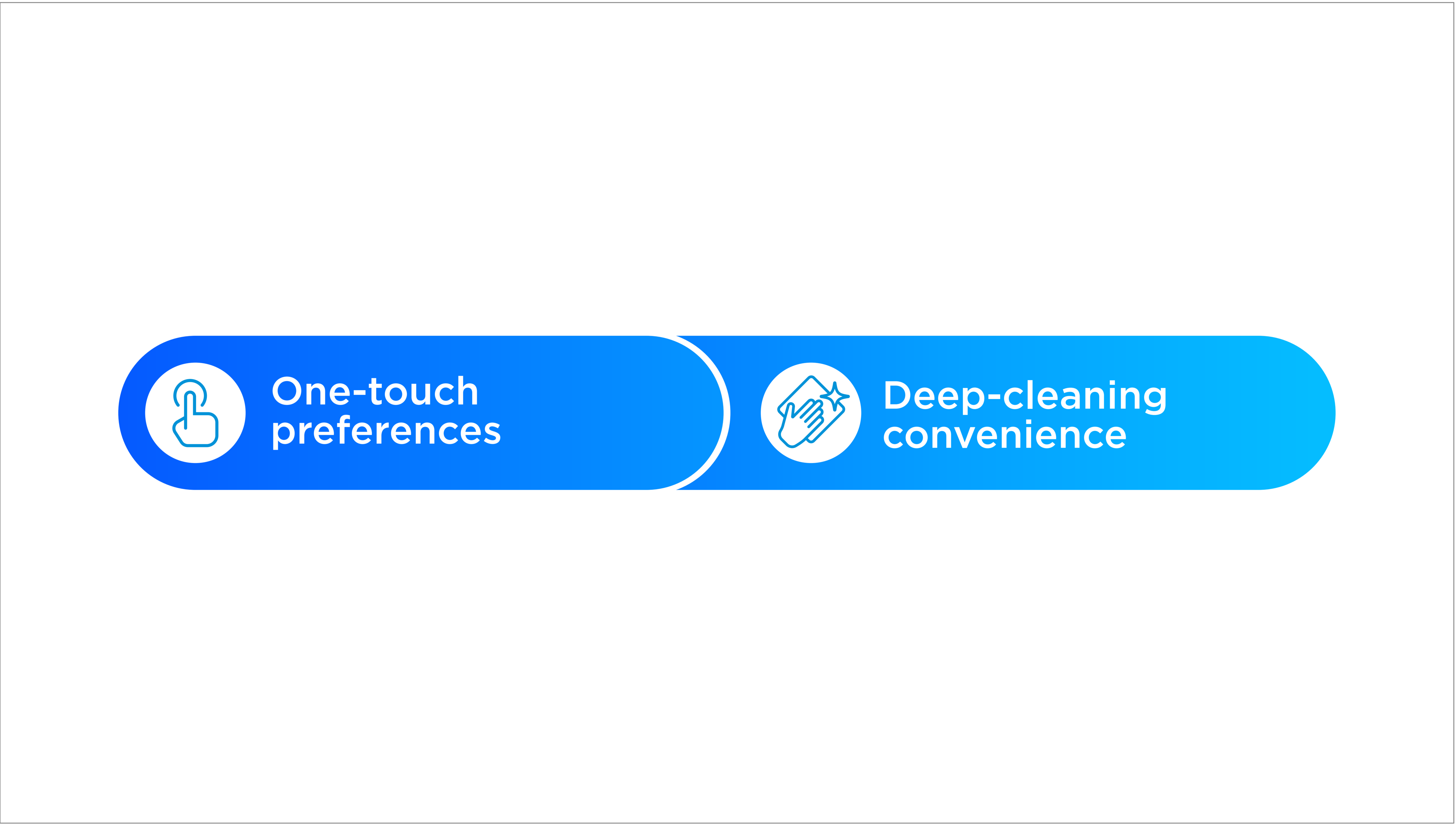
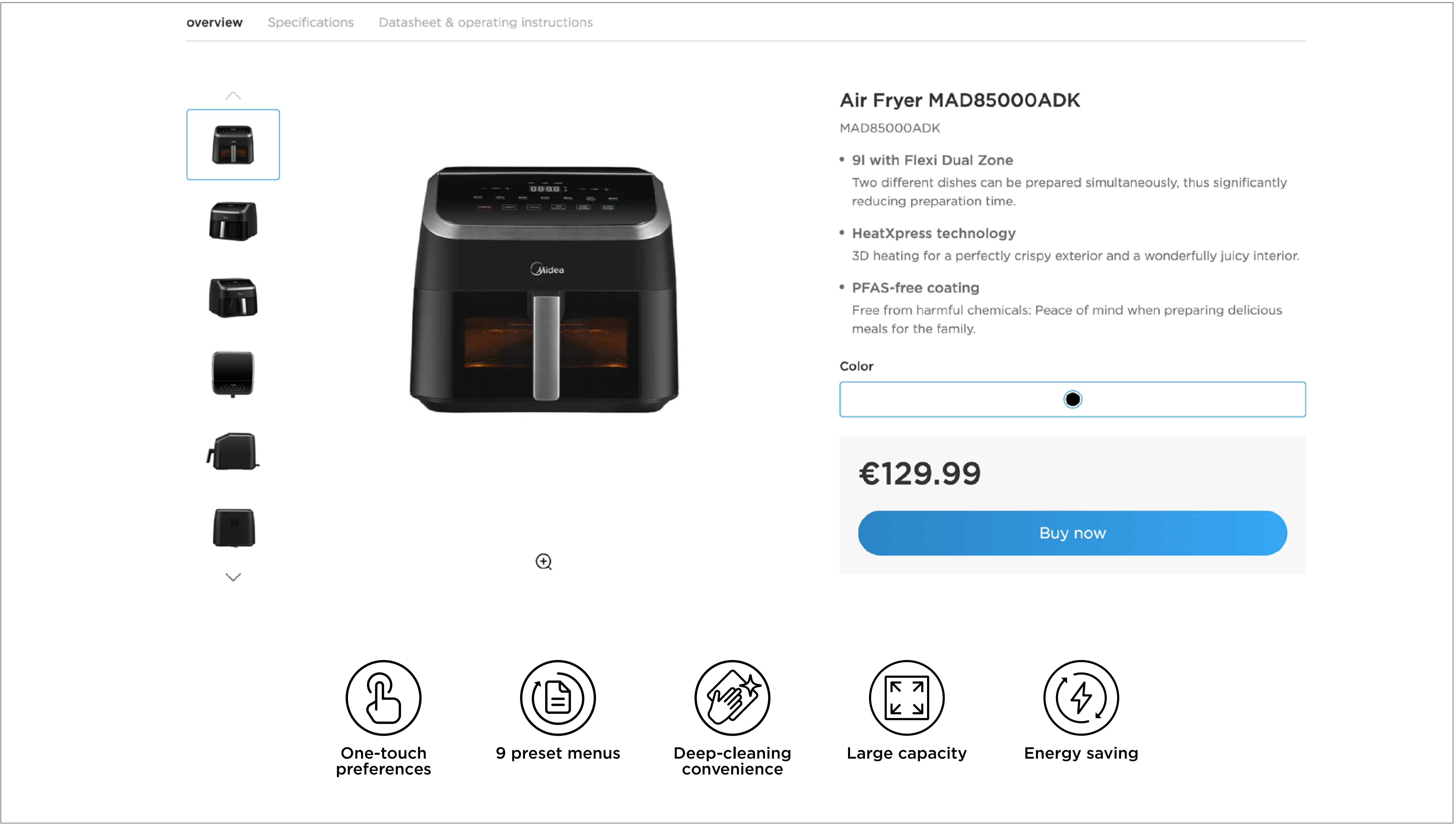
Below are the five feature icons that should be used as a guiding principle for our visual look. When designing feature icons, ensure that the primary messaging can be communicated clearly when in view with the feature text.
Below are the seven product icons that should be used as a guiding principle for our visual look. Most importantly, when designing product icons, ensure the product can be clearly recognized.
Our icons always appear in our primary colors: Midea Deep Blue, Midea Blue, and White. These primary colors are also used as background colors. This allows for combinations and visual variants that create a holistic brand look, yet provides enough flexibility for a fresher adaptation across different applications.
Vertical alignment info text
The descriptive text incorporated with the icons is in Gotham Medium. This ensures that the overall descriptive text is clearly visible and has a balanced look between the strokes of our icons and our descriptive feature text. Below are examples of our descriptive text in vertical alignment with the icons.
Horizontal alignment info text
For horizontal alignment, the descriptive text must be placed to the right of the icons, according to the following specifications.
When Gotham fonts are not applicable and/or able to be embedded into the applications on different channels (such as Microsoft software, email signatures, website, etc), an alternative system default sans-serif fonts may be used instead.
In this situation, Noto Sans is recommended as it is neutral and available in multiple languages. It is highly adaptable and retains the consistency across different looks for bilingual applications.
Note:
When designing high profile, high impact communications, Gotham is always used.
-
 POP
POP -
 Website
-
Go to Download
Icon Style