Logo Placement
Regardless of communication size or dimension, the logo should only be placed in four locations. Please keep in mind the clear space requirement when placing the logo.
Storefront Signage
Storefront sizes can vary greatly between locations, and therefore, storefront signs need to be sized accordingly. Some basic size ratios have been developed to help ensure a sign's visibility and effectiveness.
Logo Usage Principle
All fixture logo application in the retail store uses the Lozenge Block logo. The height of the logo is "H + 1/10 H". The logo must be centralized and clear space is designed by"H".
Midea text are die-cut illuminated letterforms, made with 10mm acrylic, pop out from the centrally placed blue lightbox.
The principles for using Midea logo are divided into two situations:
1. Only the independent logo appears on the wall bay, and the dimensions are as shown in the figure below. When the height of the wall bay changes, the proportion of the logo is as shown in the figure below.
2. In an island setup, the logo should be hung overhead, encompassing the perimeter of the island space. There should be no logo on the wall bay. The dimensions and proportions of the logo are illustrated in the figure below.
Dual-Sided Lightbox
The Midea logo is placed in a lightbox that can be viewed from all sides, ensuring visibility from different angles within the store.
Logo Placement Principle
The logo should be positioned 300mm from the right edge of the end cap of the island fixture. The end cap is the outermost vertical surface at the front of the fixture.
The logo should also be aligned 300mm from the right edge when viewed from the side of the island fixture.
-
 Island view of front end-cap
 -
 Island view of side end-cap
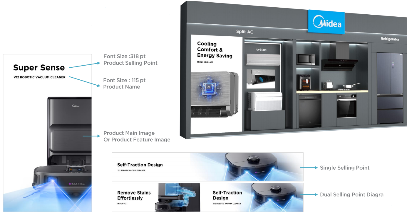
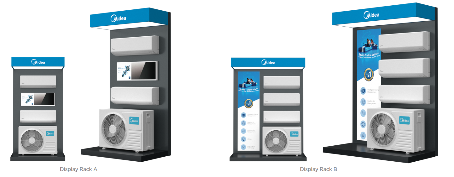
Simple and technological design style, with a white background to highlight the core selling points of the product.