The packaging architecture principle is a clear partition of the different sides of the packaging. As every side has it’s purpose, we have designed two fronts and two sides to optimize costs and communication mix. The top is fully dedicated to the Midea brand core promise to consumers with a minimalist approach.
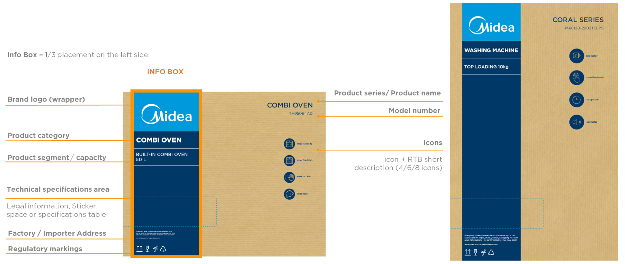
Info Area - is defined to communicate the brand followed by the product category, segment and capacity. This takes in principle 1/3 of the front of the packaging.
Visual Area - Most of the packaging area is dedicated to the product line drawing being the biggest space available 2/3. The bottom zone contains a footer bar, made to include additional information.
The frontal view should be the same at both sides.
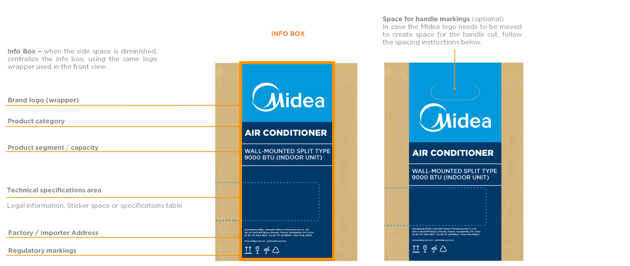
The design of the top view has the same concept for all categories, bringing focus to the brand logo and slogan. This system is applied for all packaging's for both, single and double lid, with handle or not.
Book Gotham HTF Font