The packaging update focuses on enhancing "shelf attributes" with the following optimizations:
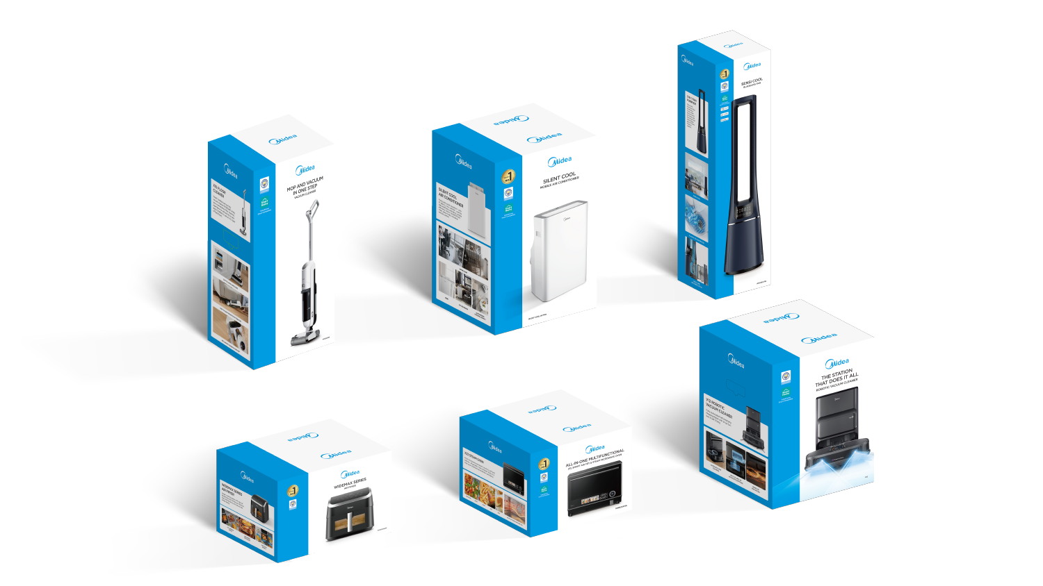
1. Compelling Selling Point Pictures
Intuitive product and selling point images replace simple icons, making it easier to convey product value and selling points information while improving sales conversion capabilities.
2. Improved Eye-Catching Ability
The use of contrasting blue and white design elements to form a striking visual design, enhancing packaging recognition and attracting shoppers' attention.
3. Enhanced Purchasing Decision Assistance
The arrangement of packaging information follows the logic of guiding consumers to make purchasing decisions.
1.1 Blue White Ratio Setting Steps
To set the blue-white visual design of the packaging:
Step 1: Define the packaging type based on the front length-to-height ratio;
Step 2: Set the blue bar width according to the each type’s blue white ratio.
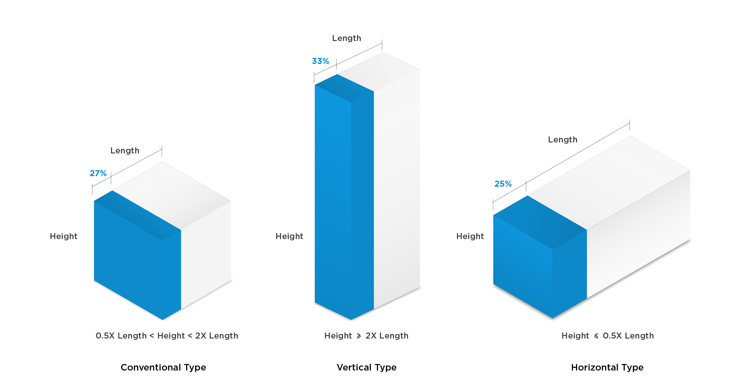
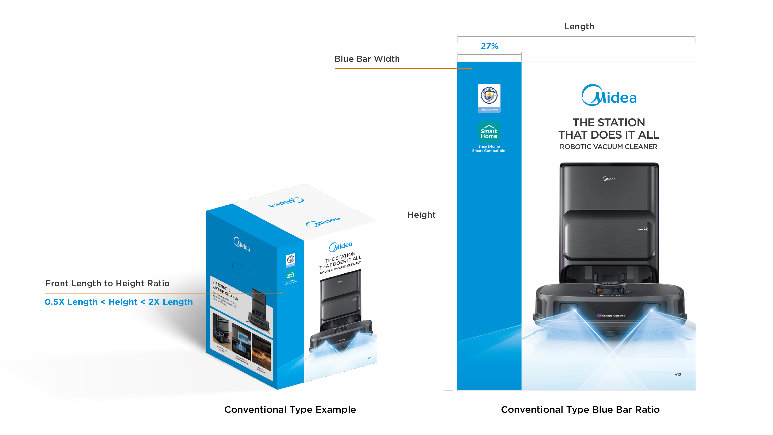
1.2 Blue White Ratio (Conventional)
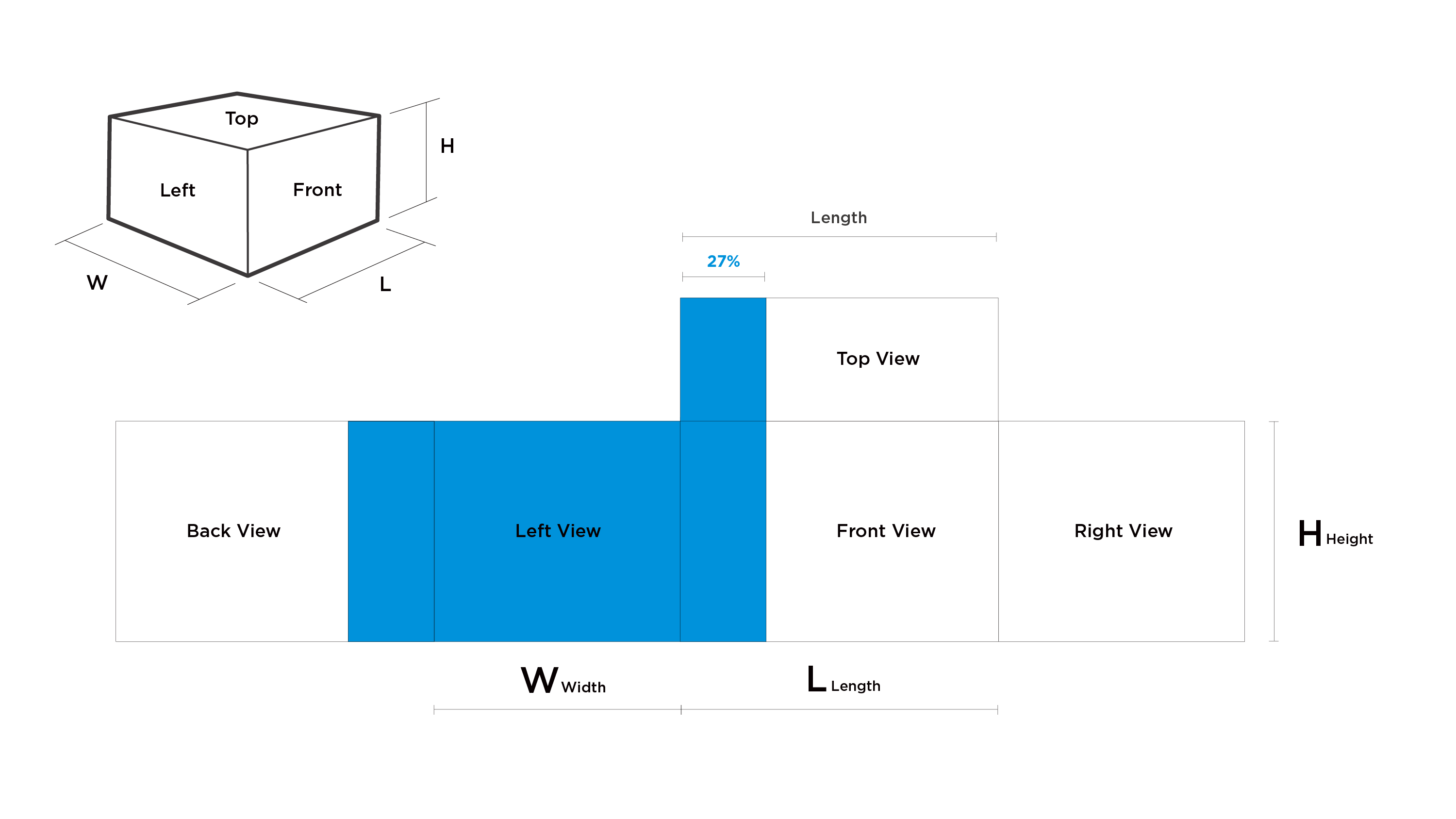
When the length and height of the front of the packaging satisfy the relationship of 0.5X Length < Height < 2X Length , we define this type of packaging as Conventional.
The width of the blue bar design is 27% of the length of the front view.
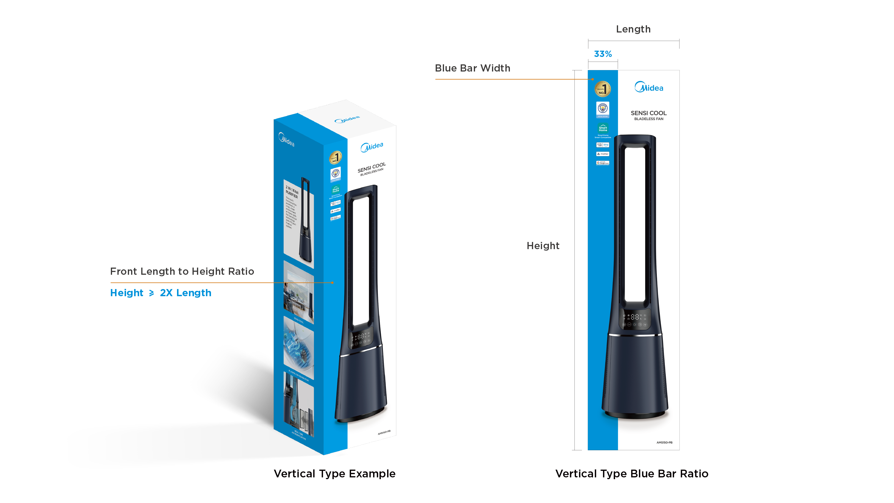
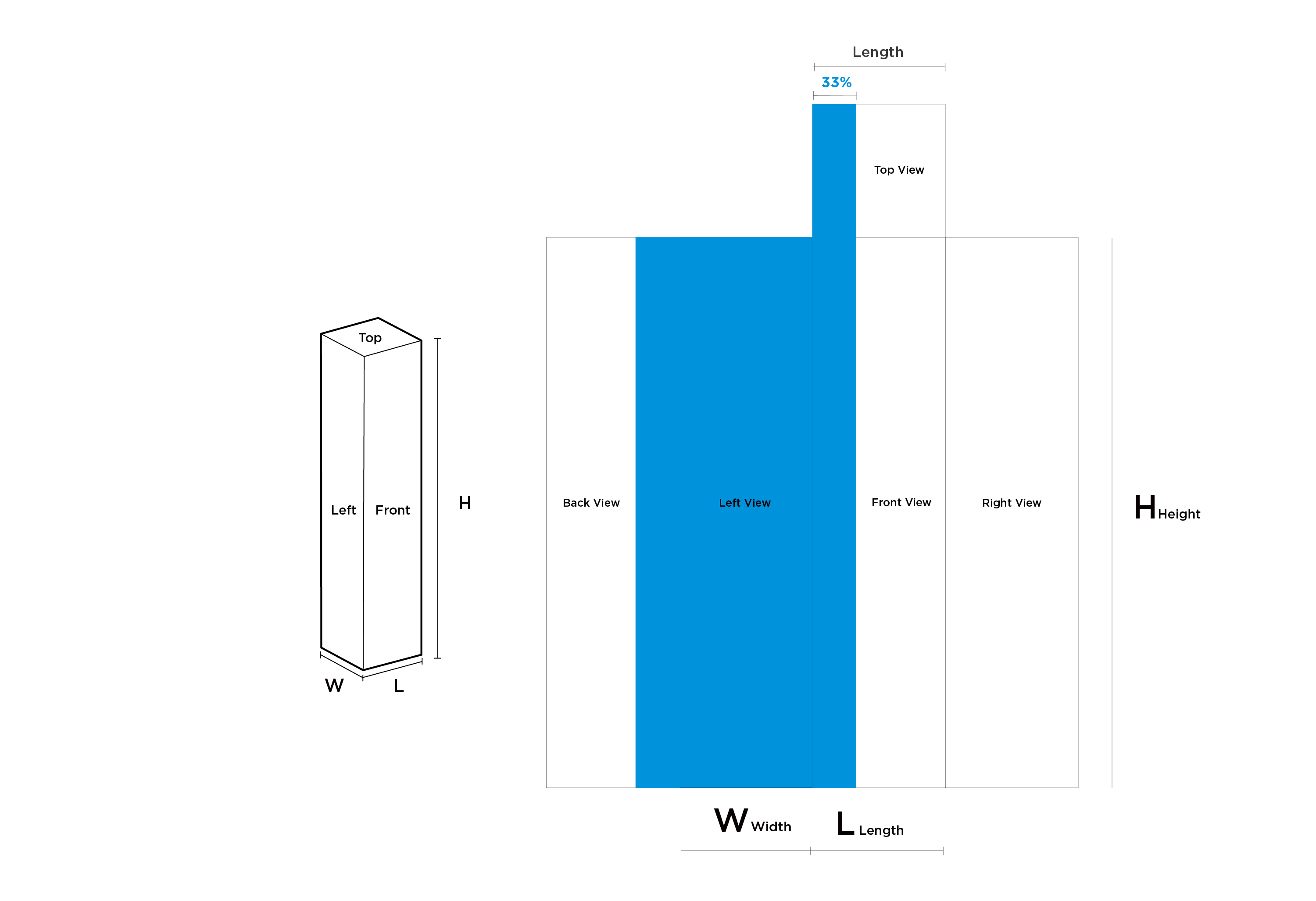
1.3 Blue White Ratio (Vertical)
When the length and height of the front of the packaging satisfy the relationship Height ≥ 2X Length, we define this type of packaging as Vertical.
The width of the blue bar design is 33% of the length of the front view.
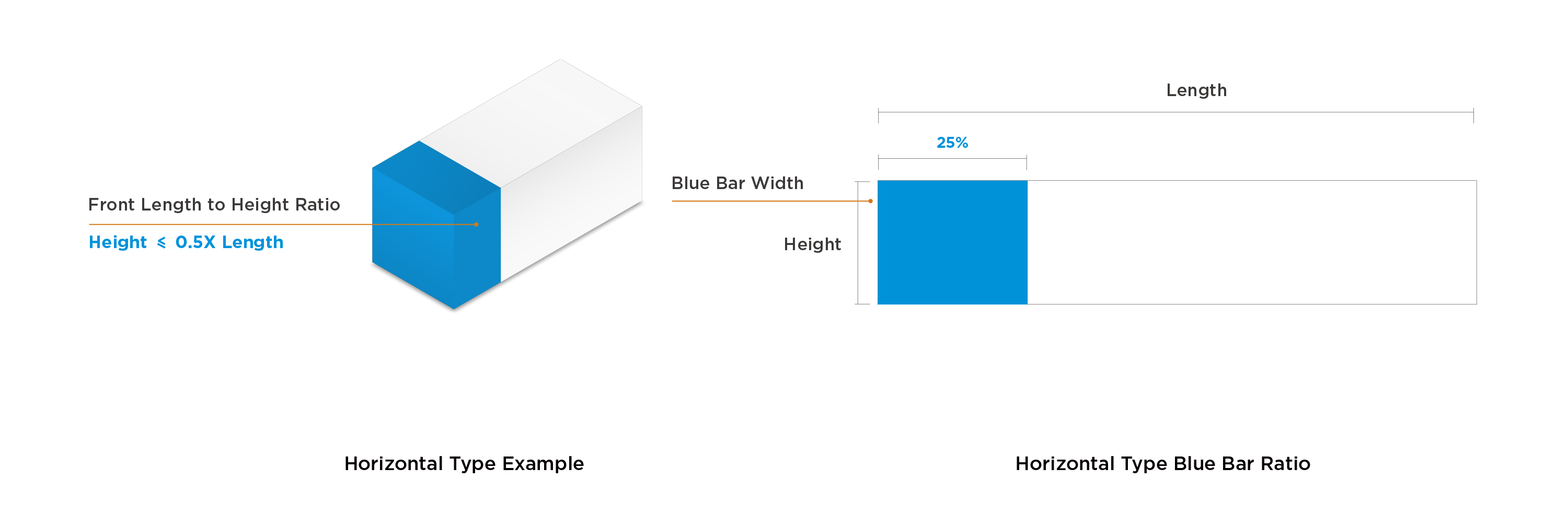
1.4 Blue White Ratio (Horizontal)
When the length and height of the front of the packaging satisfy the relationship Height ≤ 0.5X Length, we define this type of packaging as Horizontal.
The width of the blue bar design is 25% of the length of the front view.
(Due to the lack of product examples for the horizontal type, no further expansion is given here.)
2.1 Information Overview
The information layout on each side of the color box packaging follows the logic of guiding consumers to make purchasing decisions. Different sides have different information functions:
- The front/back sides display the product appearance and brand assets;
- The left/right sides display product selling points and other information;
- The top displays the brand logo.
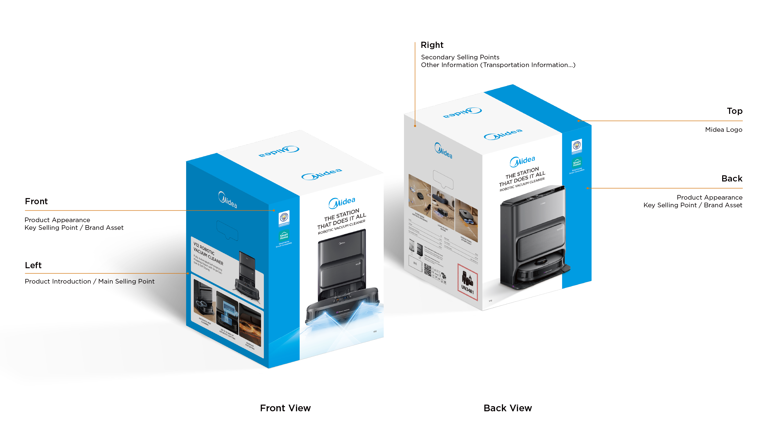
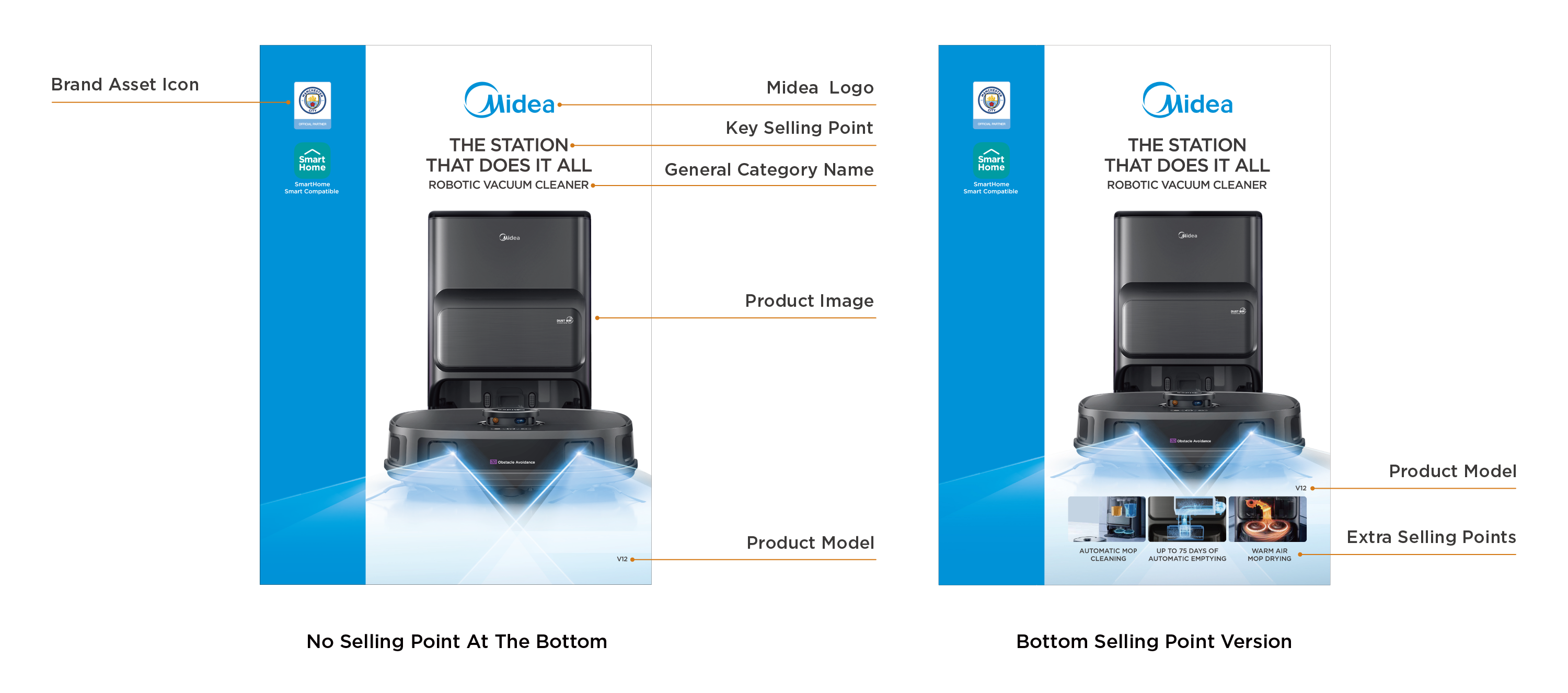
2.2 Information Layout (Front/Back)
Please arrange the information on the front/back according to the diagram annotations.
Depending on the actual material conditions and needs of the product, PDs can choose:
- Version without selling point images at the bottom;
- Version with 3 additional selling point images on the front bottom.
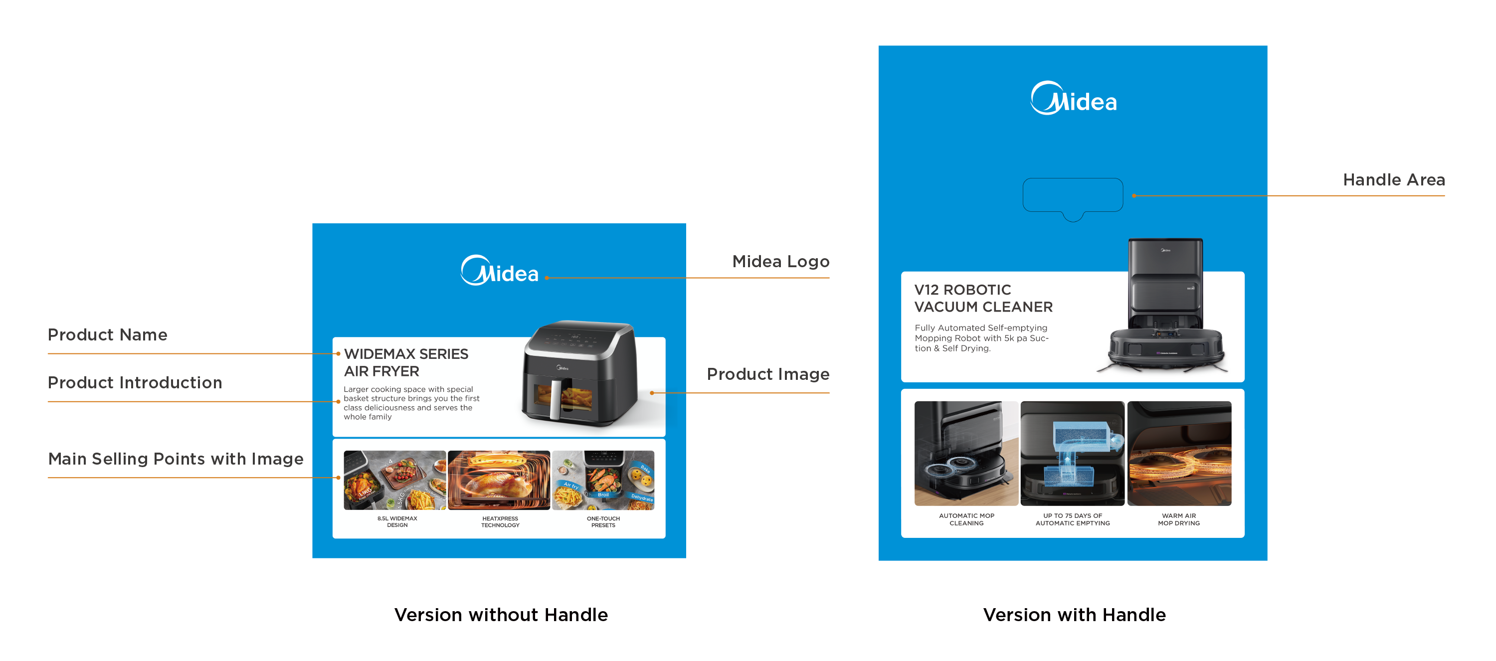
2.3 Information Layout (Left)
Please arrange the information on the left side according to the diagram annotations.
Depending on the actual product packaging requirement, the left side of the packaging can be flexibly selected:
- Version without handle area;
- Version with handle area (Leave space for the handle area).
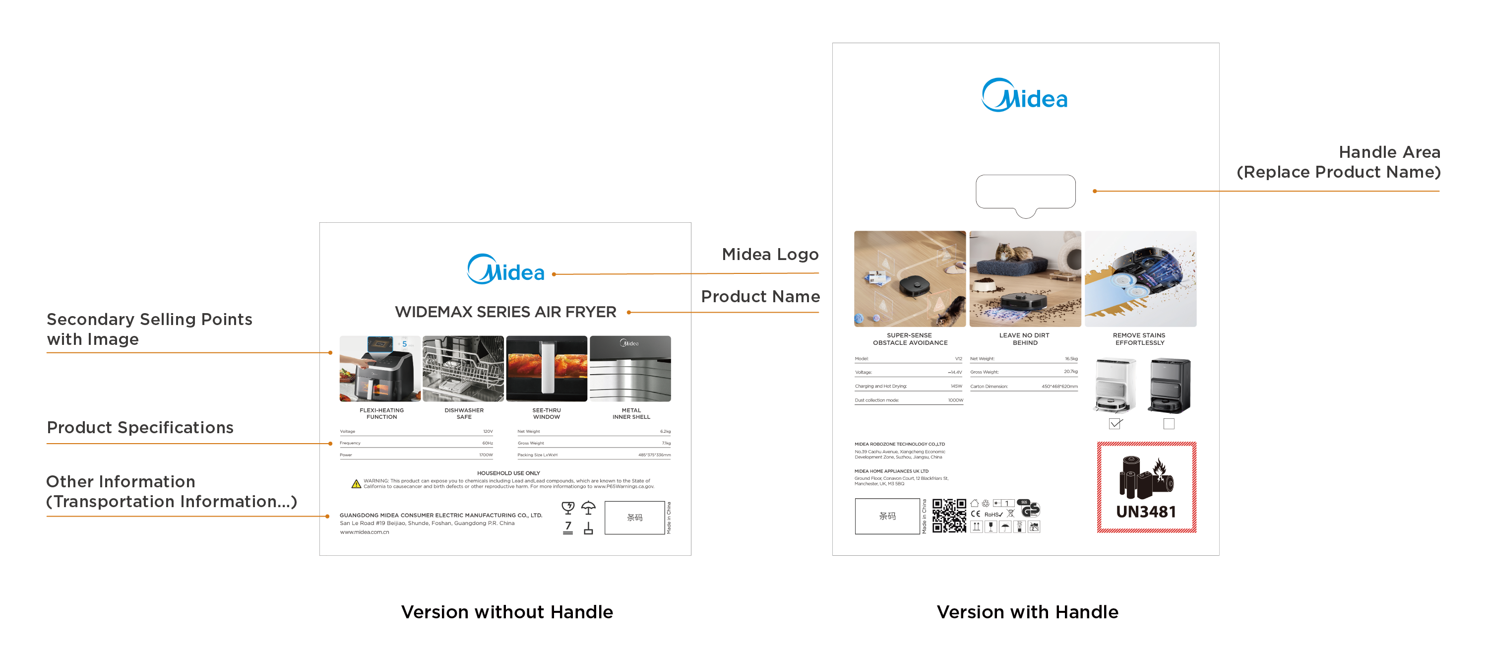
2.4 Information Layout (Right)
Please arrange the information on the right side according to the diagram annotations.
Depending on the actual needs of product packaging, the right side of the packaging can be flexibly selected:
- Version without handle area;
- Version with handle area (Leave space for the handle area).
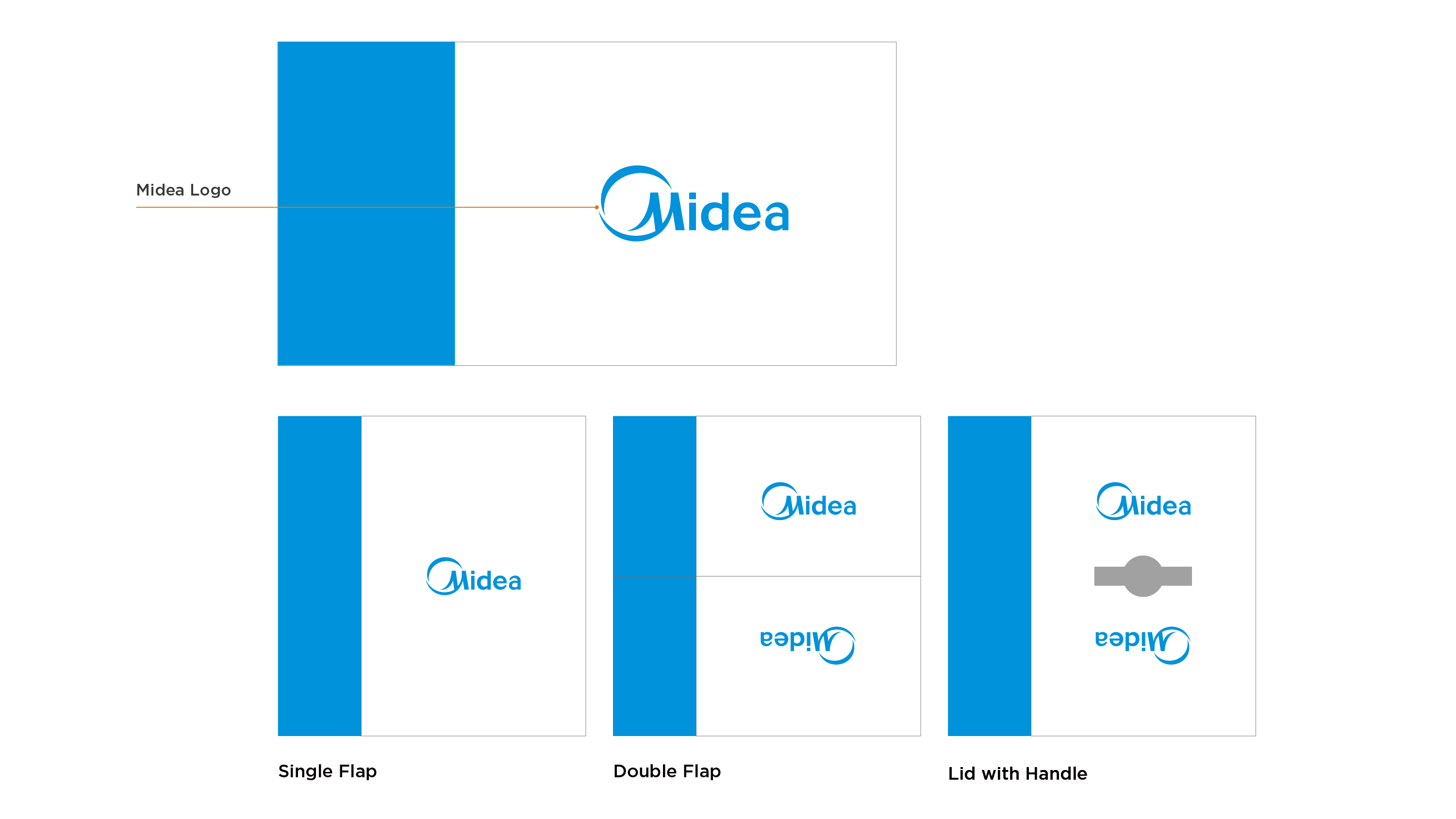
2.5 Information Layout (Top)
Depending on the actual layout of the product packaging, the top is divided into: Single Cover, Double Cover, Handle Cover, etc.
The placement of the brand logo in the center varies slightly according to to the different layouts of the top.
3.1 Font Specifications
All text on the packaging should use Gotham family fonts;
Use bold and thin fonts to distinguish between different levels of information, the font sizes of different levels of information follow a fixed ratio;
The font size can be flexibly adjusted according to the size of the information area to ensure the aesthetics of the layout;
The minimum font size is set to 10.
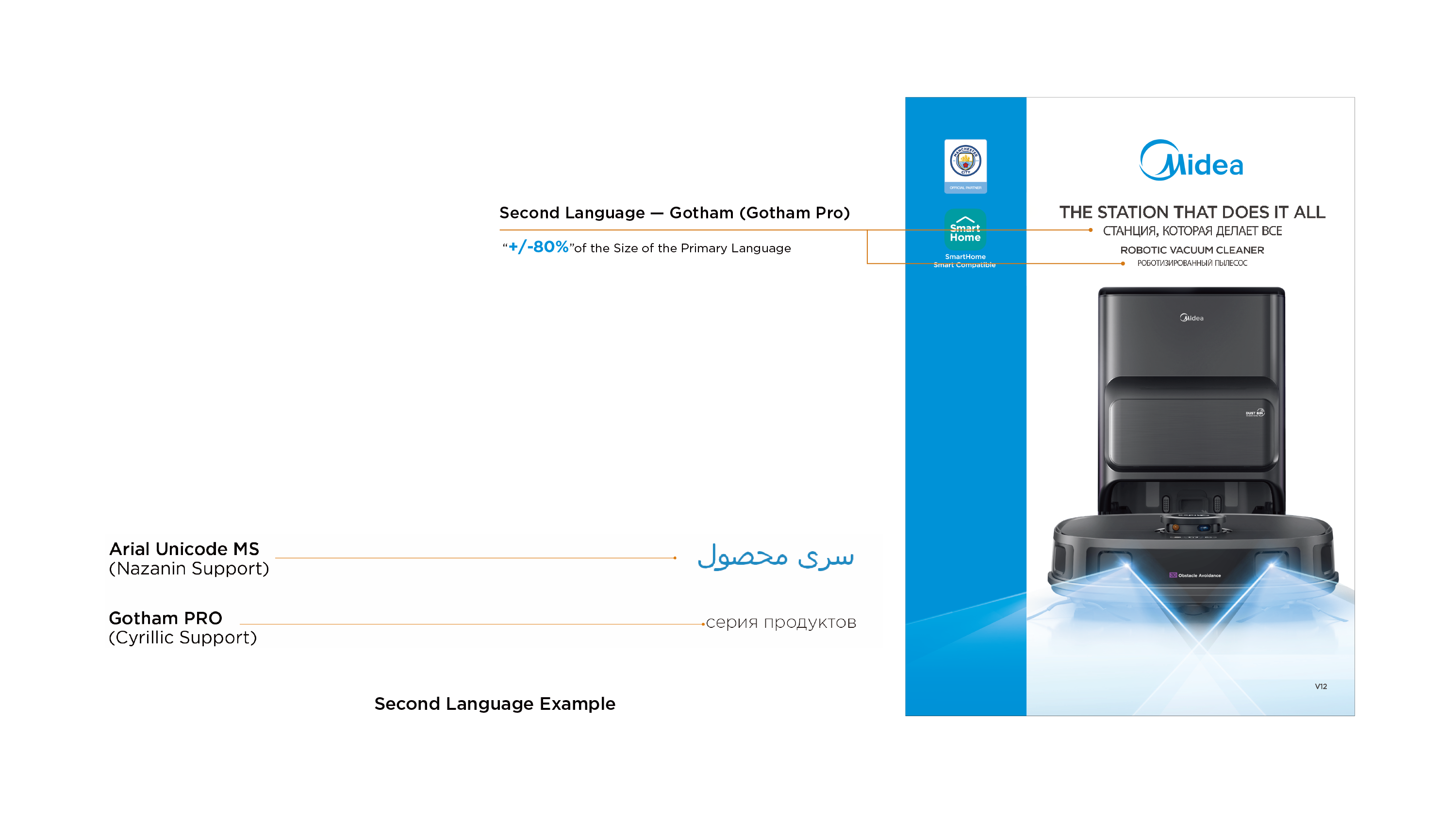
3.2 Multilingual Font Specifications
The second language font on the packaging uses Gotham Pro;
Cyrillic (Russian) uses Gotham Prop; Nazanin (Persian) uses Arial Unicode MS;
The second language font size should follow the ratio given in the annotations.
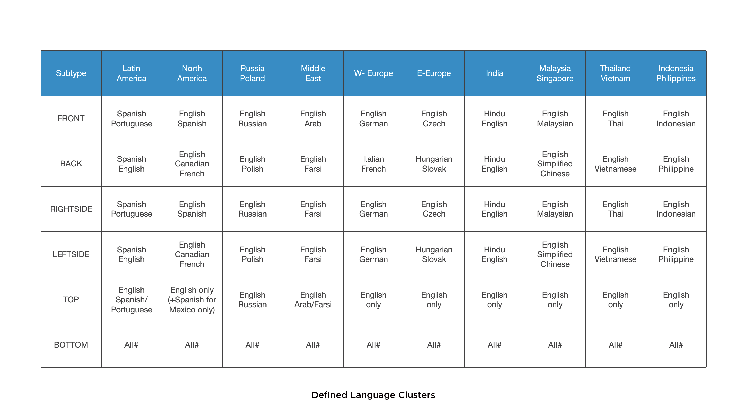
3.3 Multilingual Application
Please strictly follow the local regulations when applying packaging language to ensure compliance with relevant laws and regulations (the following table is the defined language cluster for reference). Notes:
- A maximum of 4 languages can be displayed on each package;
- If you need to add information that is not related to consumer purchases, please use the bottom of the package;
- All information content must comply with legal requirements.
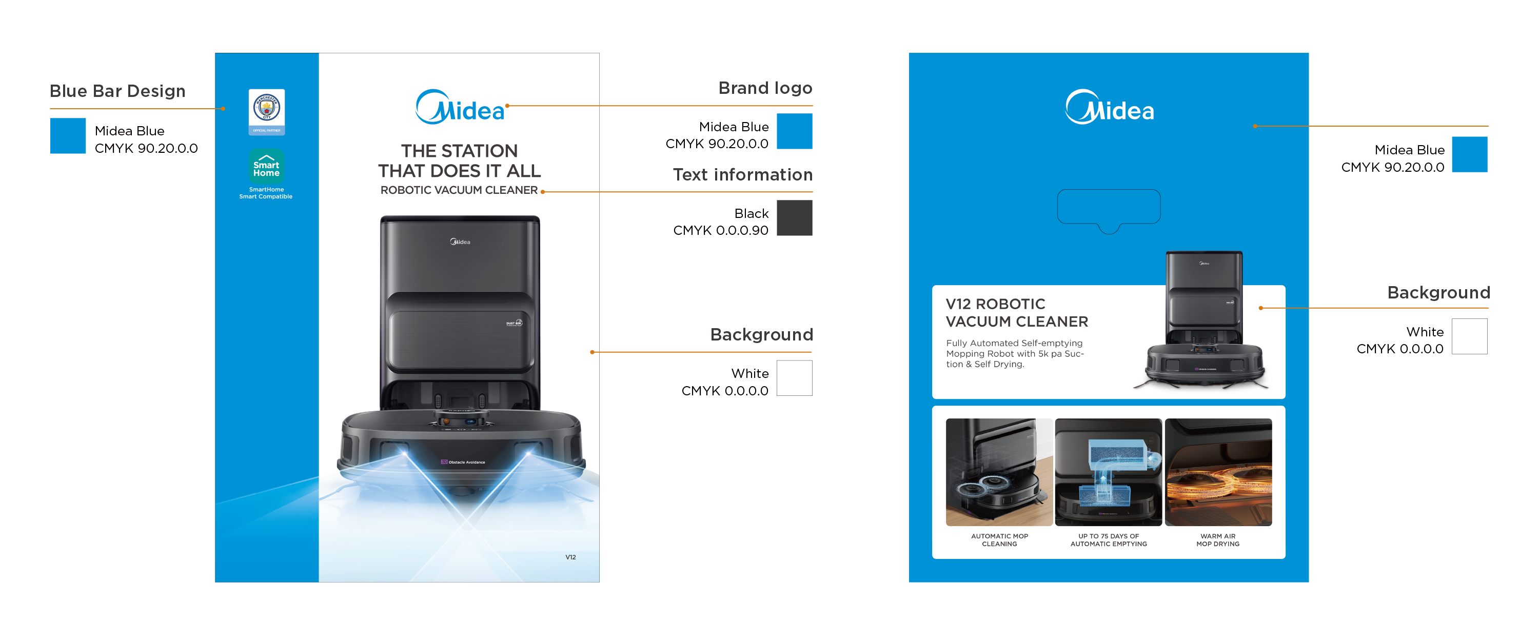
The packaging mainly uses three colors: blue, white and black.
- White: packaging background color;
- Midea Blue: blue bar visual design to highlight the packaging;
- Black: font color.
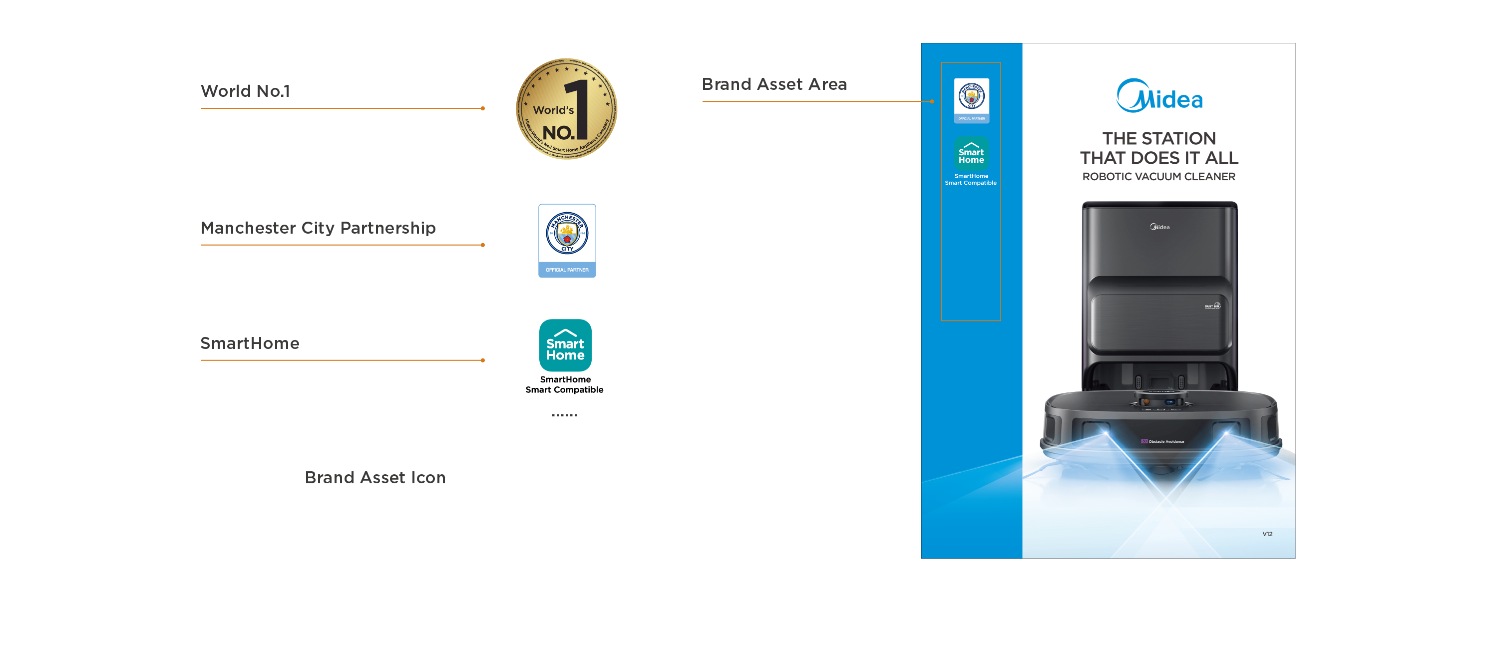
Place the brand asset icon within the non-safe area of the blue bar on the front/back of the package
It is recommended sort them in order of priority with appropriate size and consistent spacing to ensure aesthetics.
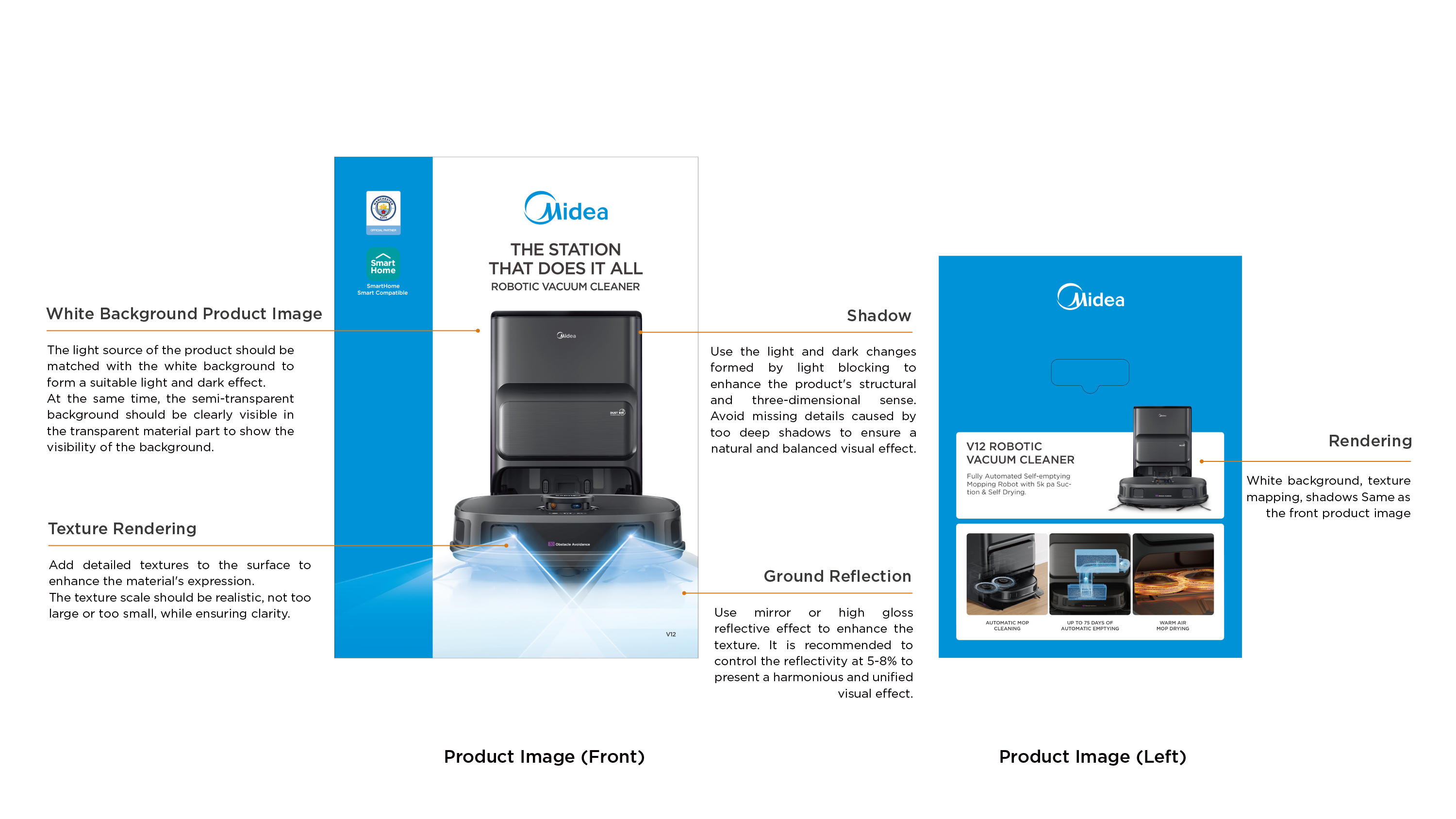
6.1 Product Image Rendering
Ensure the rendering quality of the front and back product maps and the left blue product introduction product map. Through the processing of rendering details such as texture, shadow and ground reflection, the realism and quality of product pictures are enhanced.
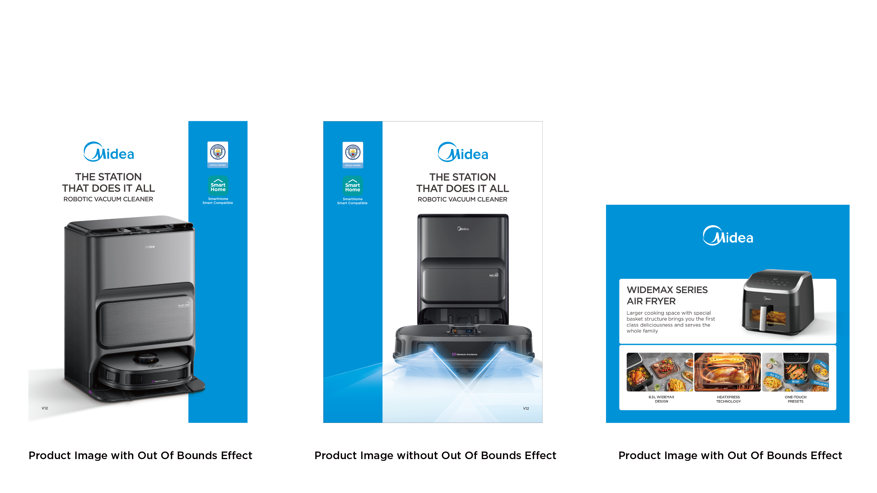
6.2 Out of Bounds Effect
The front/back of the packaging can adopt the same or different product angles according to the product aesthetic requirements.
- Without out of bounds effect;
- With out of bouds effect (it is more recommended for aesthetics)
Out of Bounds Effect: Extend part of the product image beyond the border to create a three-dimensional, close-up effect and highlight the product.
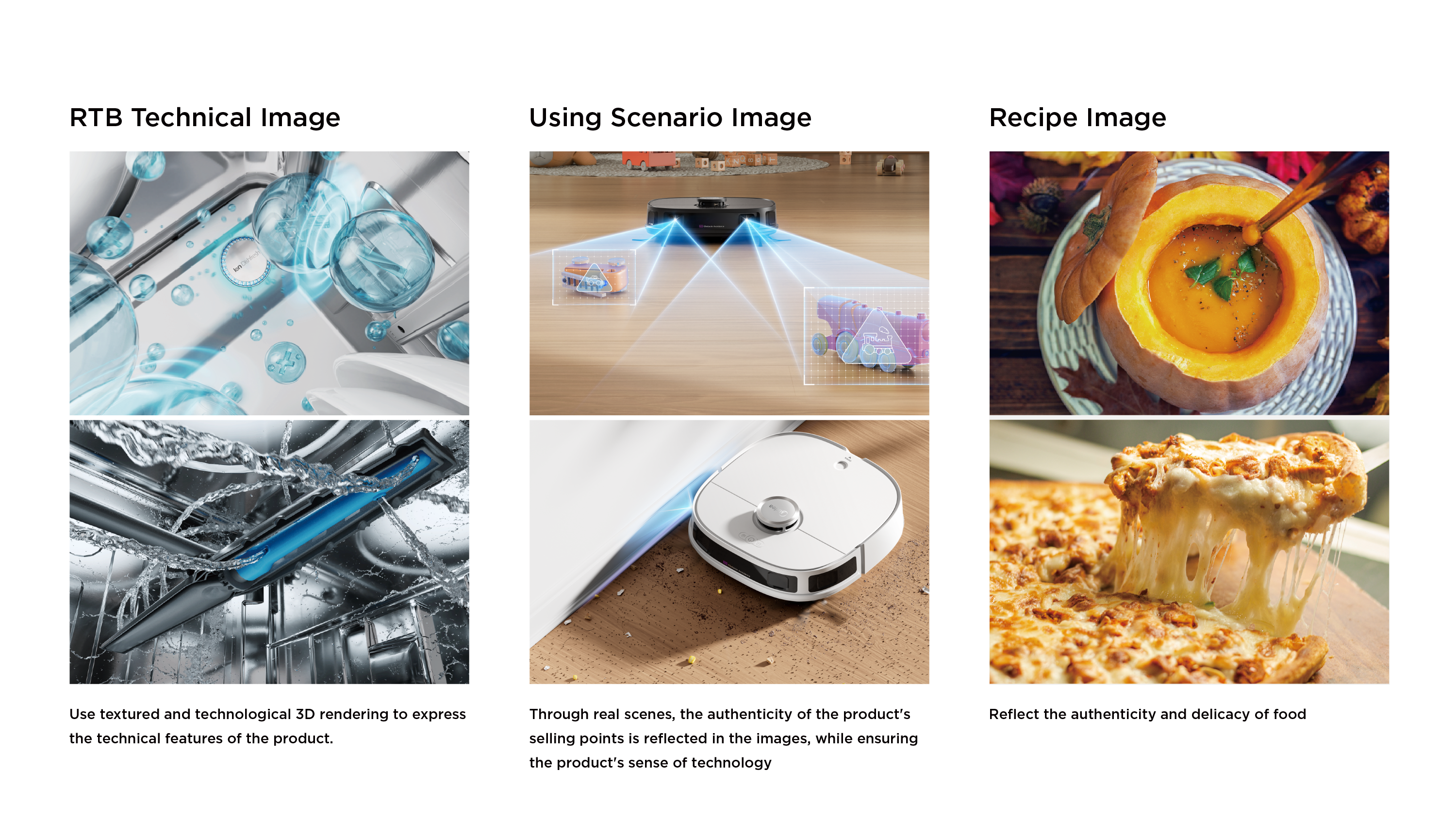
6.3 Selling Point Image Rendering
Ensure the rendering quality of the selling point images on the left/right sides of the packaging, including technical image, using scenario image and recipe image, etc.
7.1 Robotic Vacuum Cleaner Example
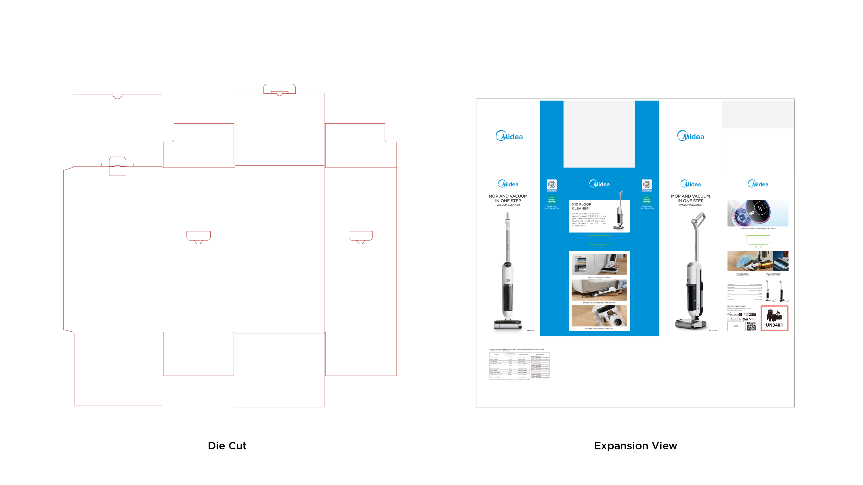
7.2 Vacuum Cleaner Example
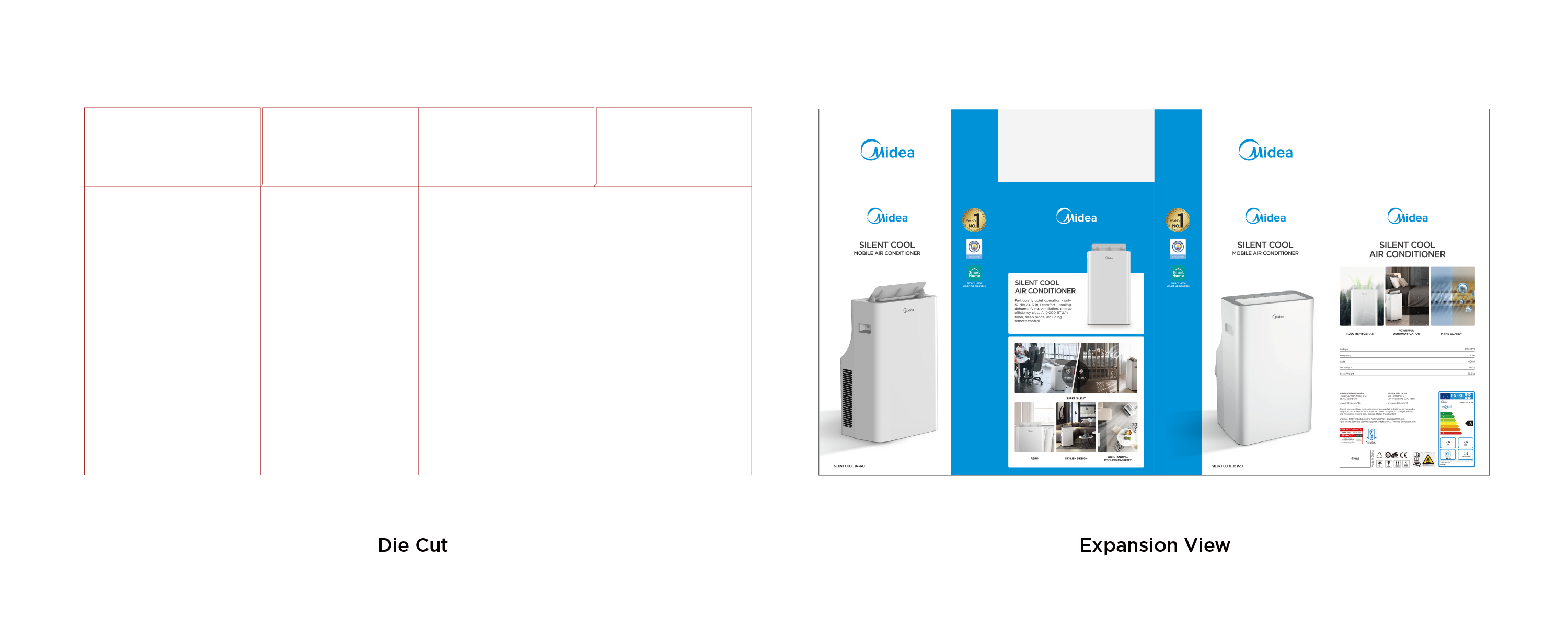
7.3 Mobile Air Conditioner Example
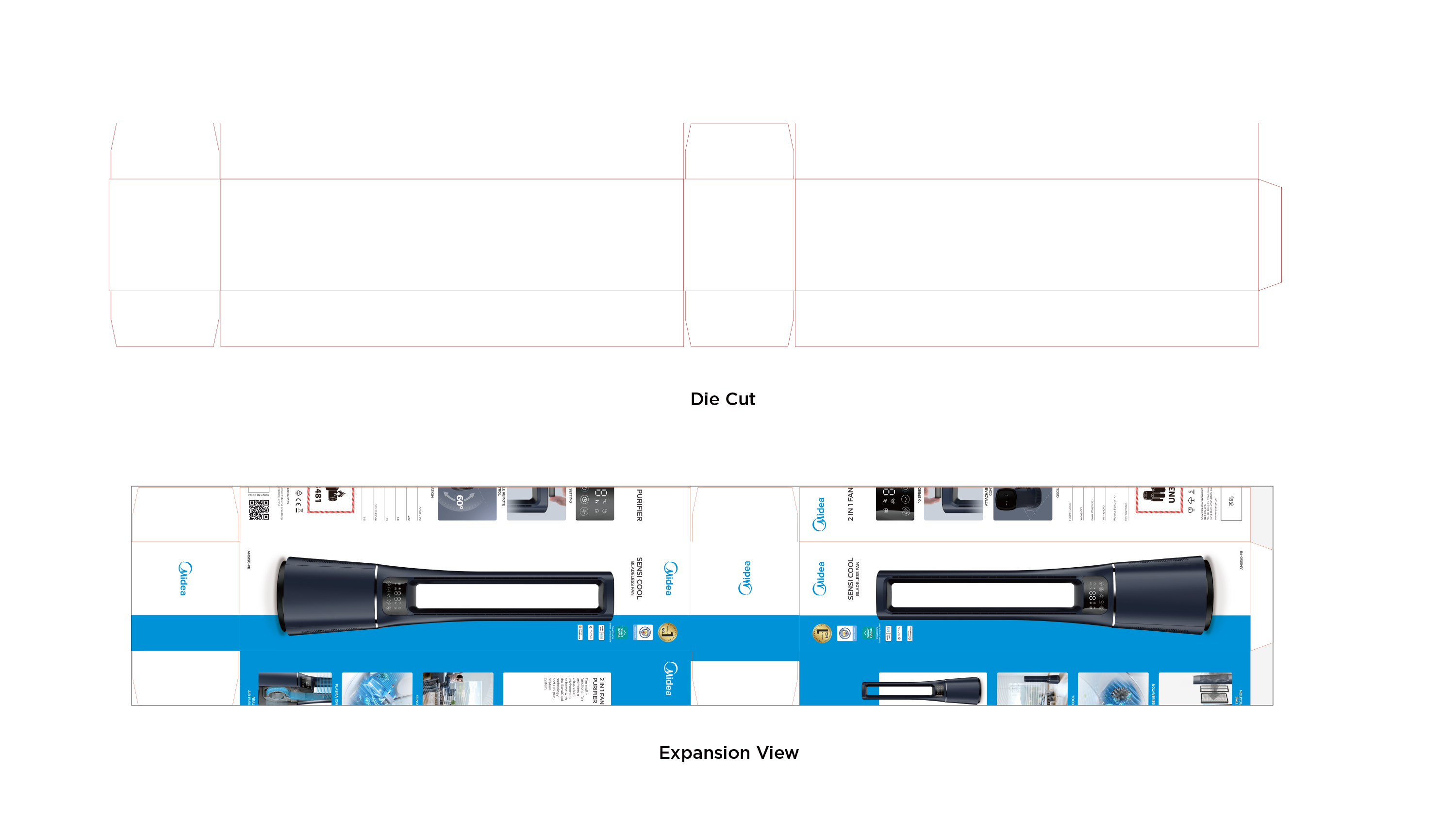
7.4 Bladeless Fan Example
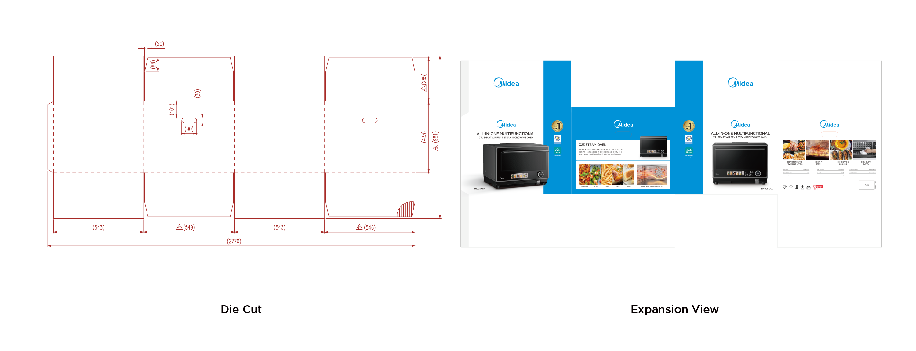
7.5 Microwave Oven Example
7.6 Air Fryer Example
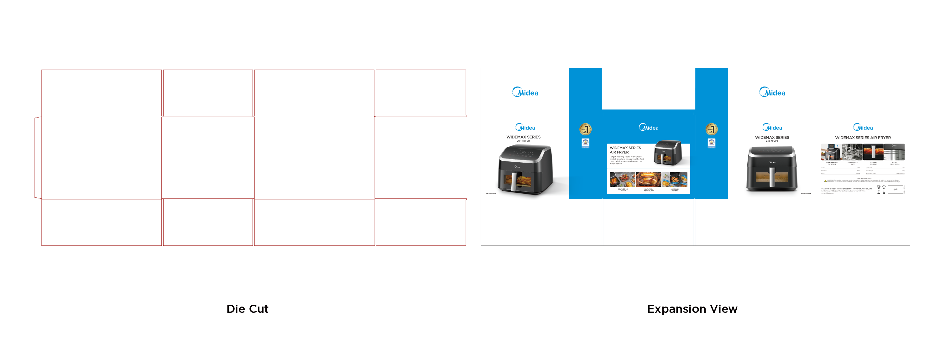
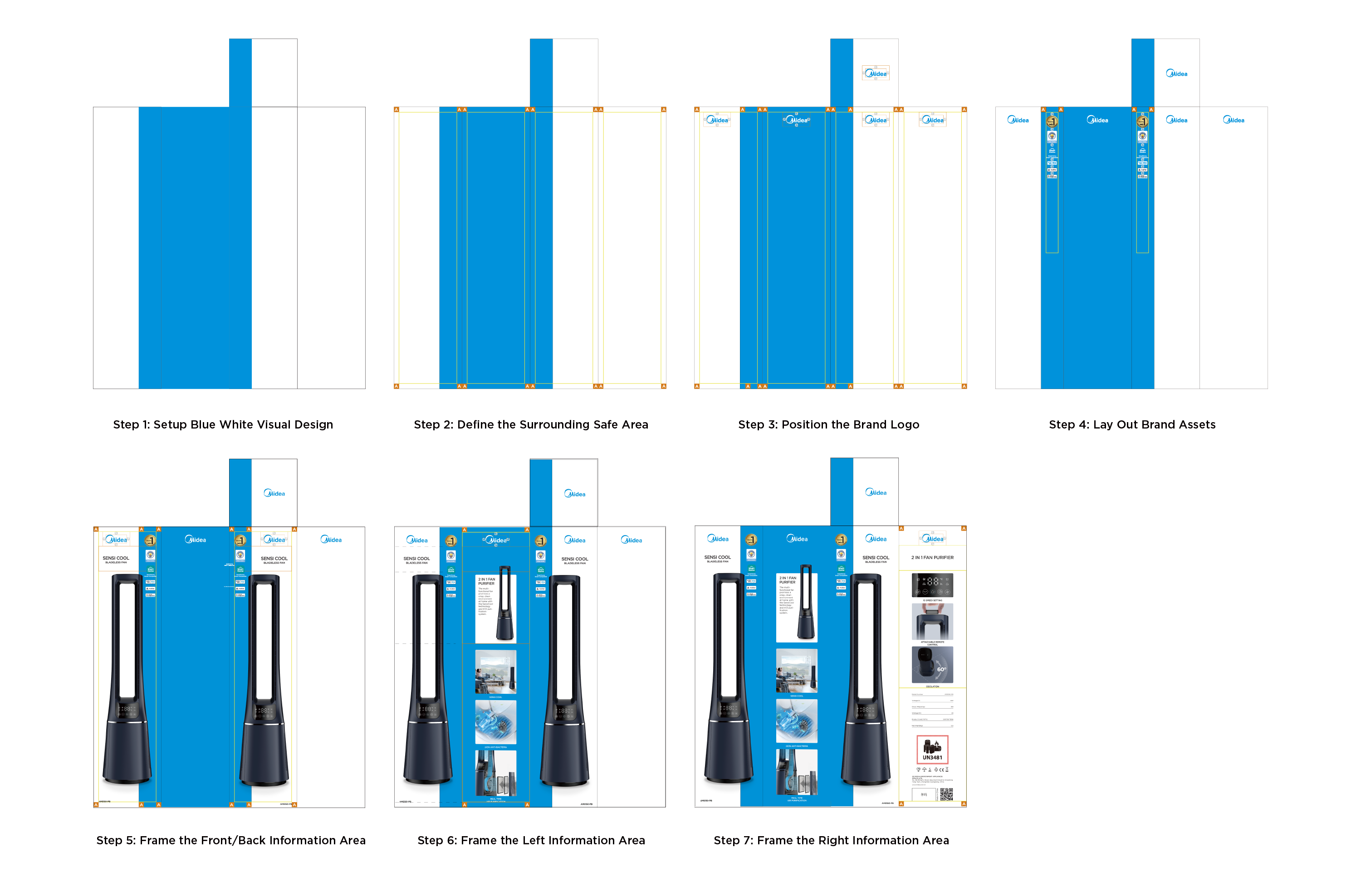
8.1 Basic Layout Setup Steps
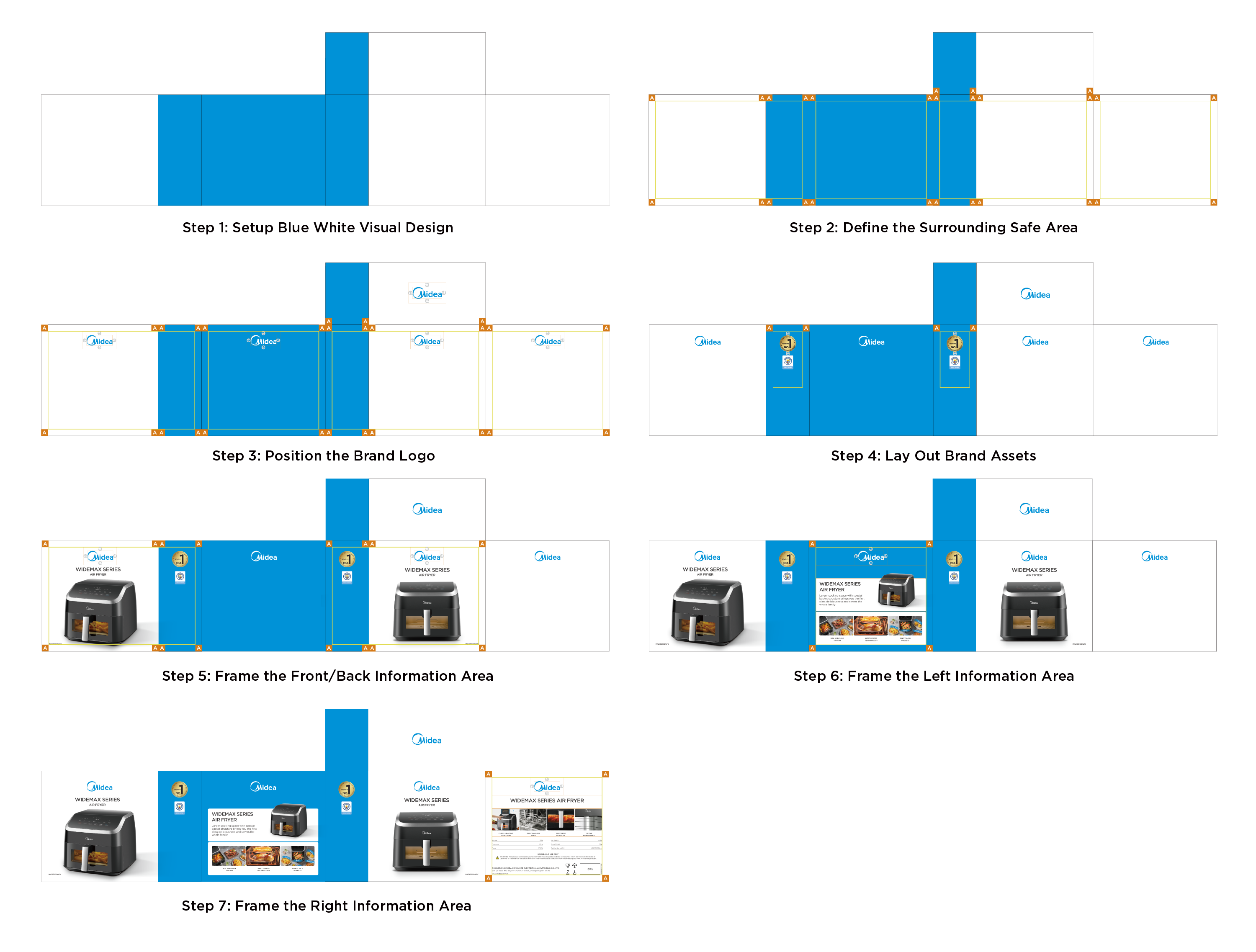
8.2 Step 1: Setup Blue White Visual Design
Set blue bar visual design on the front, back and top of the packaging.
The width is 27% of the front length.
The left side is all blue, the right side is all white.
8.3 Step 2: Define the Surrounding Safe Area
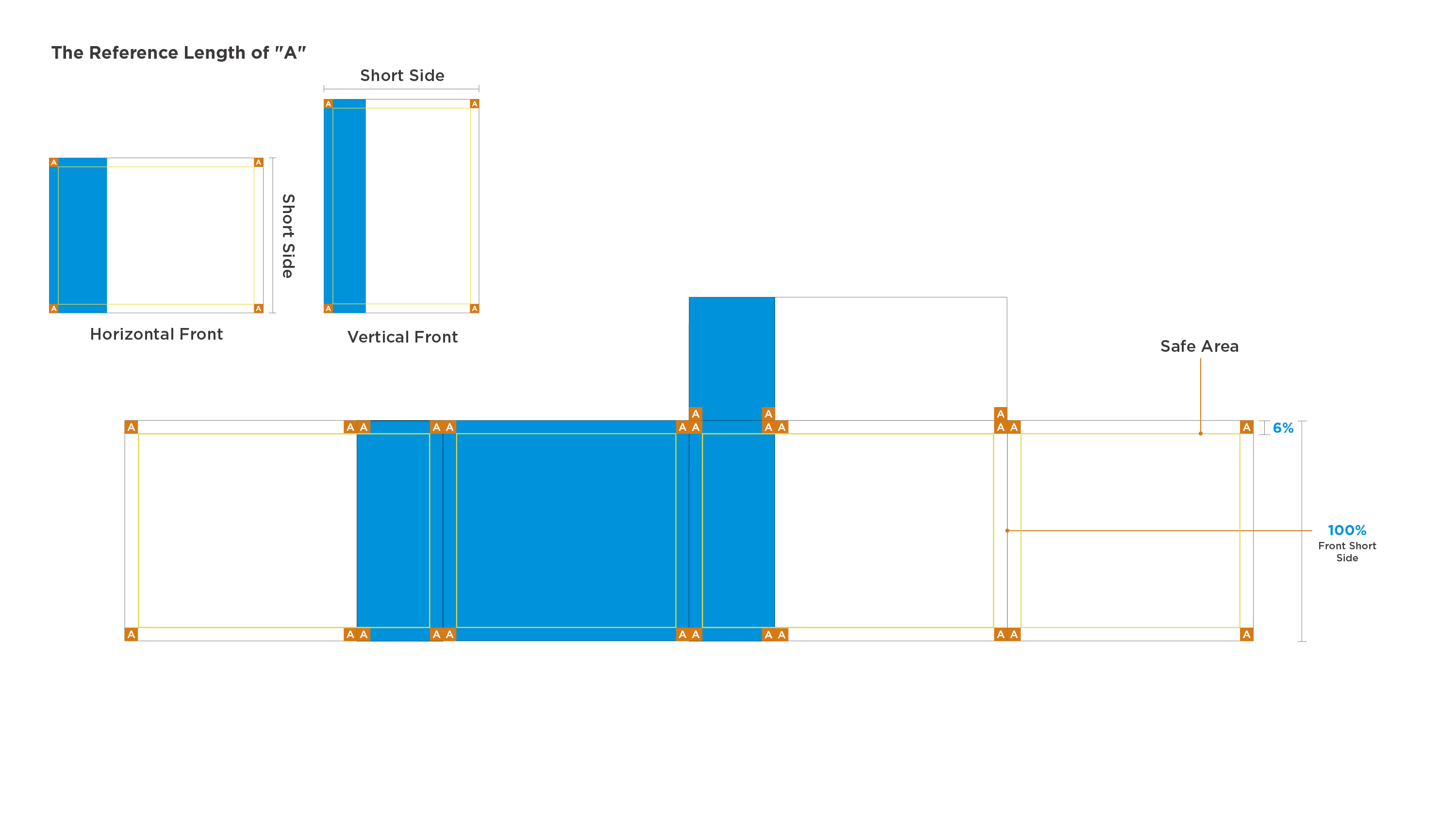
The width of the safe area square "A" is 6% of the front short side;
The safe area width is the same around each side;
No content is allowed to be placed in the safe area defined by "A".
8.4 Step 3: Position the Brand Logo
Brand logo on four sides (front/back/left/right):
- The logo length is 30% of the front short side;
- Place in the center below the safe area "A";
- Not allowed to cover the safe area of four sides.
Top brand logo:
- The logo length is 34% of the front short side;
- Place in the center of the white background on the top.
8.5 Step 4: Lay Out Brand Assets
Height Setting of the Brand Asset Area:
- The height is about 50% of the packaging height.
Layout Requirements of the Brand Asset Icon:
- Place in the non-safe area around the blue bar to ensure icons are visually clear and aesthetically arranged;
- The icon spacing is defined by the height of Midea “e”;
- Brand asset icons are prohibited from covering the safe area of blue bar.
8.6 Step 5: Frame the Front/Back Information Area
Text Area Height Setting:
- The height is about 12% of the packaging height;
- Place in the center of the white background;
- Not allowed to cover the logo’s clearspace and safe area.
Image Area Height Setting:
- The height is about 65% of the packaging height;
- Place in the center of the white background and cover part of the blue bar aesthetically;
- Not allowed to cover the text area and safe area.
For the bottom selling points version, please refer to the annotation as below.
8.7 Step 6: Frame the Left Information Area
Generally, it is recommended that:
- Blank Area Height: about 12% of the packaging height;
- Product Introduction Area: about 30% of the packaging height;
- Main Selling Point Area: about 30% of the packaging height;、
For the version with handle please refer to the annotation as below;
Content cannot cover the surrounding safe area;
(In actual application, PDs can adjust the height ratio of the information area according to needs).
8.8 Step 7: Frame the Right Information Area
Generally, it is recommended that:
- Product Name Area Height: about 12% of the packaging height;
- Secondary Selling Points Area Height: about 25% of the packaging height;
- Other Information Area Height: about 35% of the packaging height;
For the version with handle please refer to the annotation as below;
Content cannot cover the surrounding safe area;
(In actual application, PDs can adjust the height ratio of the information area according to needs).
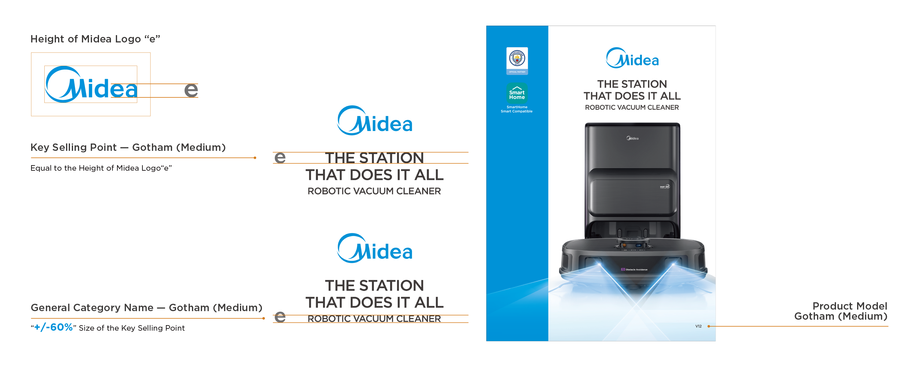
9.1 Text Requirements (Front/Back)
Take "Midea" logo "e" as the height reference:
- Key Selling Point Font Height : the height of 100% “e”;
- General Category Name Font Height : the height of 60% “e”;
- Spacing between Title and Subtitle: the height of 60% “e”;
- Product Model Font Height : the height of 35% “e”;
(In actual application, PDs can adjust the font height according to needs while ensuring the font size differences for information hierarchy).
Please follow the annotation as below standardize the font size, capitalization, alignment and line spacing.
9.2 Typesetting Requirements (Left)
Take "Midea" logo "e" as the reference:
- Product Introduction Safe Area Width : the height of 100% "e";
- Main Selling Point Safe Area Width : the height of 100% "e";
- Not allowed to cover the surrounding safe area inside information area;
- Main Selling Points Text Area Height : the height of 150% "e";
Please follow the annotation as below to set the font alignment.
9.3 Text Requirements (Left)
Generally, take "Midea" logo "e" as the height reference:
- Product Name Font Height : the height of 100% "e";
- Product Introduction Font Height : the height of 60% "e";
- Main Selling Point Font Height: the height of 35% "e";
(In actual application, PDs can adjust the font height according to needs while ensuring the font size differences for information hierarchy).
Please follow the annotation as below to standardize the font size, capitalization, alignment and line spacing.
9.4 Typesetting Requirements (Right)
Take "Midea" logo "e" as the reference:
- Secondary Selling Point Area Width : the height of 150% "e";
- Text Spacing of Product Specifications: the height of 100% "e";
Please follow the annotation as blow to set the font alignment;
Suggest to use left aligned to lay out transportation information for the aesthetics.
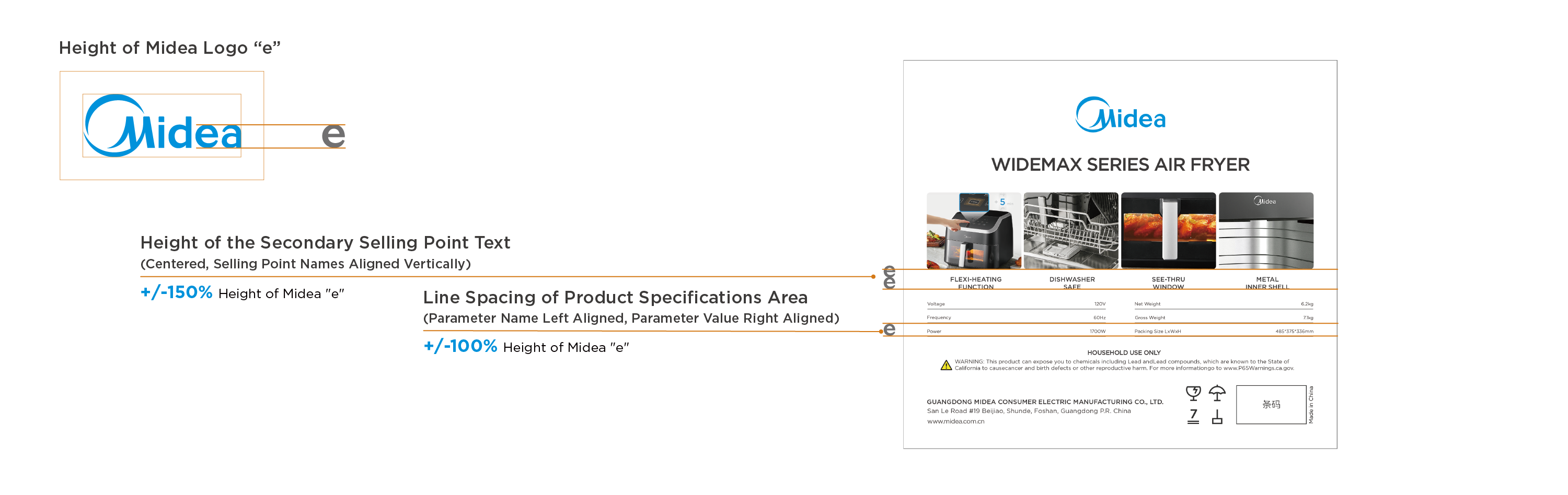
9.5 Text Requirements (Right)
Generally, take "Midea“ logo “e” as the height reference:
- Product Name Font Height : the height of 100% “e”;
- Secondary Selling Point Font Height: the height of 35% “e”;
- Product Specifications Font Height : the height of 25% “e”;
(In actual application, PDs can adjust the font height according to needs while ensuring the font size differences for information hierarchy).
Please follow the annotation on the right to standardize the font size, capitalization, alignment and line spacing;
The font height of other information area is not standardized here, just follow the requirements from PDs.
10.1 Basic Layout Setup Steps
10.2 Step 1: Setup Blue White Visual Design
Set blue bar visual design on the front, back and top of the packaging.
The width is 33% of the front length.
The left side is all blue, the right side is all white.
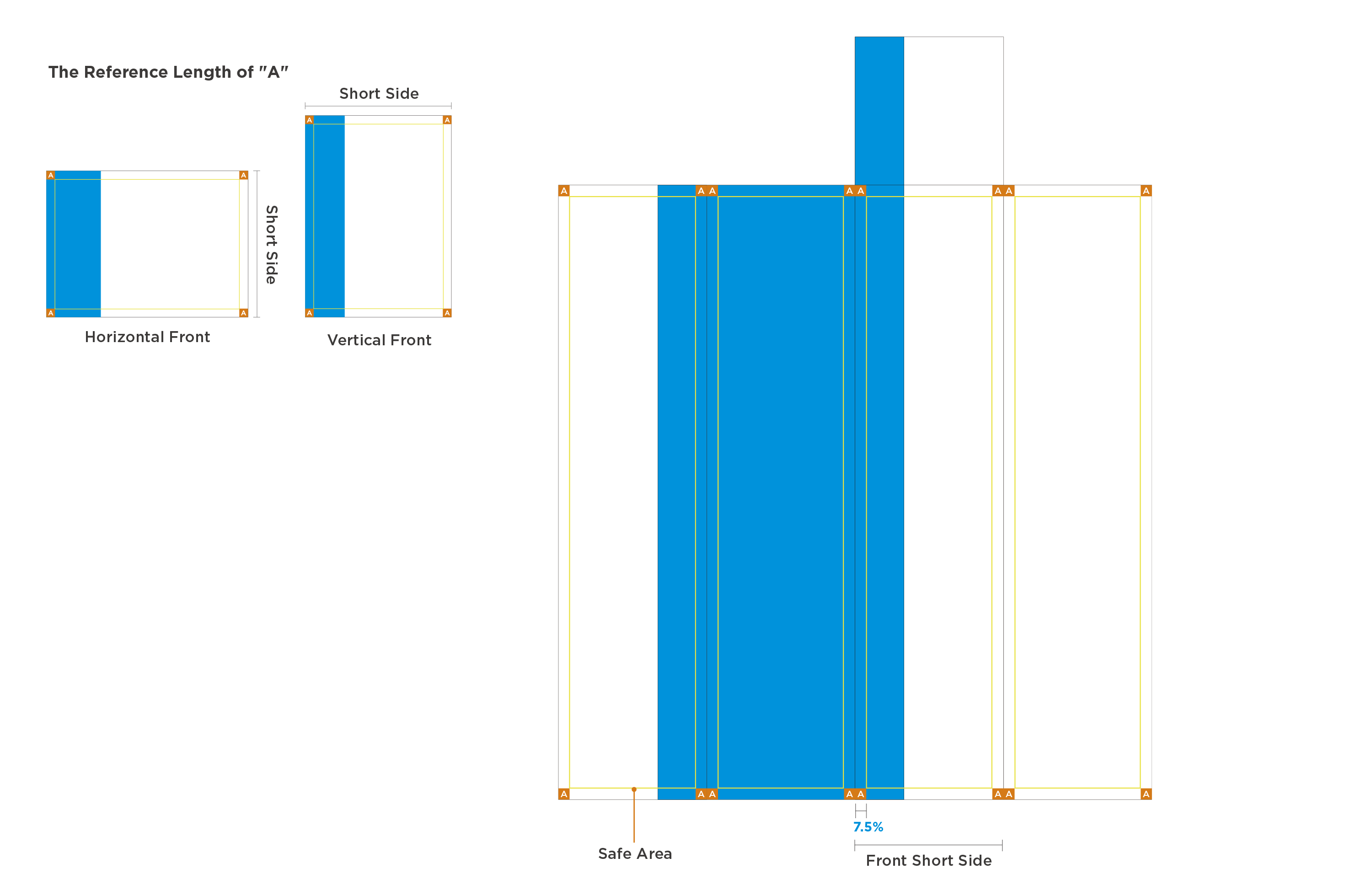
10.3 Step 2: Define the Surrounding Safe Area
The width of the safe area square "A" is 7.5% of the front short side;
The safe area width is the same around each side;
No content is allowed to be placed in the safe area defined by "A".
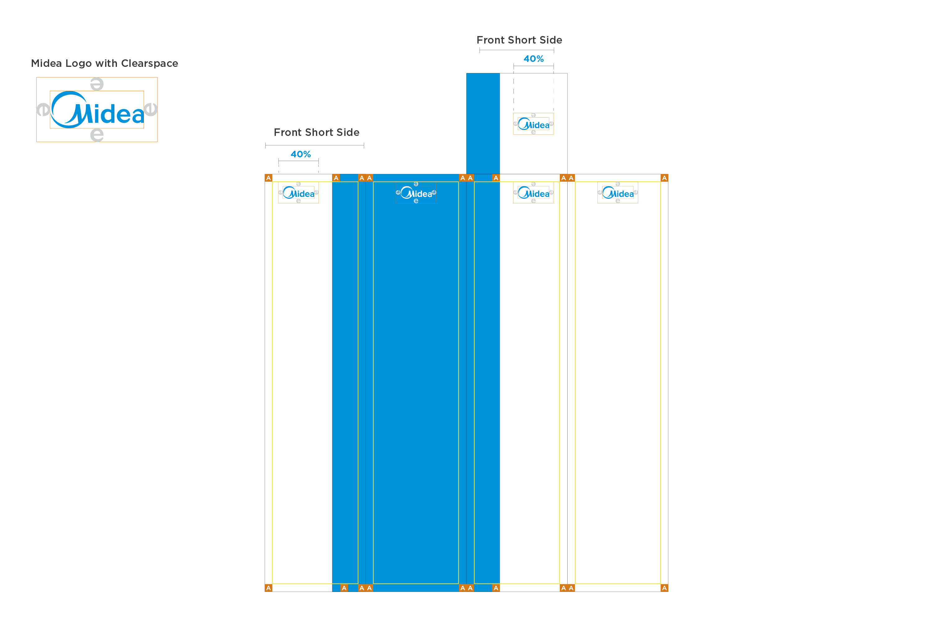
10.4 Step 3: Position the Brand Logo
Brand logo on four sides (front/back/left/right):
- The logo length is 40% of the front short side;
- Place in the center below the safe area "A";
- Not allowed to cover the safe area of four sides.
Top brand logo:
- The logo length is 40% of the front short side;
- Place in the center of the white background on the top.
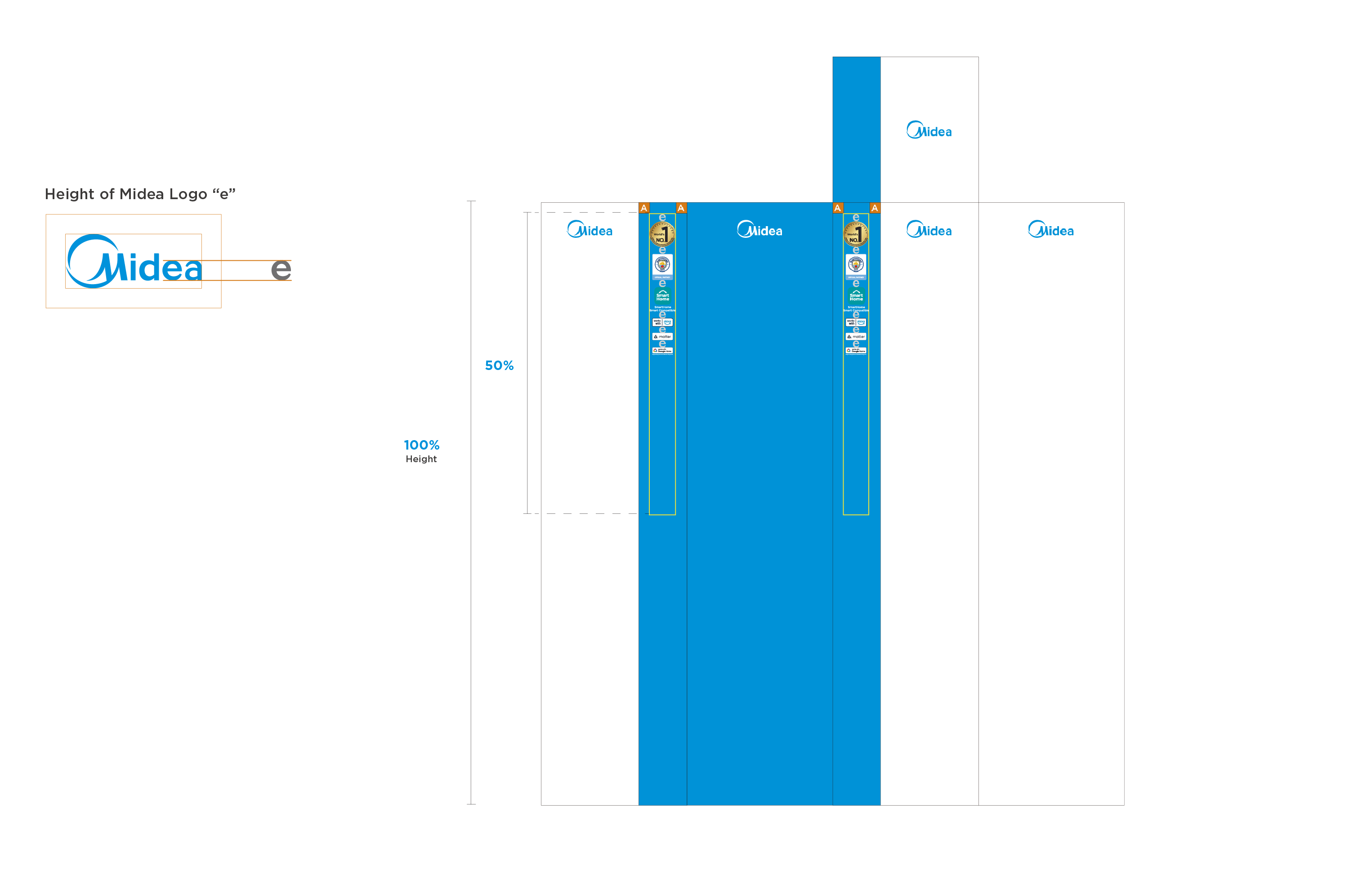
10.5 Step 4: Lay Out Brand Assets
Height Setting of the Brand Asset Area:
- The height is about 50% of the packaging height.
Layout Requirements of the Brand Asset Icon:
- Place in the non-safe area around the blue bar to ensure icons are visually clear and aesthetically arranged;
- The icon spacing is defined by the height of Midea “e”;
- Brand asset icons are prohibited from covering the safe area of blue bar.
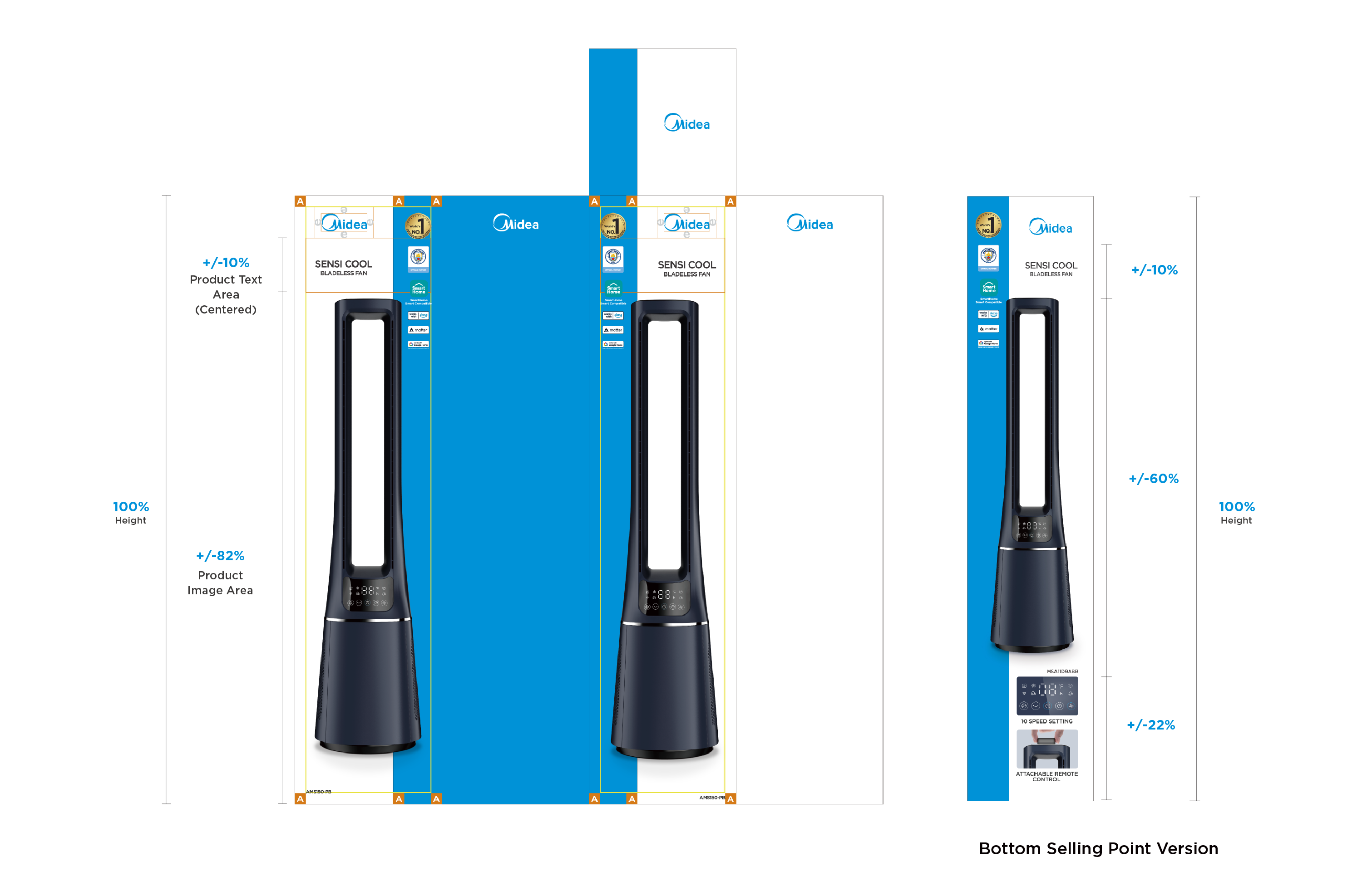
10.6 Step 5: Frame the Front/Back Information Area
Text Area Height Setting:
- The height is about 10% of the packaging height;
- Place in the center of the white background;
- Not allowed to cover the logo's clearspace and safe area.
Image Area Height Setting:
- The height is about 82% of the packaging height;
- Place in the center of the white background and cover part of the blue bar aesthetically;
- Not allowed to cover the text area and safe area.
For the bottom selling points version, please refer to the annotation as below.
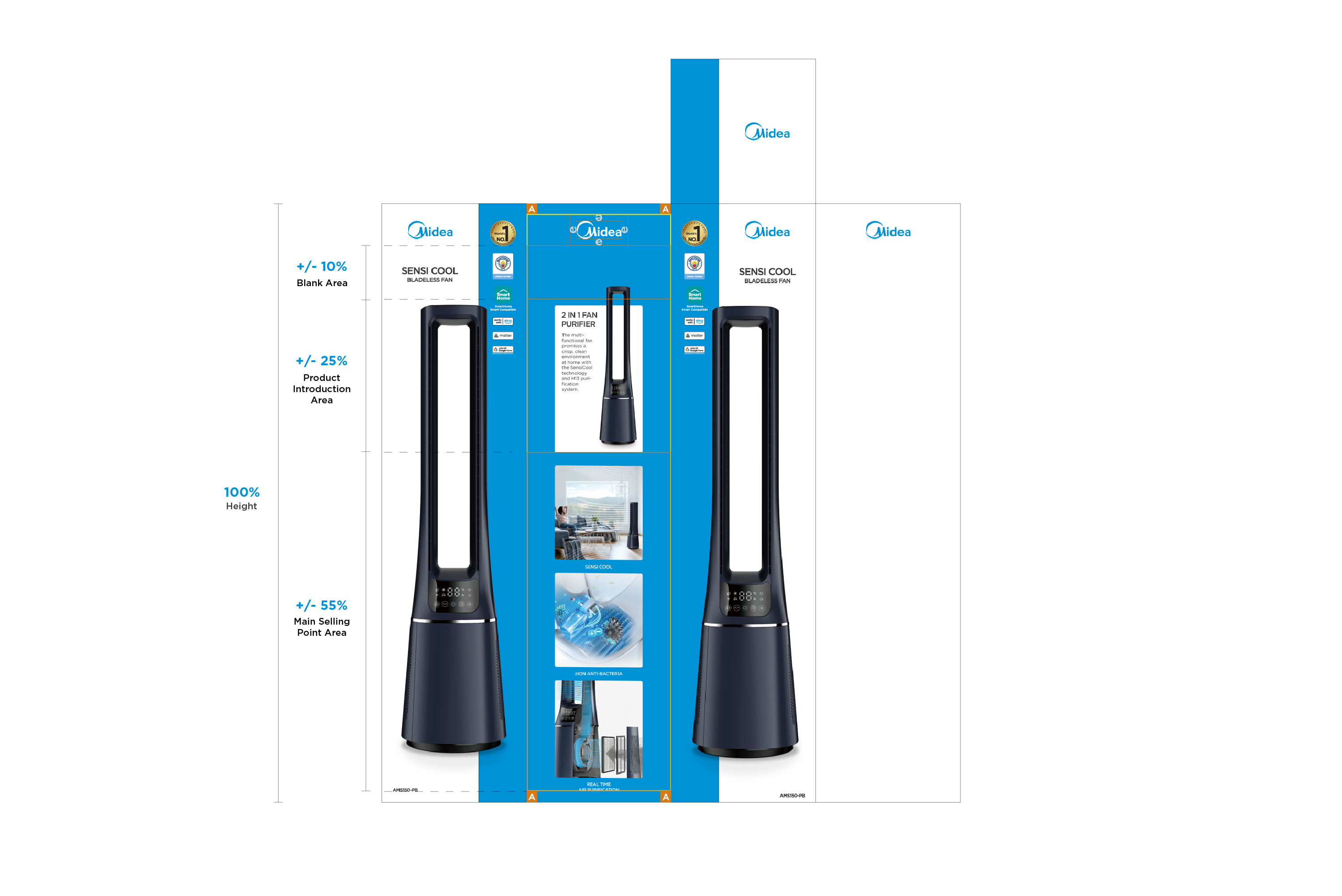
10.7 Step 6: Frame the Left Information Area
Generally, it is recommended that:
- Blank Area Height: about 10% of the packaging height;
- Product Introduction Area Height: about 25% of the packaging height;
- Main Selling Point Area Height: about 55% of the packaging height;
Content cannot cover the surrounding safe area;
(In actual application, PDs can adjust the height ratio of the information area according to needs).
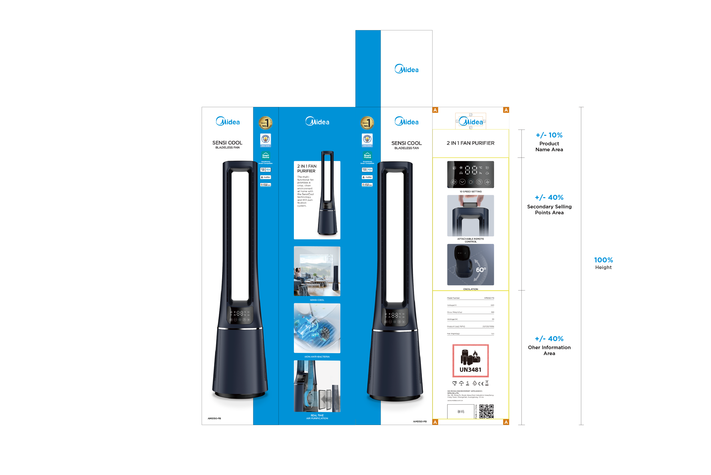
10.8 Step 7: Frame the Right Information Area
Generally, it is recommended that:
- Product Name Area Height: about 10% of the packaging height;
- Secondary Selling Points Area Height: about 40% of the packaging height;
- Other Information Area Height: about 40% of the packaging height;
Content cannot cover the surrounding safe area;
(In actual application, PDs can adjust the height ratio of the information area according to needs).
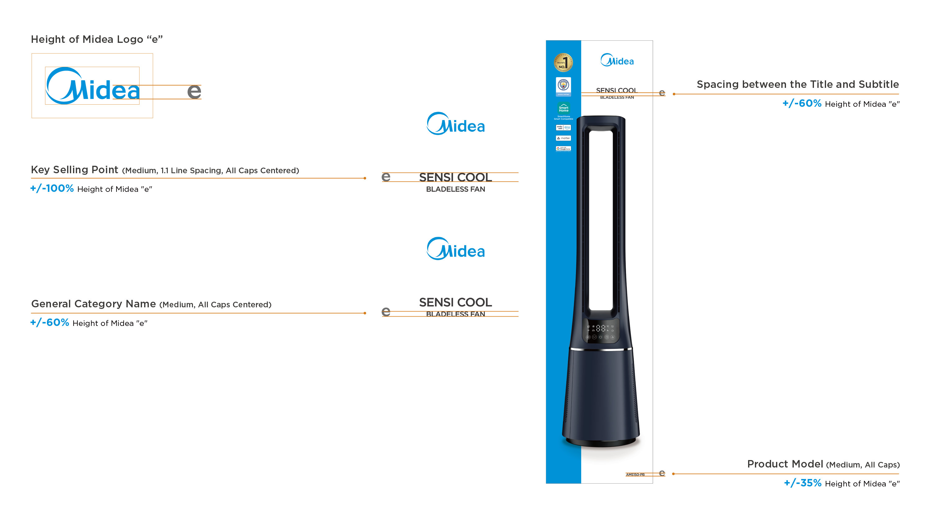
11.1 Text Requirements (Front/Back)
Take "Midea" logo "e" as the height reference:
- Key Selling Point Font Height : the height of 100% "e";
- General Category Name Font Height : the height of 60% "e";
- Spacing between Title and Subtitle: the height of 60% "e";
- Product Model Font Height : the height of 35% "e".
(In actual application, PDs can adjust the font height according to needs while ensuring the font size differences for information hierarchy).
Please follow the annotation as below to standardize the font size, capitalization, alignment and line spacing.
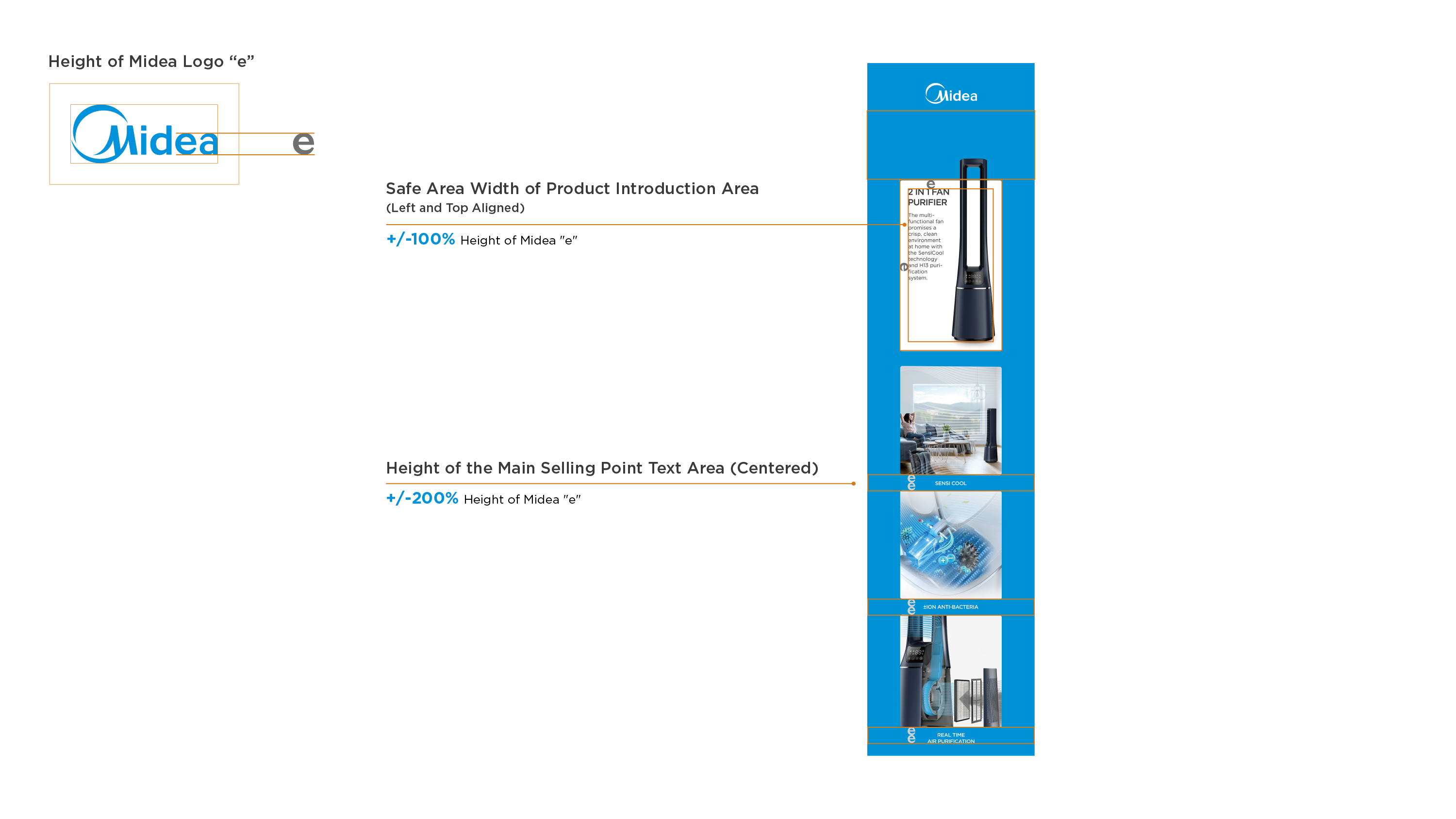
11.2 Typesetting Requirements (Left)
Take "Midea" logo "e" as the reference:
- Product Introduction Safe Area Width : the height of 100% "e";
- Not allowed to cover the surrounding safe area;
- Main Selling Points Area Font Height : the height of 200% "e";
Please follow the annotation as below to set the font alignment.
11.3 Text Requirements (Left)
Generally, take "Midea" logo "e" as the height reference:
- Product Name Font Height : the height of 100% "e";
- Product Introduction Font Height : the height of 60% "e";
- Main Selling Point Font Height: the height of 35% "e";
(In actual application, PDs can adjust the font height according to needs while ensuring the font size differences for information hierarchy).
Please follow the annotation as below to standardize the font size, capitalization, alignment and line spacing.
11.4 Typesetting Requirements (Right)
Take "Midea" logo "e" as the reference:
- Secondary Selling Point Area Width : the height of 200% "e";
- Text Spacing of Product Specifications: the height of 200% "e";
Please follow the annotation as below to set the font alignment;
Suggest to use left aligned to lay out transportation information for the aesthetics.
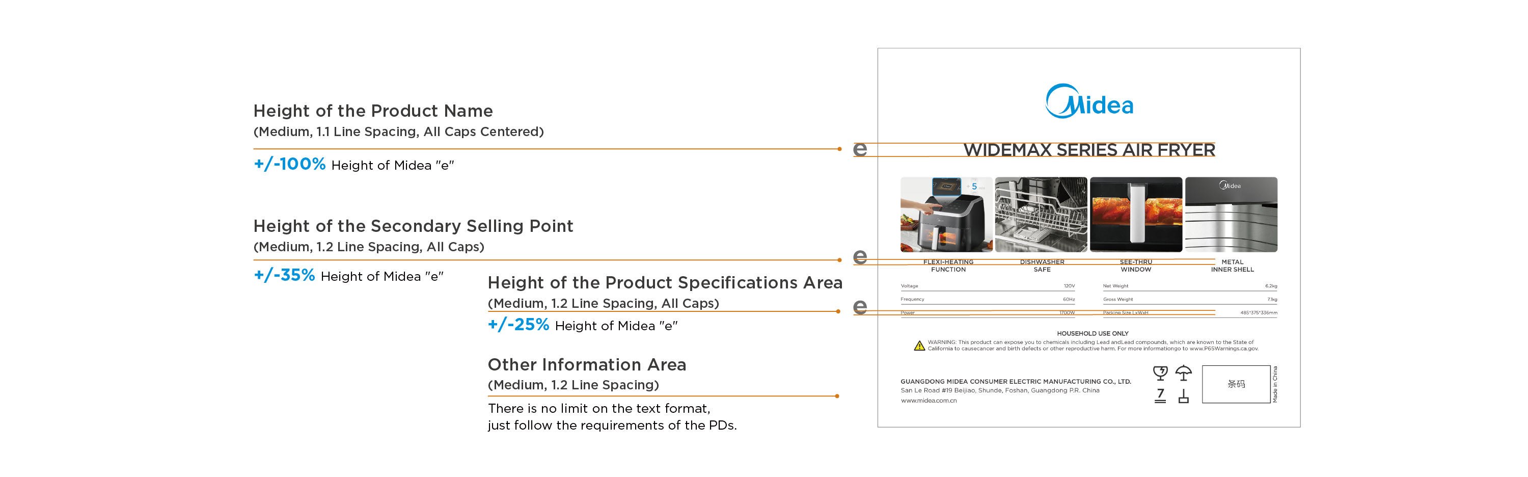
11.5 Text Requirements (Right)
Generally, take "Midea" logo "e" as the height reference:
- Product Name Font Height : the height of 100% "e";
- Secondary Selling Point Font Height: the height of 35% "e";
- Product Specifications Font Height : the height of 25% "e";
(In actual application, PDs can adjust the font height according to needs while ensuring the font size differences for information hierarchy).
Please follow the annotation as below to standardize the font size, capitalization, alignment and line spacing;
The font height of other information area is not standardized here, just follow the requirements from PDs.
-
Go to Download
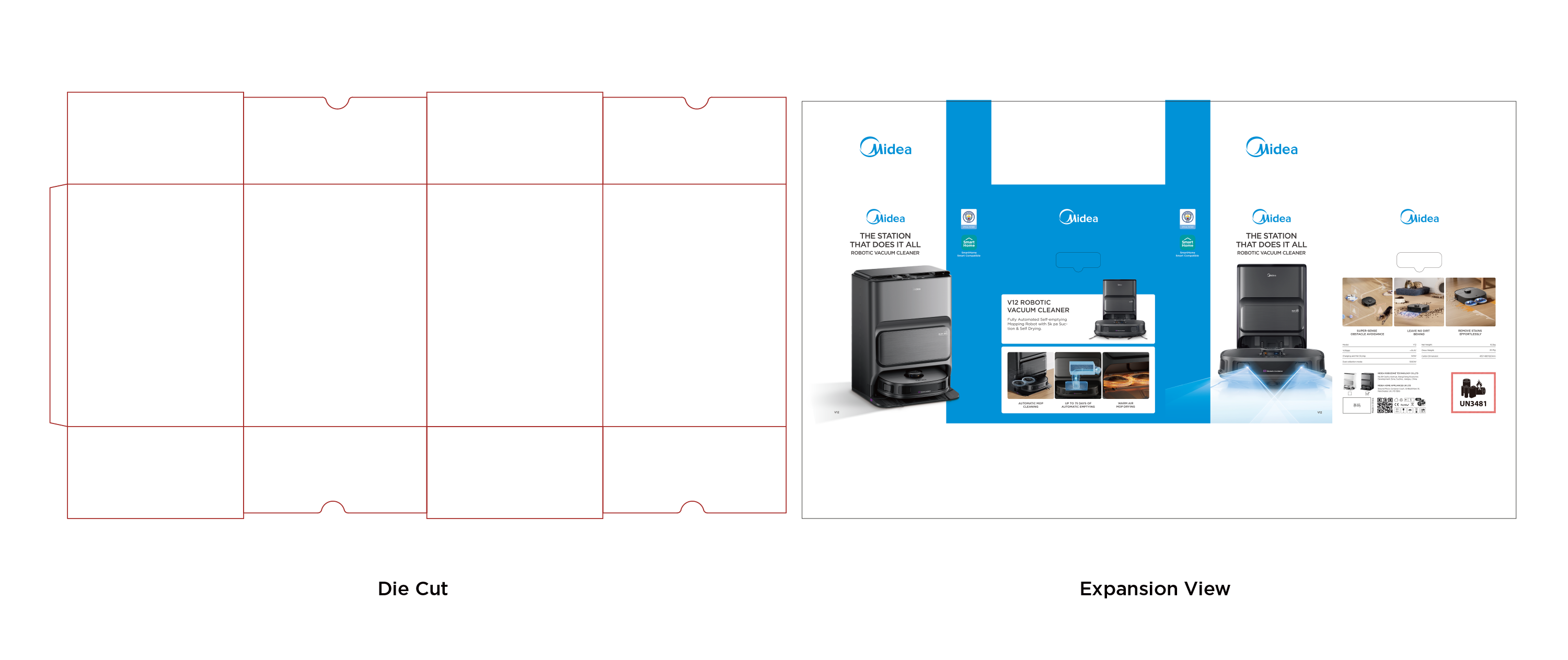
Color Box for Display