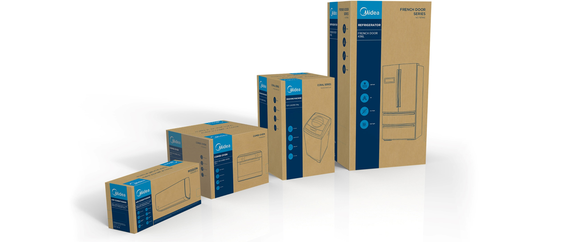
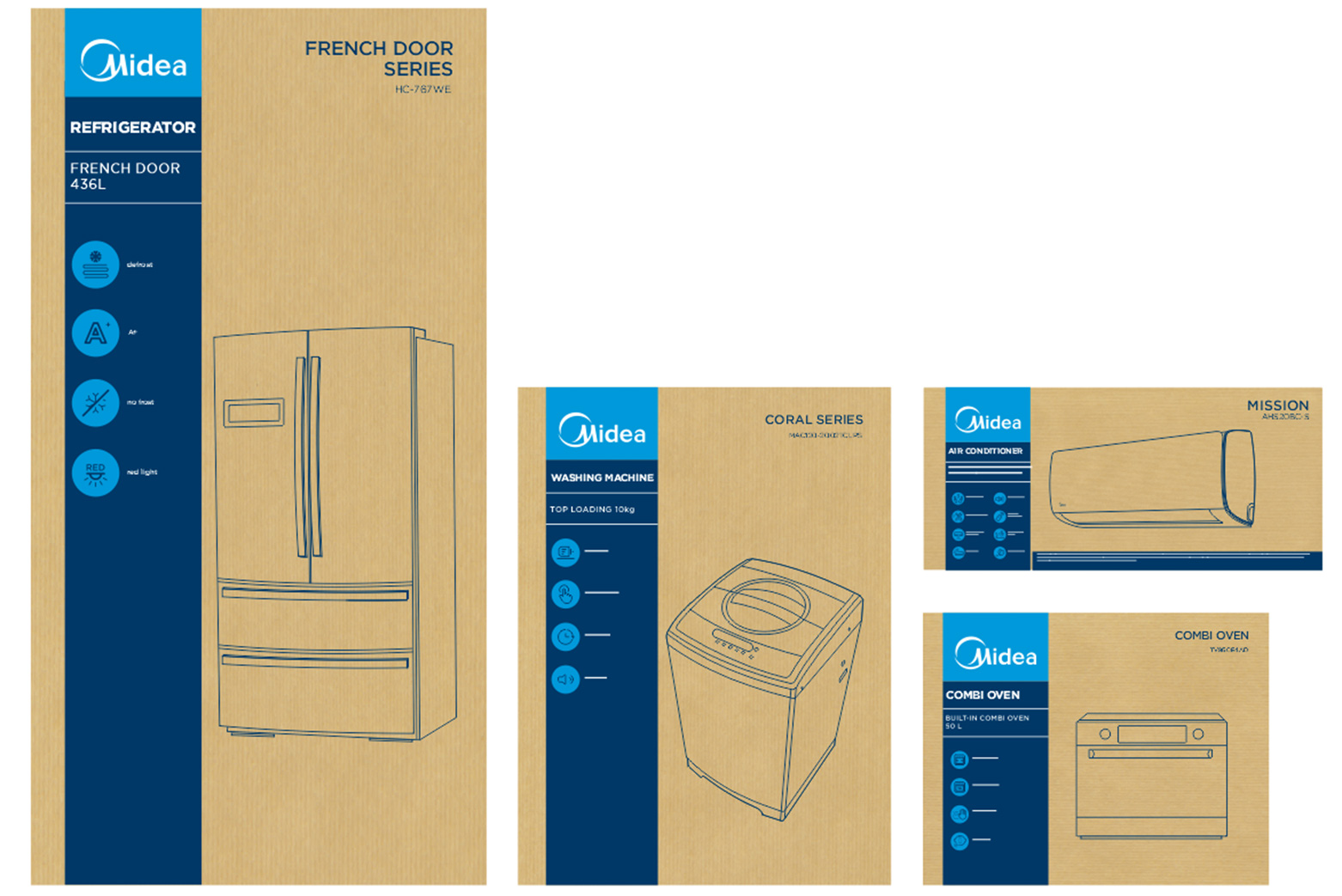
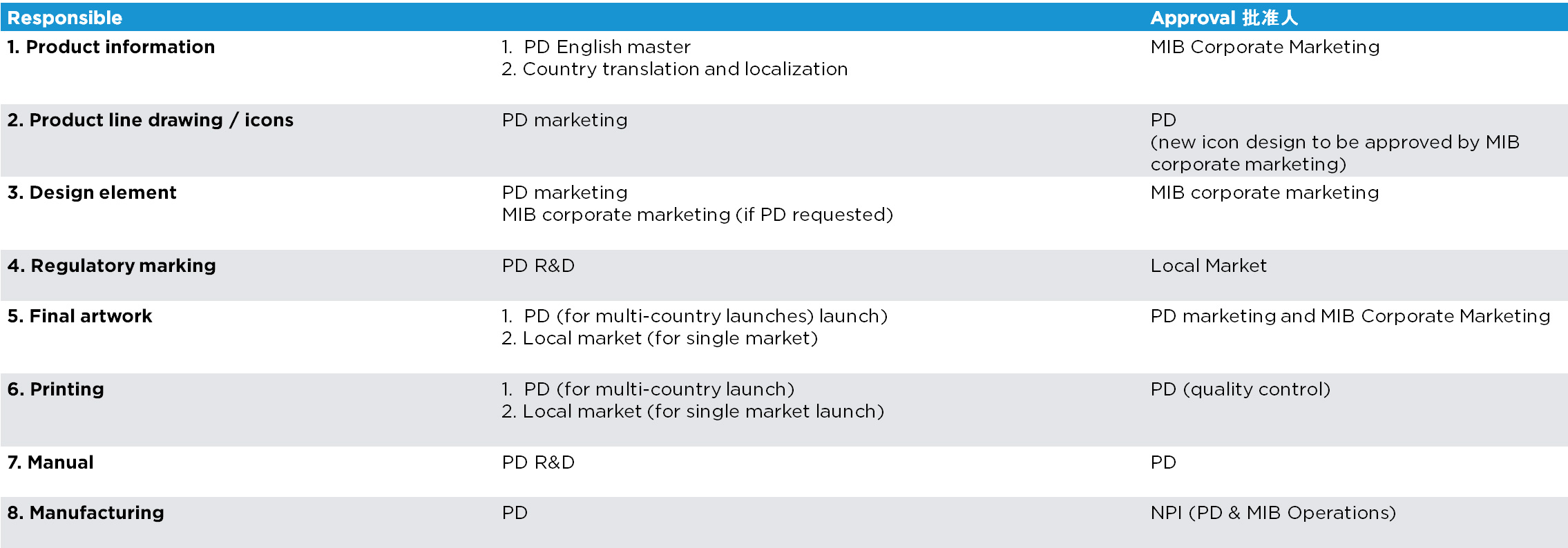
The Midea major appliances carton packaging has been designed with the main objective to build a global brand by having ONE packaging look & feel in line with the Brand equity. The major appliances packaging design is inspired by the small appliances packaging design that has been released in June 2016. The design is uniform and flexible and can work across many different formats and categories.
Overview
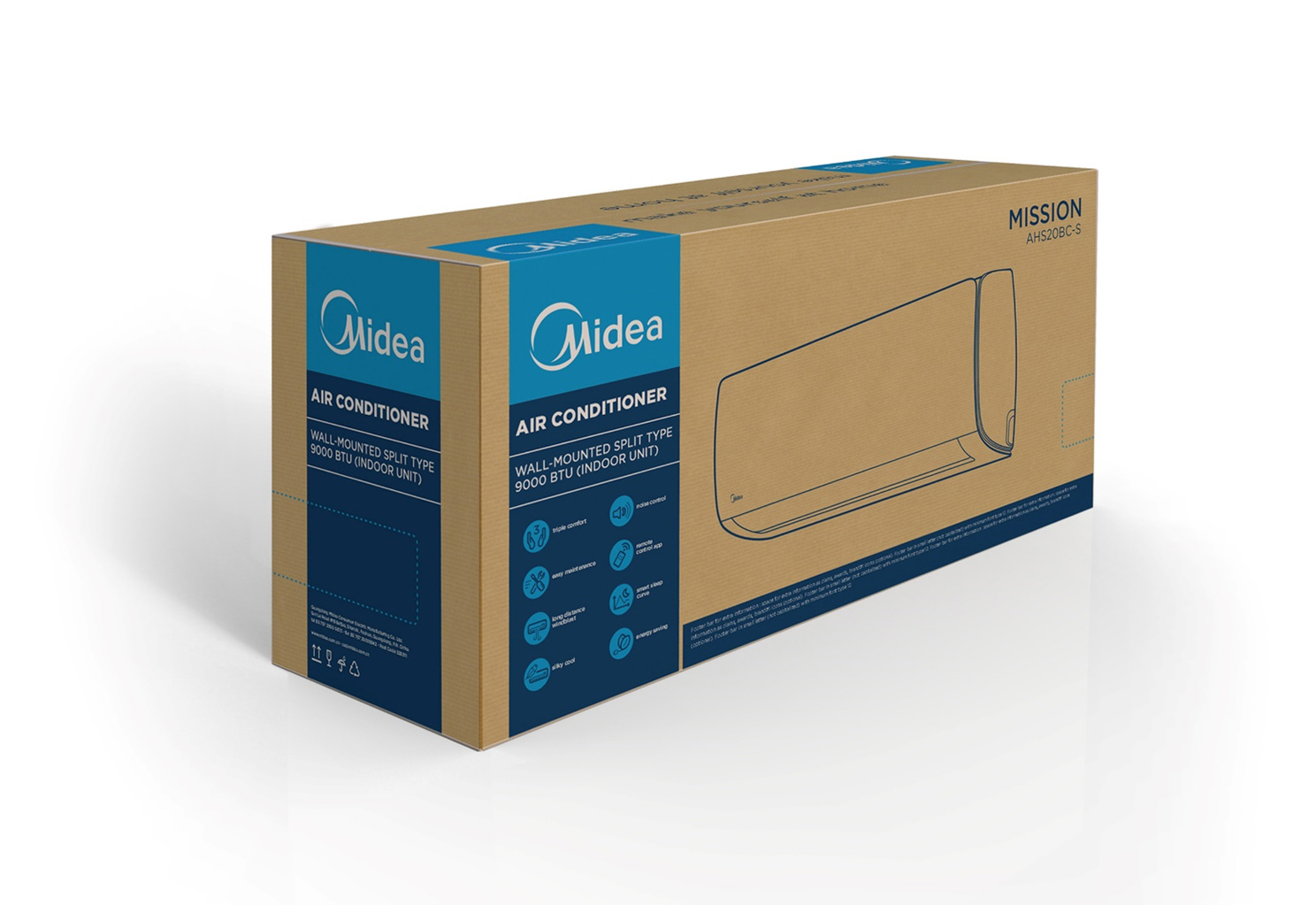
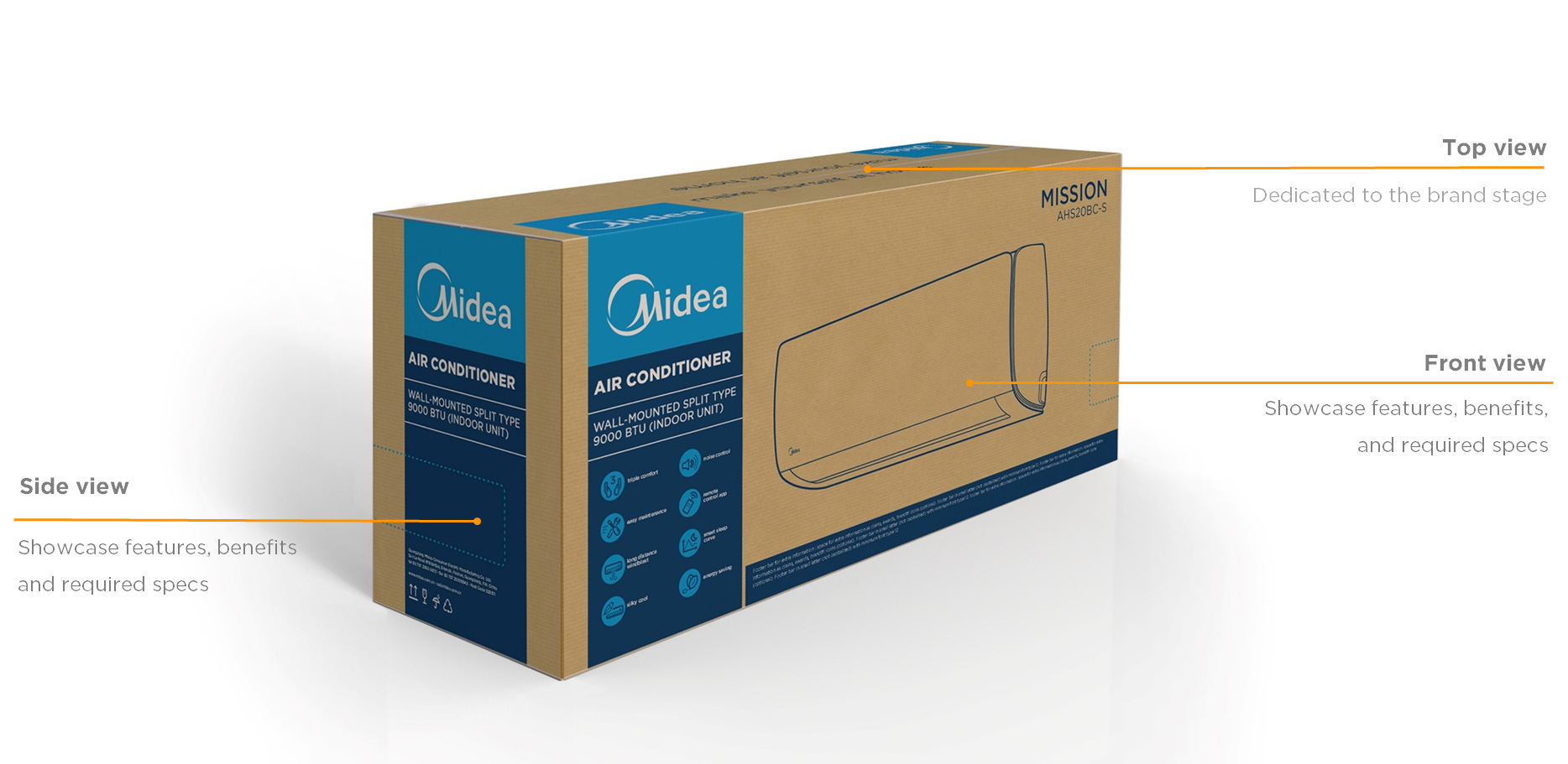
The packaging architecture principle is a clear partition of the different sides of the packaging. As every side has it’s purpose, we have designed two fronts and two sides to optimize costs and communication mix. The top is fully dedicated to the Midea brand core promise to consumers with a minimalist approach.
Concept
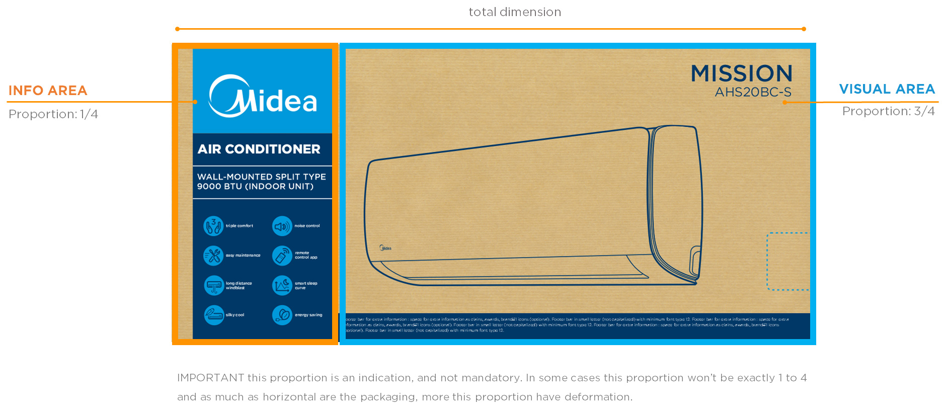
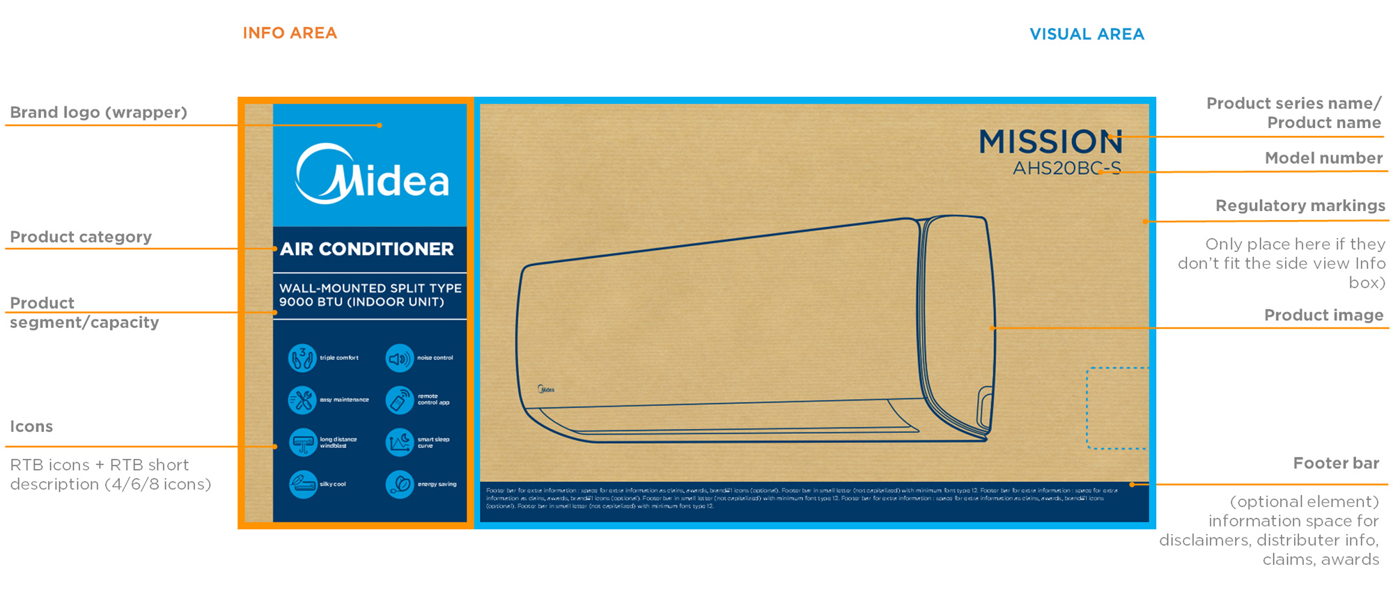
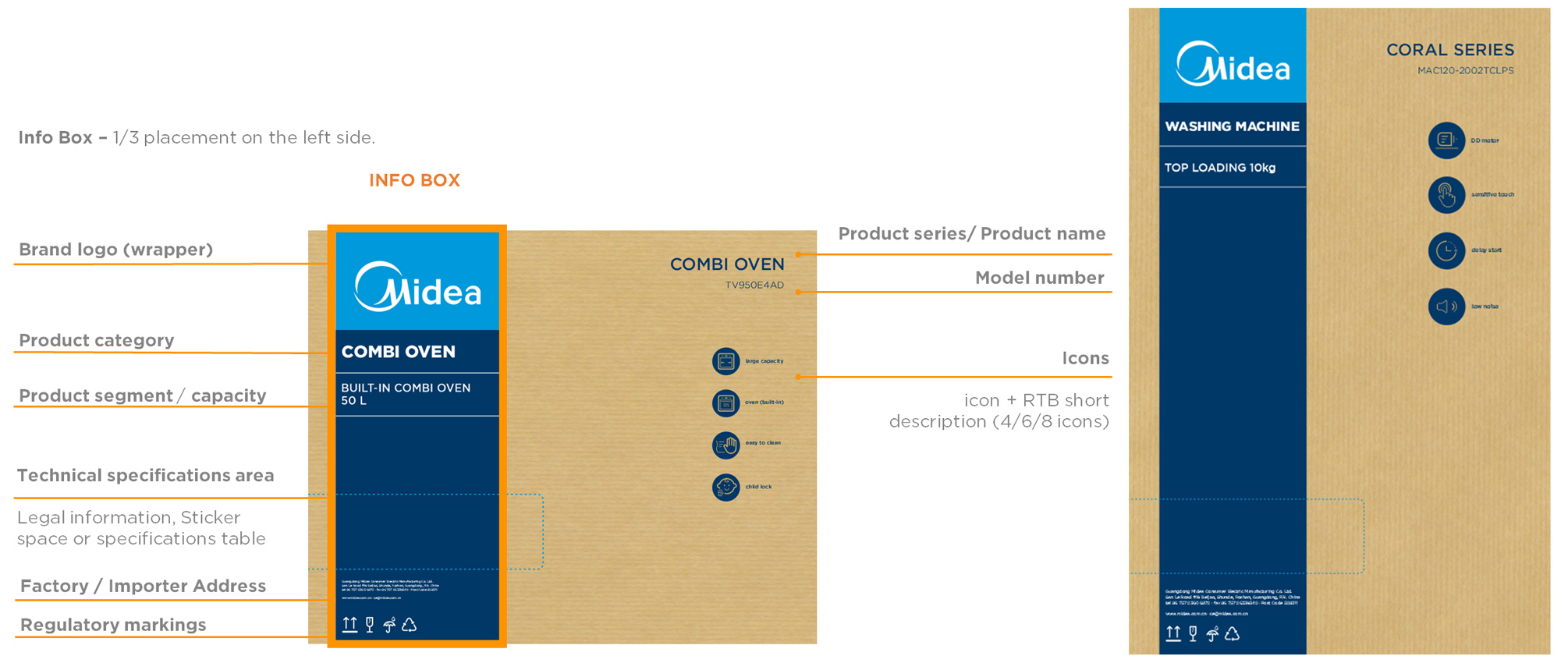
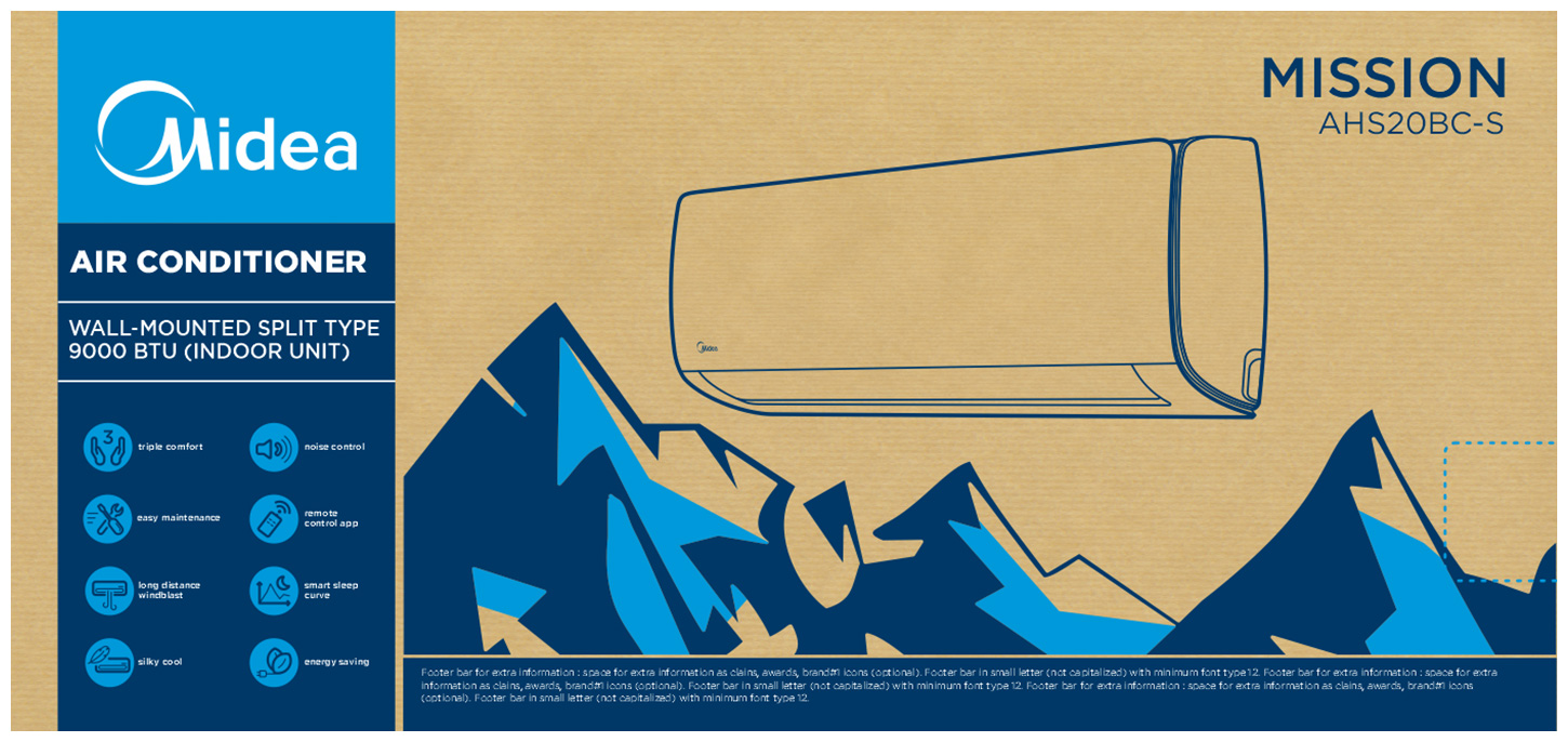
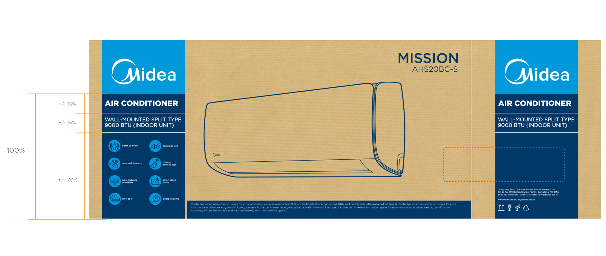
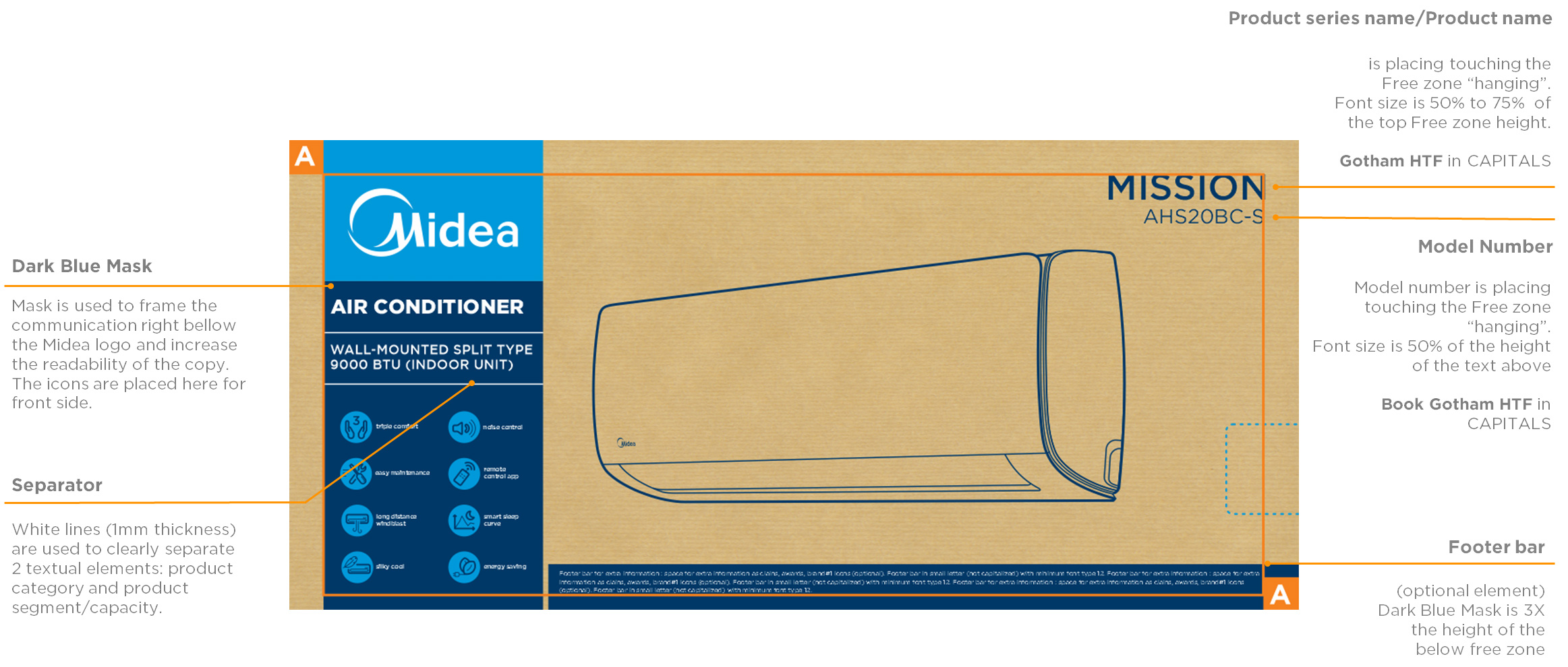
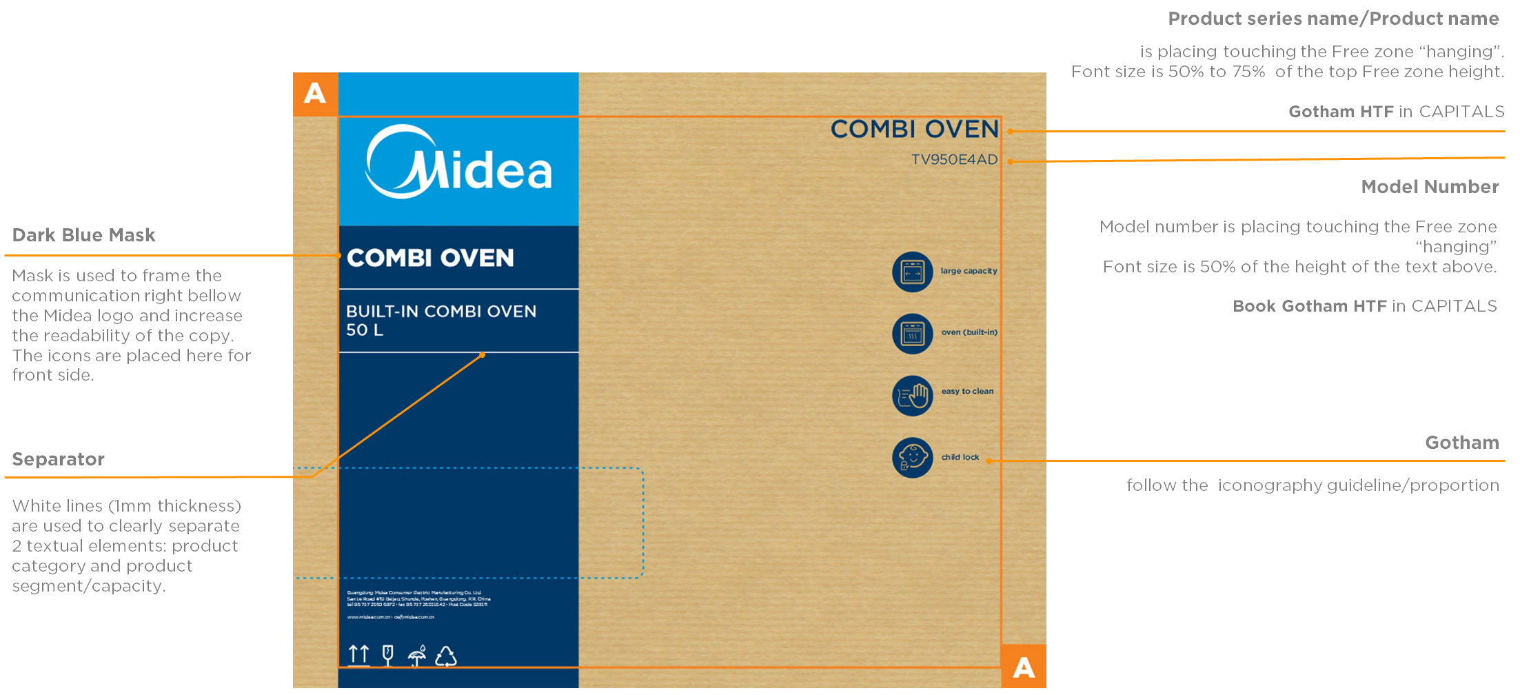
Info Area - is defined to communicate the brand followed by the product category, segment and capacity. This takes in principle 1/3 of the front of the packaging.
Visual Area - Most of the packaging area is dedicated to the product line drawing being the biggest space available 2/3. The bottom zone contains a footer bar, made to include additional information.
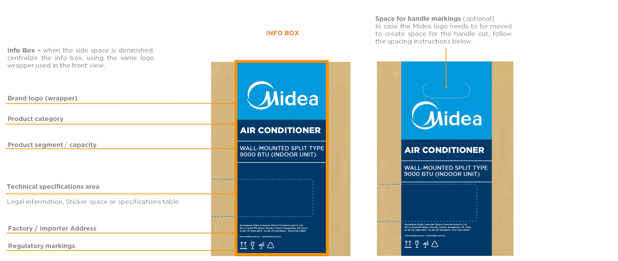
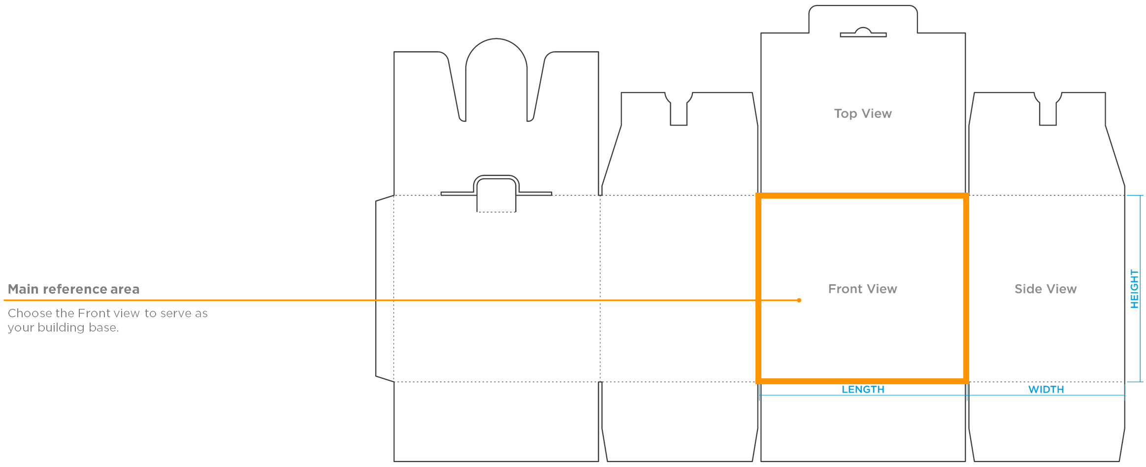
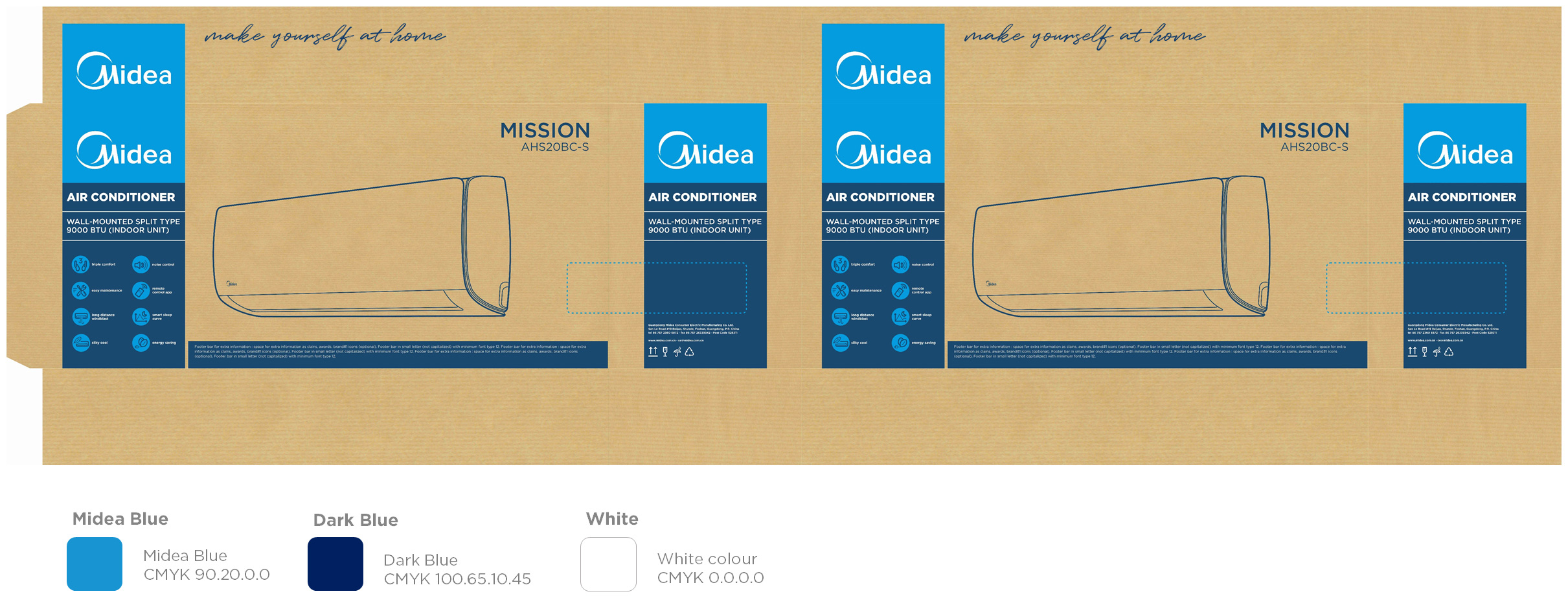
The frontal view should be the same at both sides.
Front view
Side view (horizontal/squared)
Side view (vertical)
Top view (horizontal/vertical samples)
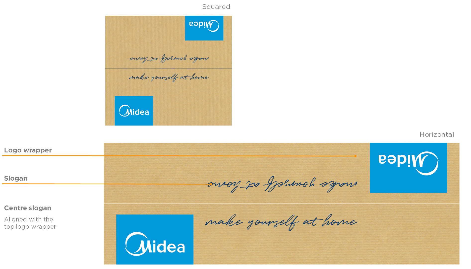
The design of the top view has the same concept for all categories, bringing focus to the brand logo and slogan. This system is applied for all packaging's for both, single and double lid, with handle or not.
Book Gotham HTF Font
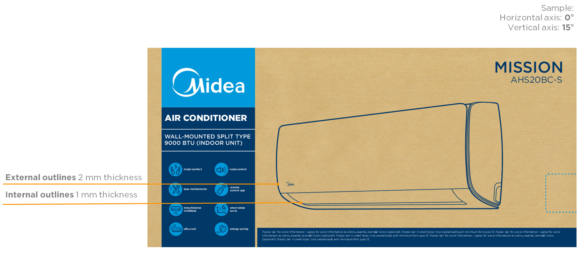
Product image (line-art and angle)
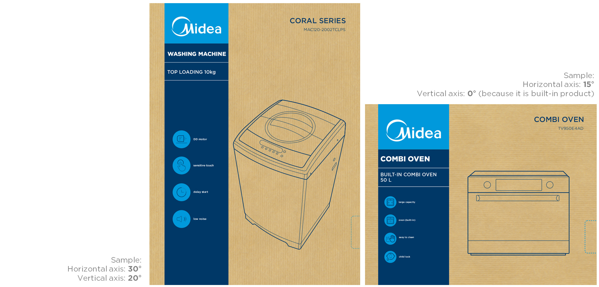
The product image is a line drawing, based on the product image. It is advised to use a perspective angle, because it provides a better product definition. Always angle the product benefiting the product. The only exceptions is to built-in or flat products as cooktops, where they can be shown in a frontal or top view.
- horizontal axis: 0° to 30°
- vertical axis: 0° to 30°
Product image (angles samples)
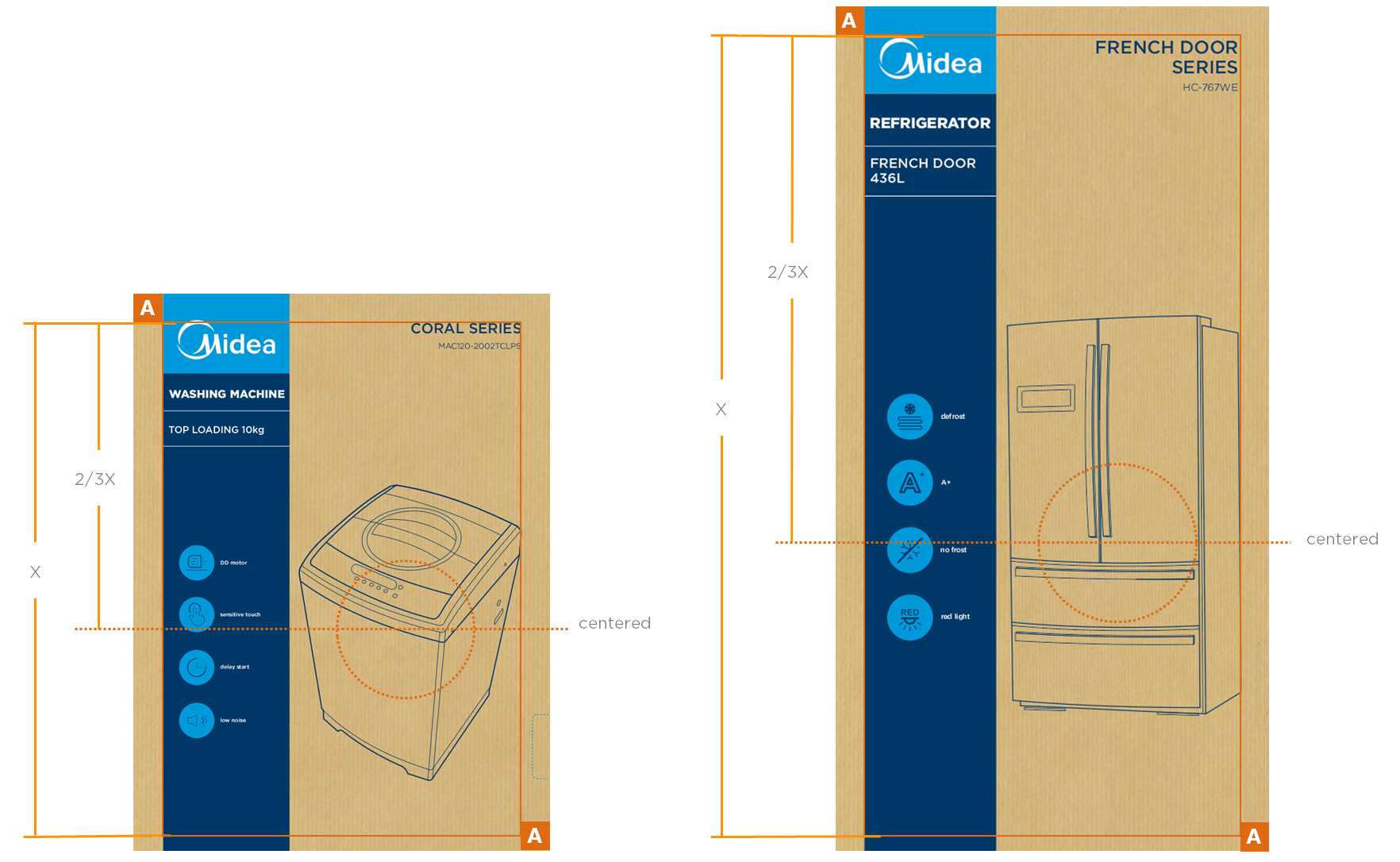
Product image (positioning)
The product image is always centred on the 2/3 (2/3 X) line from the vertical dimension (X).
Without overlapping the INFO AREA, taking better advantage of the space and respecting the free zone area.
Product image (flexography)
For some markets the product image requires more details and accuracy to the photo effect. In this case we can use a one colour reticulation, using the flexography process.
The same rules are valid to the image angle.
- horizontal axis: 0° to 30°
- vertical axis: 0° to 30°
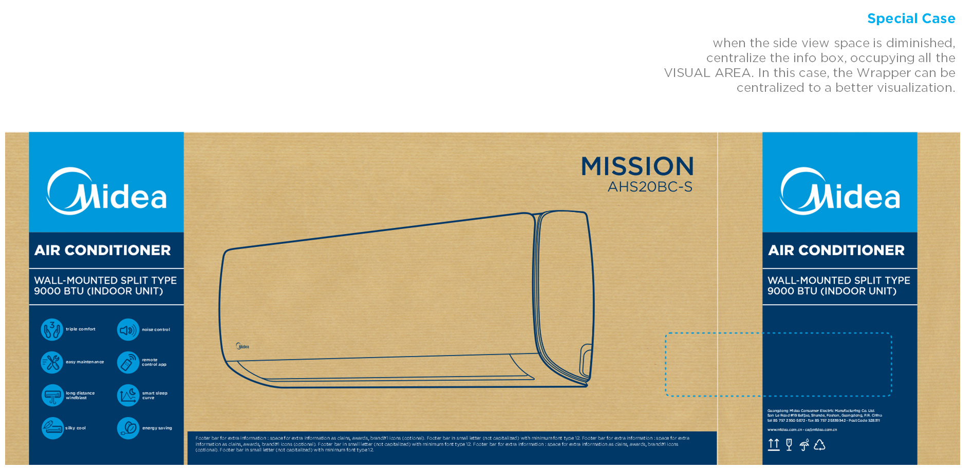
In-store concept
The design can be optimized for in-store placement purposes by adding a design element which emphasizes the workings of the product.
RAC products are shown in store in the Middle East and therefore implemented an ice mountain in the final packaging design. This to emphasize the cooling effect of the product and referring to their branded ‘Mount’ series.
Design element
New design elements requests need to be approved by MIB brand team to insure cross-category consistency.
A request for design elements development can be sent by e-mail with a briefing to MIB brand team:
Send an email to:
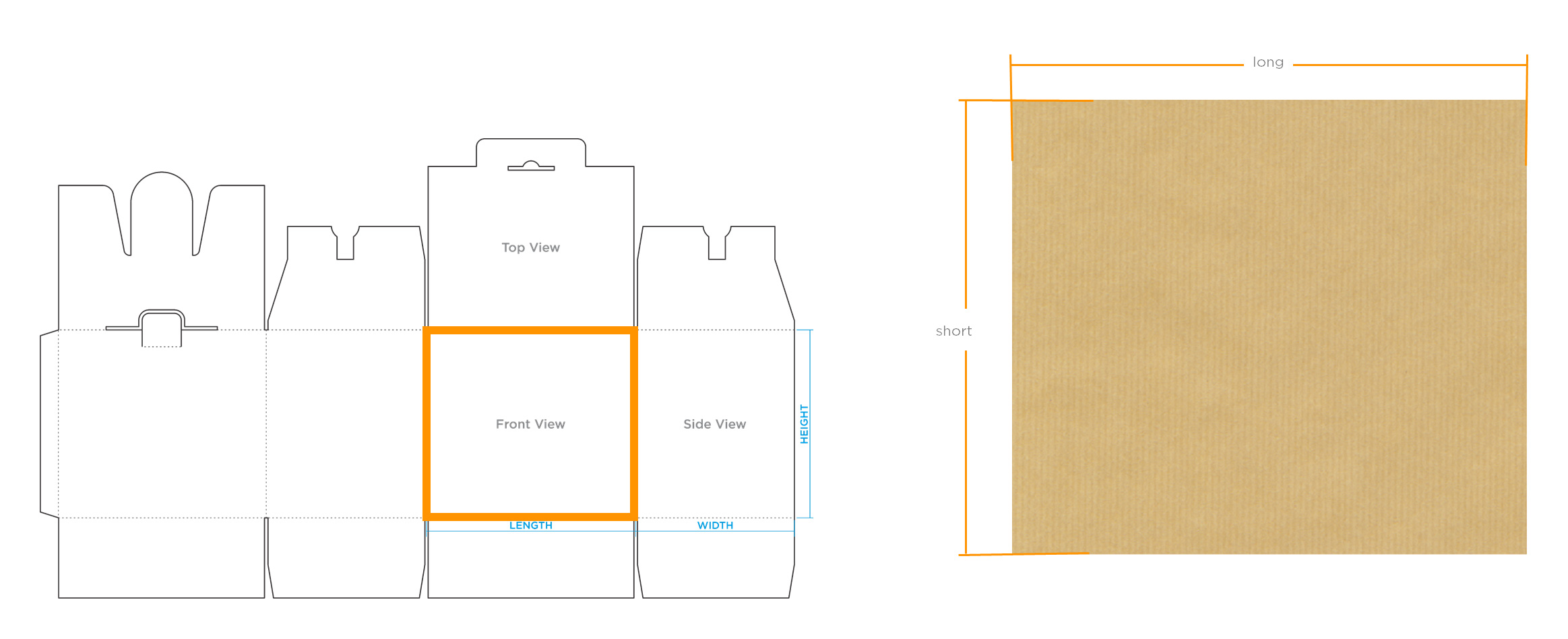
Formats overview
Front/side view (horizontal/squared)
Die cuts
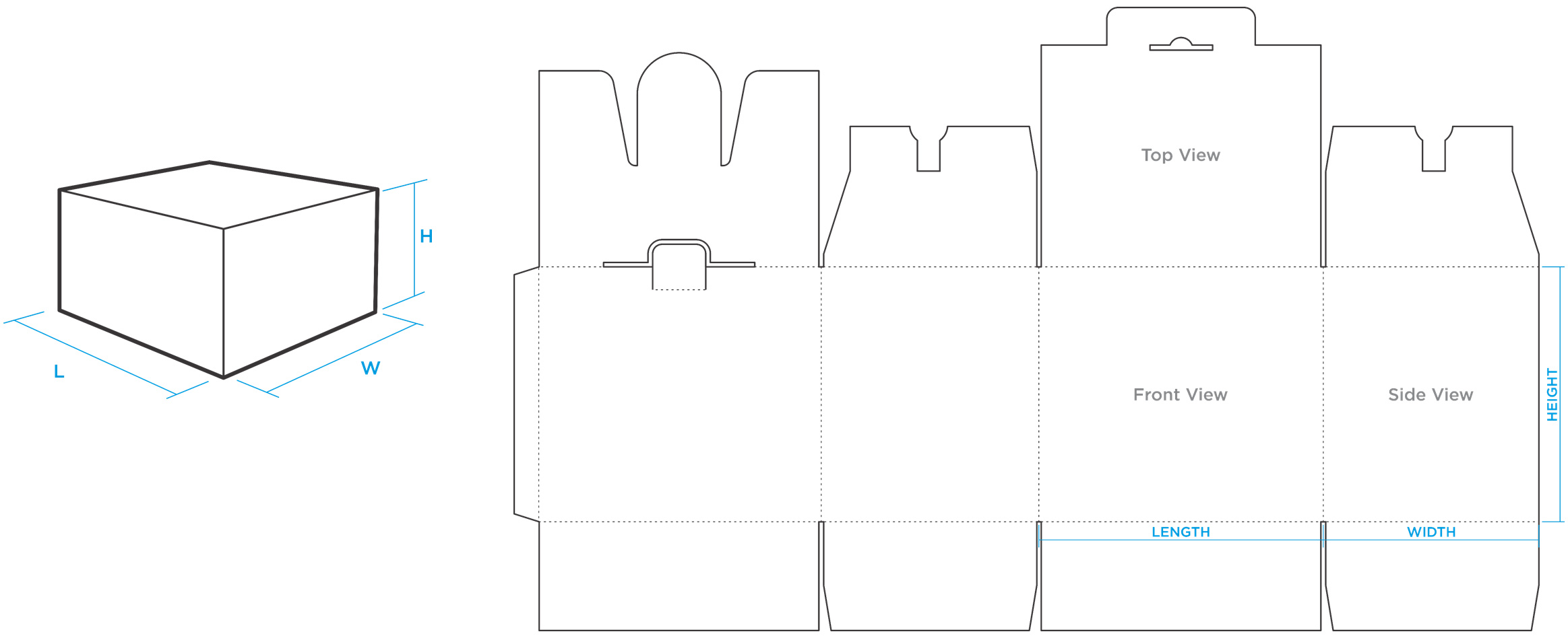
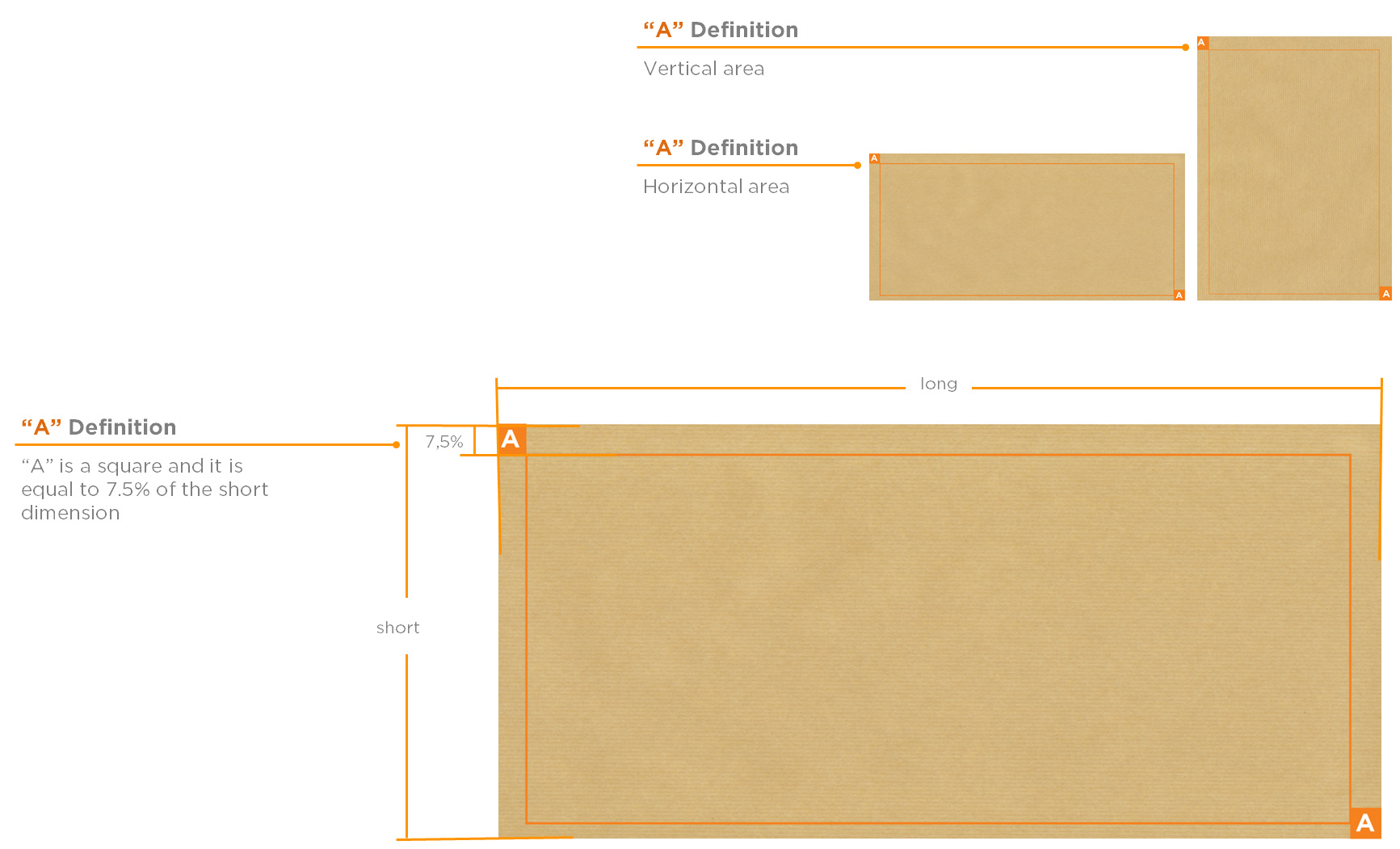
Working area
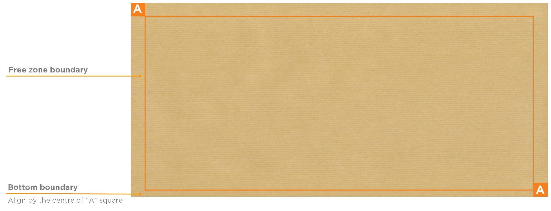
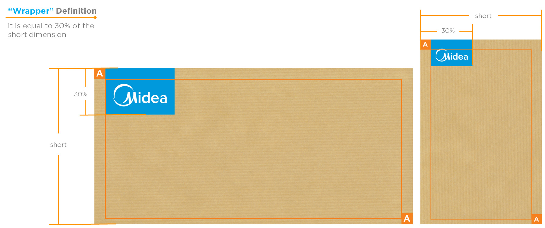
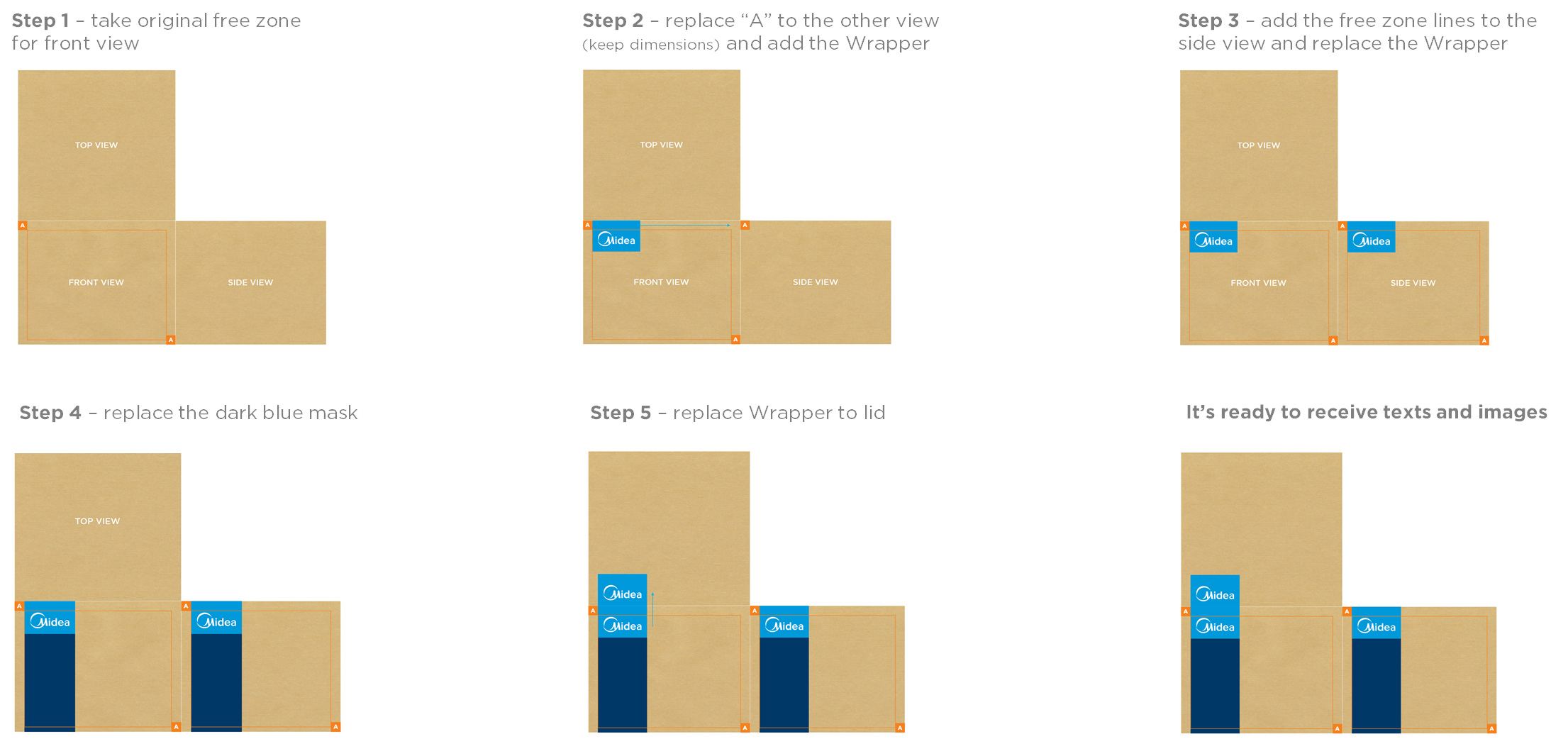
Free zone (“A” definition)
“Free zone” defined by the “A” width should not be covered with any content except the product code in the lower right and the Midea wrapper.
Free zone (boundary)
Logo wrapper
Use provided “Mask Tool” in. ID to define the relationship of the logo vs. the surface.
Step 1: Logo width needs to be between 25 - 30% of the short dimension.
Step2: Distance of Logo to edge is separated by “A”.
IMPORTANT is to maintain the look & feel of the artwork and to stay in-line in the flexible area to develop an "one Family" look for all Midea packaging, independent from final dimensions.
Step by step
Spacing and fonts (front view)
Language
The Major appliance packaging has a one-language design.
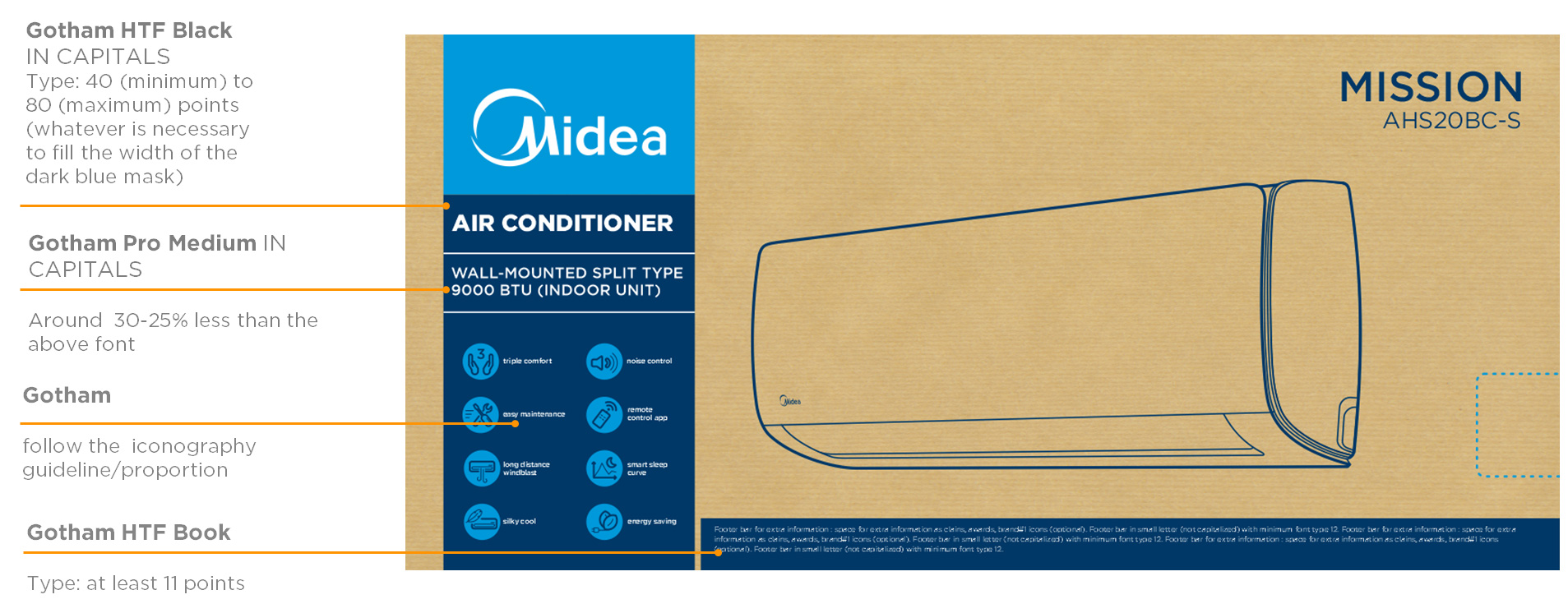
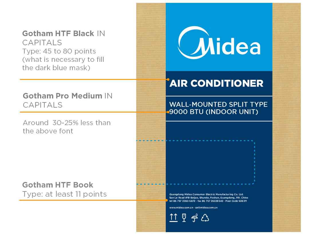
Fonts
Font type is Gotham family.
Text size
Minimum size 11 pt.
The font size relationship must be in aesthetic relationship to the available space, this can vary depending on the size of the packaging.
Spacing and fonts (side view)
Frontal layout
Side layout
Icons size and proportion
The icons size and proportion
The icons group must be centralized in the dark blue mask among the last separator and the free zone. Their proportion change according the packaging dimension.
To the side view icons dimension are the exactly the same as used on the frontal view.
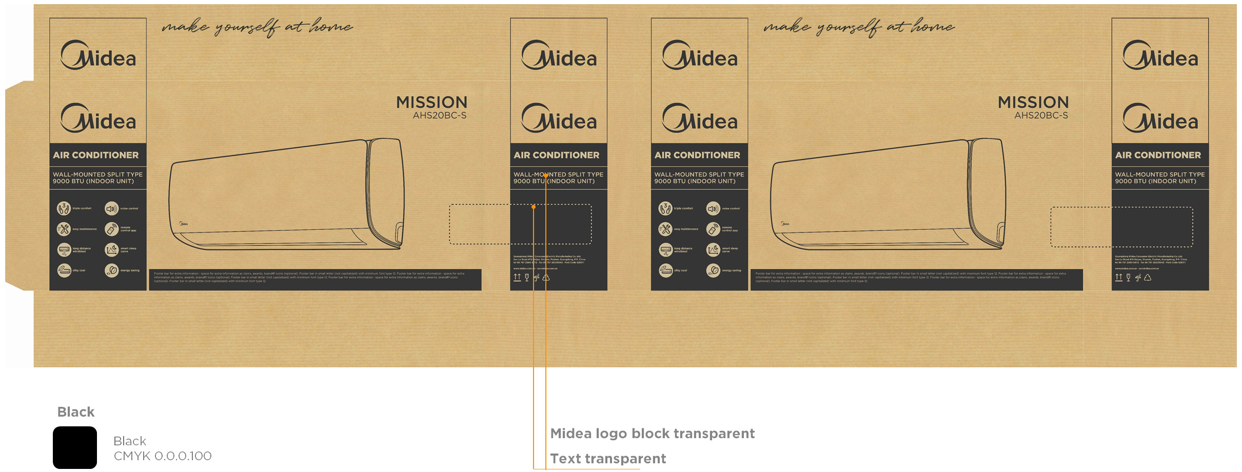
Use and colours
Colour directions (3 colours)
Colour directions (2 colours)
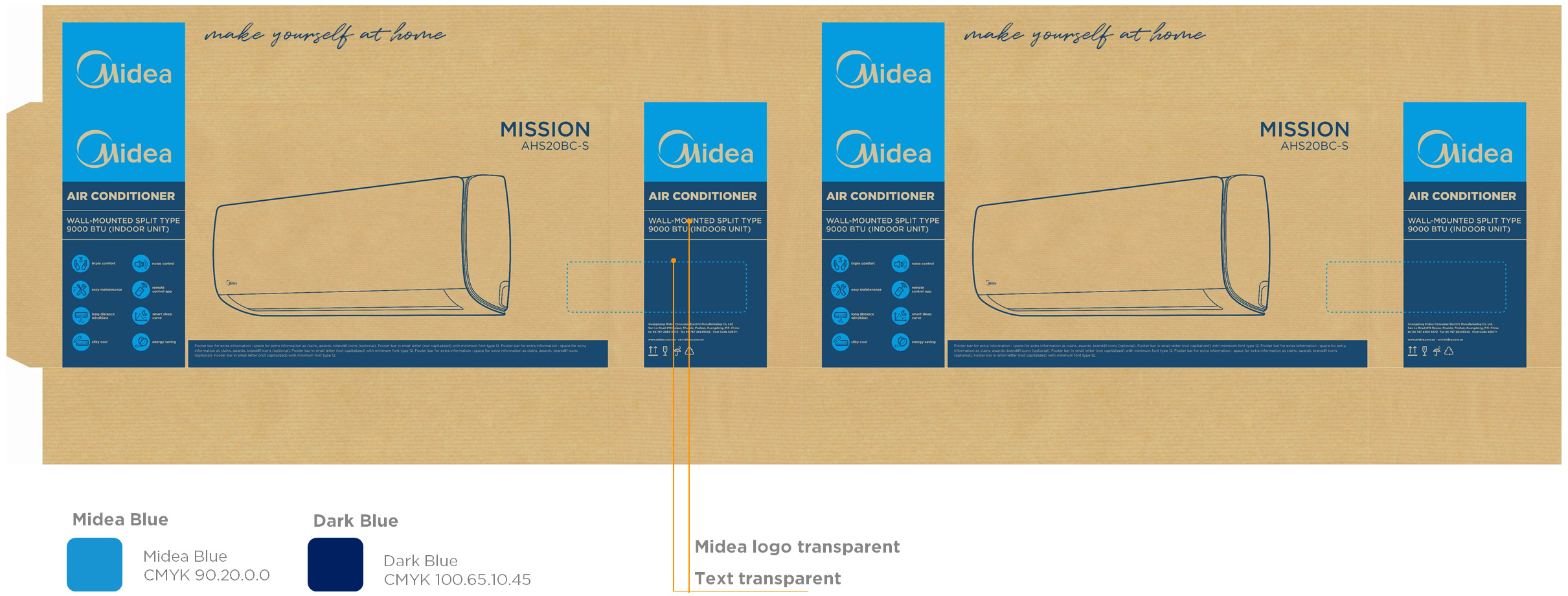
Colour directions (1 colours)
Execution
Description: Packaging outside printing Dimension: Custom made according die-cuts Material: E.g.: C1Sart paper, Kraft, corrugated, duplex paperboard Prints Process: Finishing: |
File Preparation Directions FORMAT RESOLUTION ARTWORK DIMENSIONS BLEED SETTINGS CUSTOM CONTOUR CUTTING WHITE UNDERPAINTING INK |
-
Go to Download
Carton Box for Display