Signage
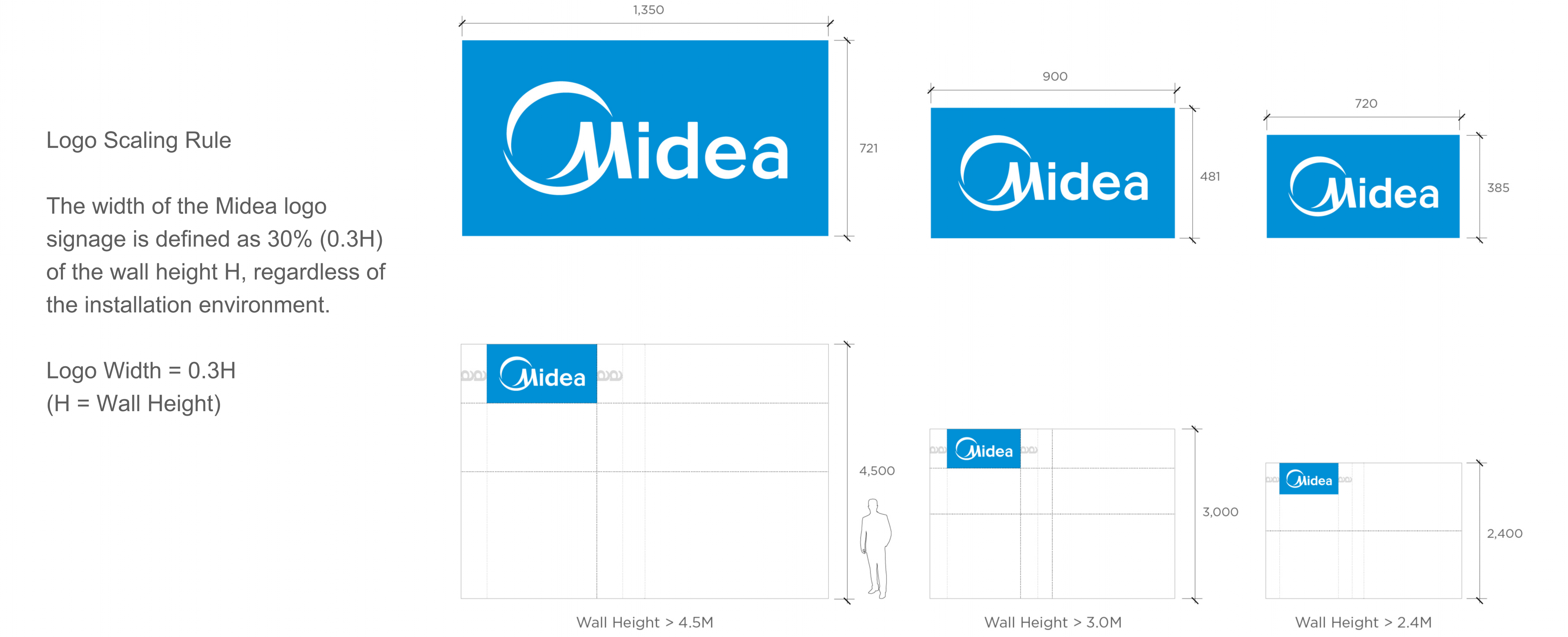
The Midea logo signage functions as the primary brand identifier in exhibition and spatial environments and must be applied in accordance with the defined scaling, placement, and clear space rules.
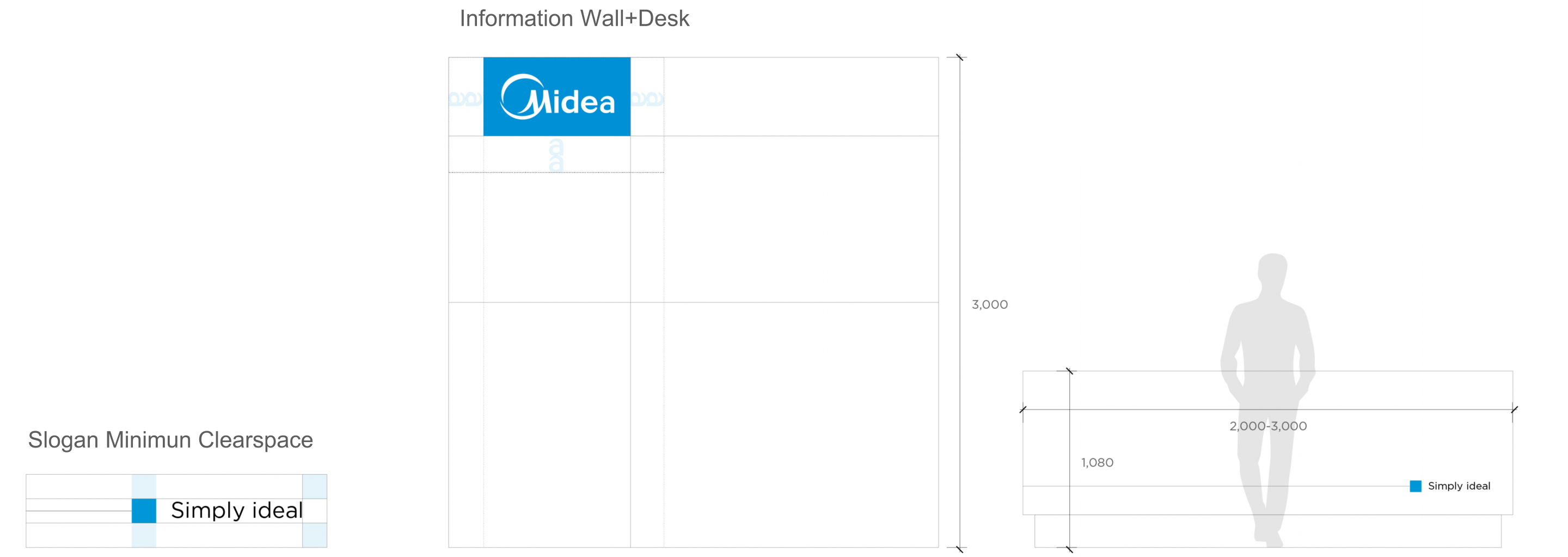
Signage Clear Space
The clear space defines the minimum area required around the Midea logo signage to preserve legibility and visual integrity.
This protected zone ensures the logo remains unobstructed by surrounding graphics, text, architectural elements, or visual noise.
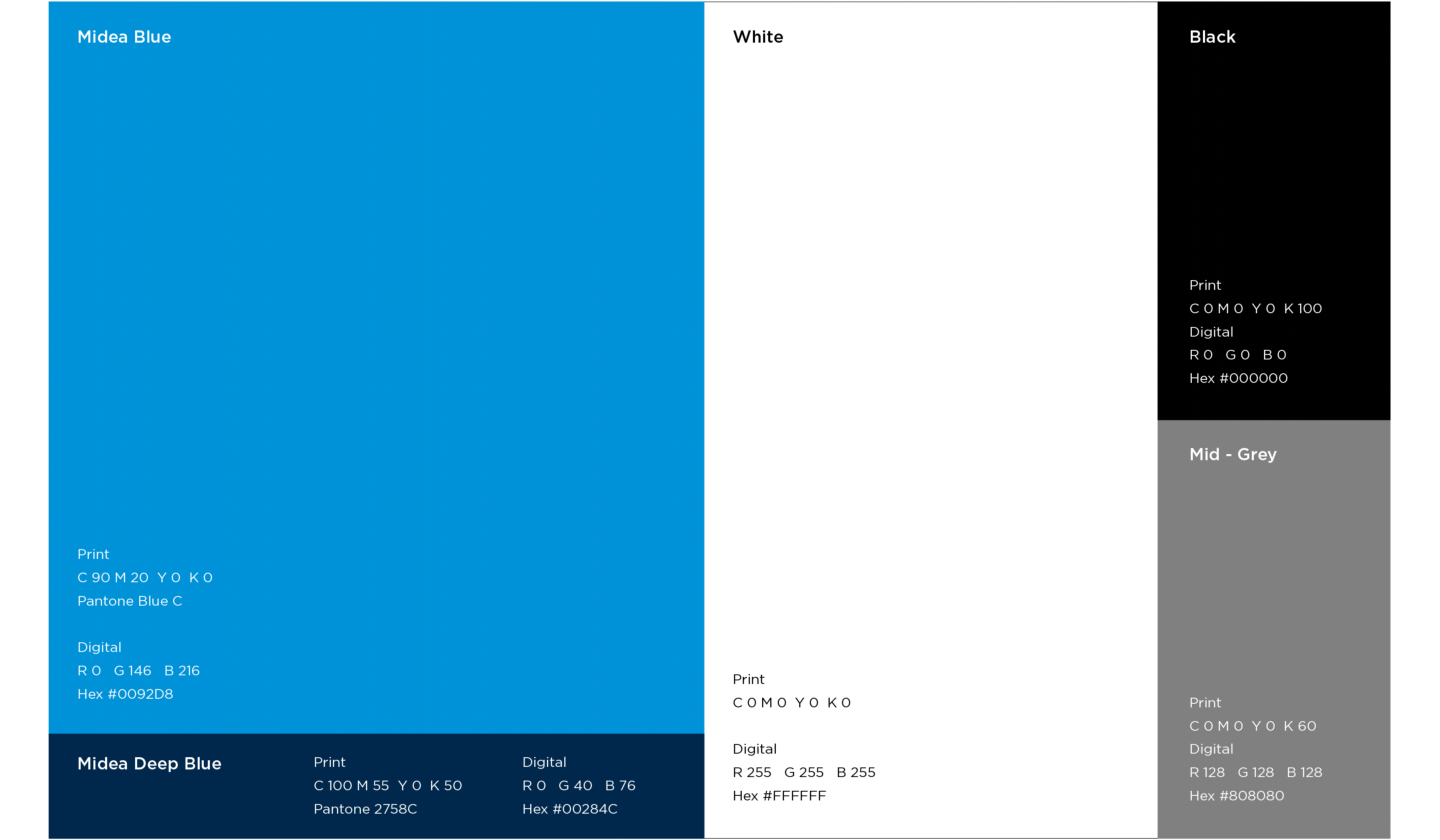
Primary Color
The primary brand palette features Midea Blue, which are the primary color of our brandmark. White is our primary logotype color, panel as well as text information in image and/or darker background. While black is reserved for text on lighter backgrounds. Midea Mid-Grey functions as the supporting graphic line color.
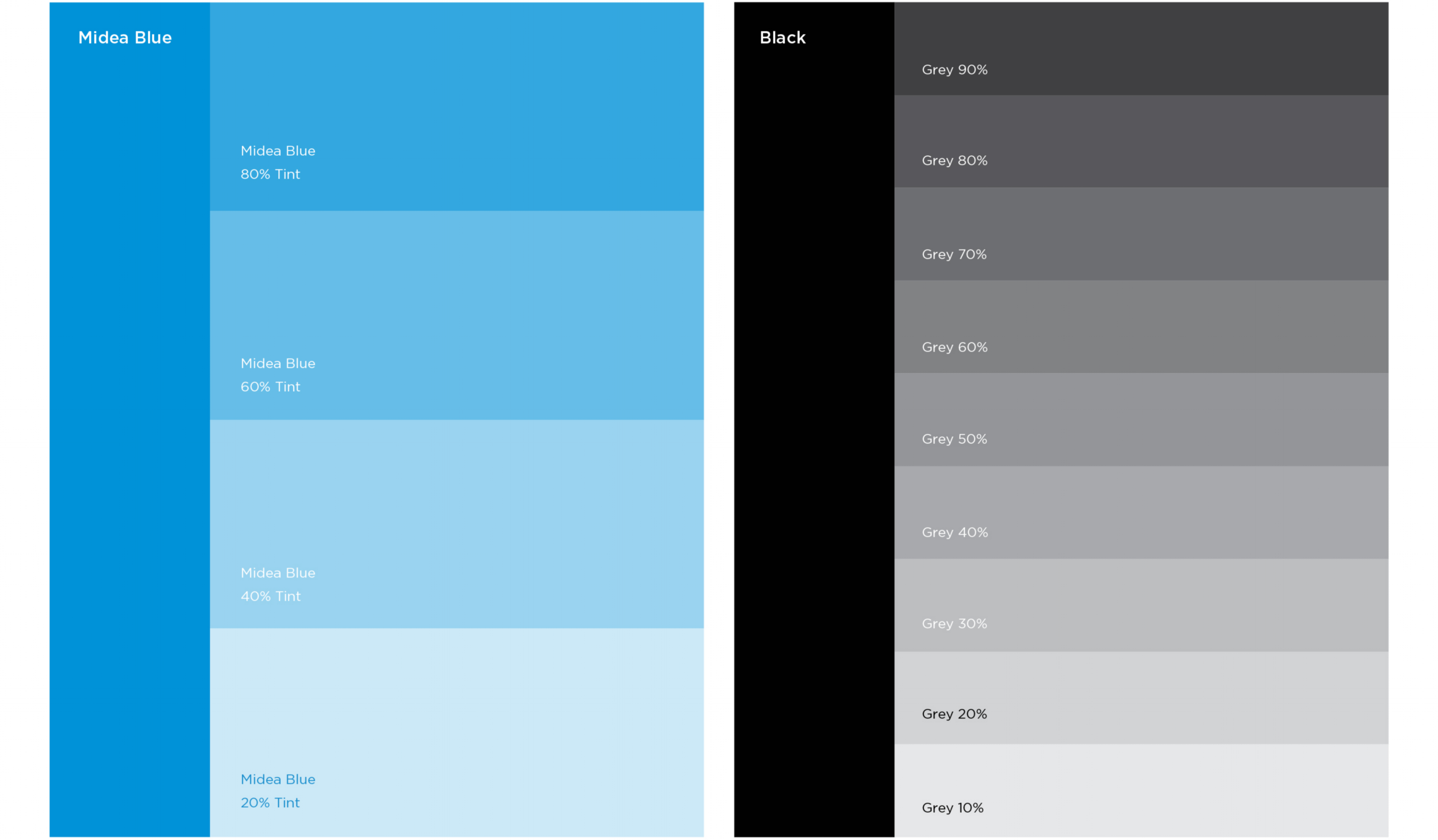
Secondary Color
The secondary color palette is derived from Midea Blue and Black, offering alternative tones primarily used for certain applications such as:
- Primary styling tones including clothes and interiors.
- Background for image collages
- Digital applications background such as PPT and icons active and deactive state.
- Printer limitations.
When expanding or choosing one of the ting from Midea Blue as well as Black for styling, ensure that the tone still fits to the overall image look.
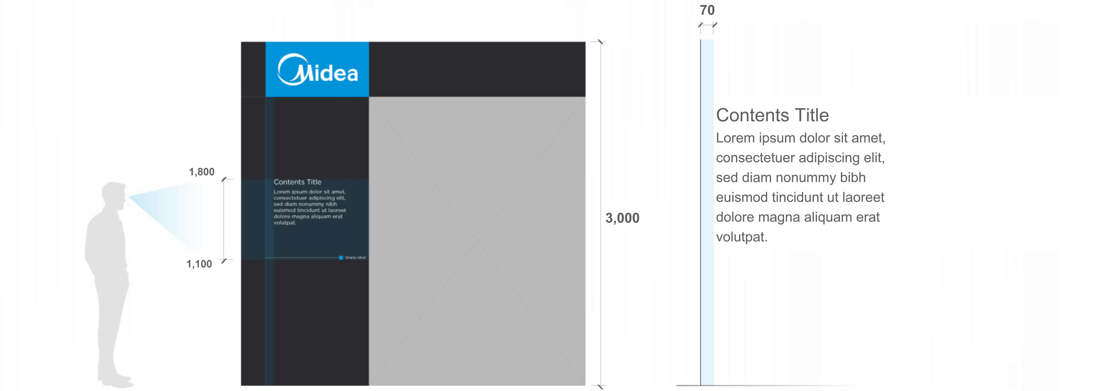
5m wall
Maintain visual consistency by standardizing font sizes and mounting heights for titles, subtitles, and product details based on wall height.
3m wall
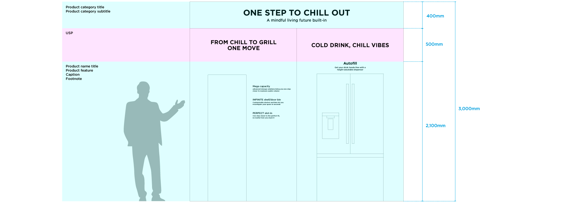
Maintain visual consistency by standardizing font sizes and mounting heights for titles, subtitles, and product details based on wall height.
2.4m wall
Maintain visual consistency by standardizing font sizes and mounting heights for titles, subtitles, and product details based on wall height.
2.4m wall with products
Maintain visual consistency by standardizing font sizes and mounting heights for titles, subtitles, and product details based on wall height.
3m wall with products
Maintain visual consistency by standardizing font sizes and mounting heights for titles, subtitles, and product details based on wall height.
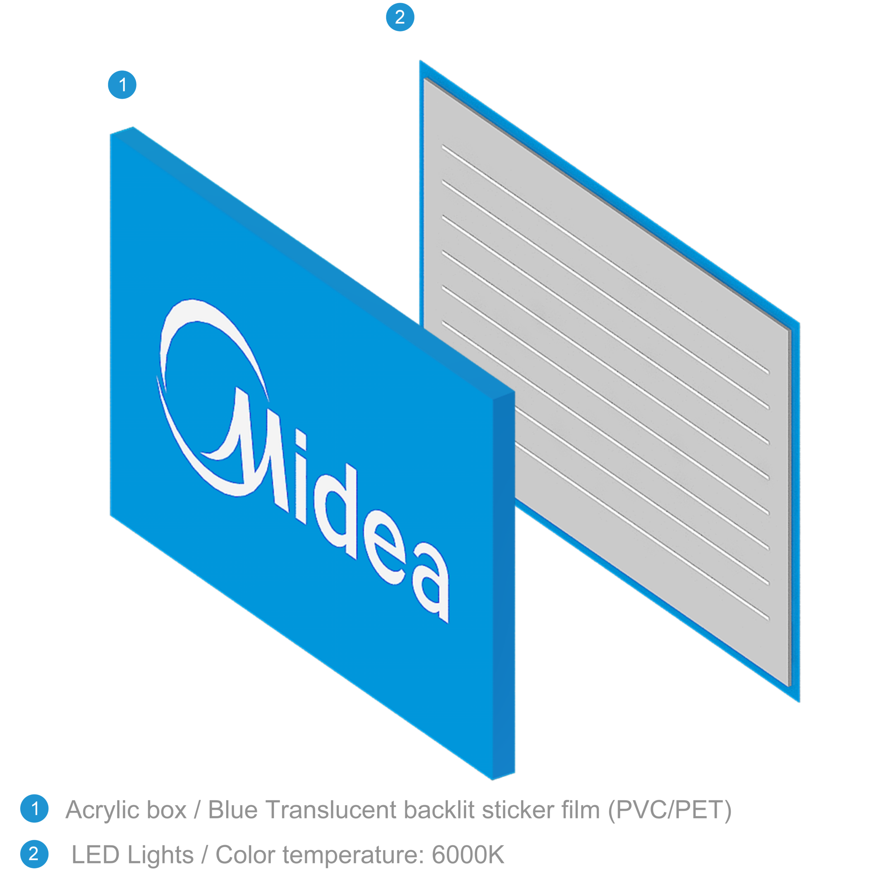
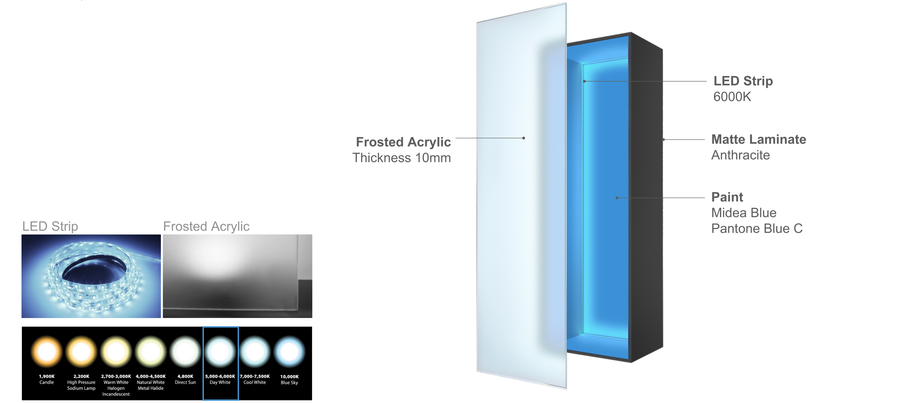
Lighting Box
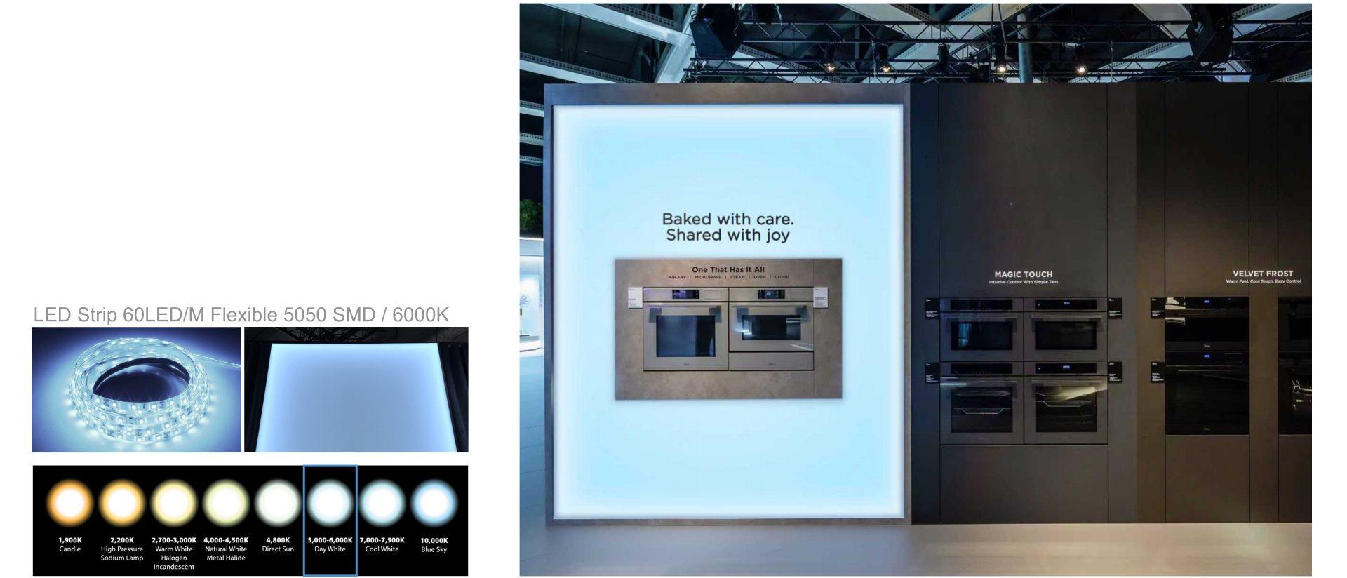
The signage is a major fabrication that patrons will encounter at a given exhibition. The signage must be in clear line of sight and positioned optimally for exposure. The blue lighting color must be achieved using a sheet that matches the Midea brand color as closely as possible, and the color must always be verified with the lighting turned on. In particular, when a blue optical filter film is applied to a 6000K acrylic light box, the illuminated output must produce a color as close as possible to Pantone Blue C, and must be evaluated under actual operating conditions.
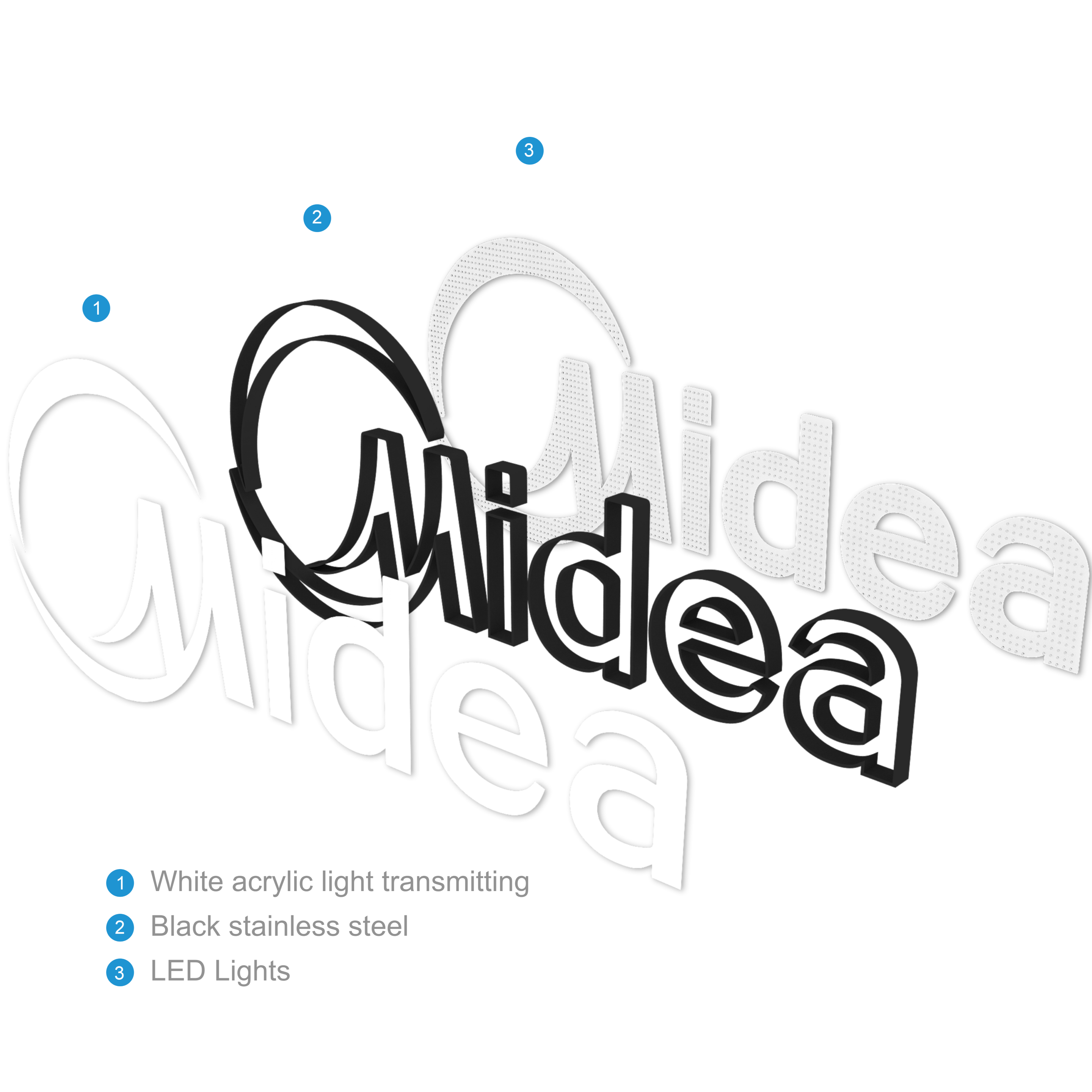
Channel Sign
The channel sign is a key visual element and must be positioned at the booth’s upper focal point to maximize visibility and impact. White lighting should be executed at 6500K with high brightness and uniform diffusion. Side finishes are applied in black or silver metal, depending on site and design conditions.
Placement Guideline
This graphic system (line, rectangle, and “Simply ideal” slogan) is restricted to the following four applications only:
*Use outside of these defined areas is not permitted.
The graphic must be positioned only in the bottom area within each defined application zone (Header, Brand Wall, Info Desk, Hero Display). While the Header sits at the top of the space, graphic placement is always determined by the bottom area within each application zone.
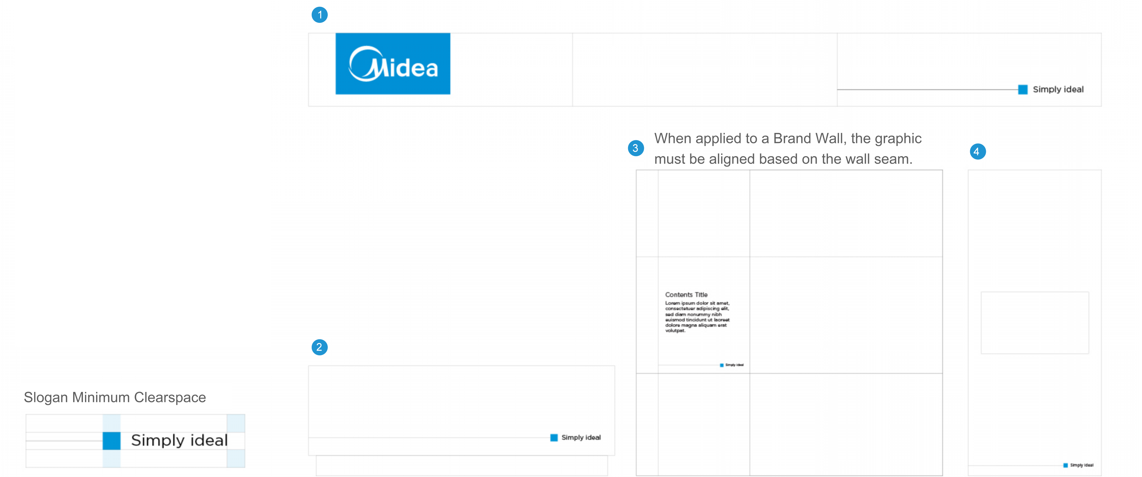
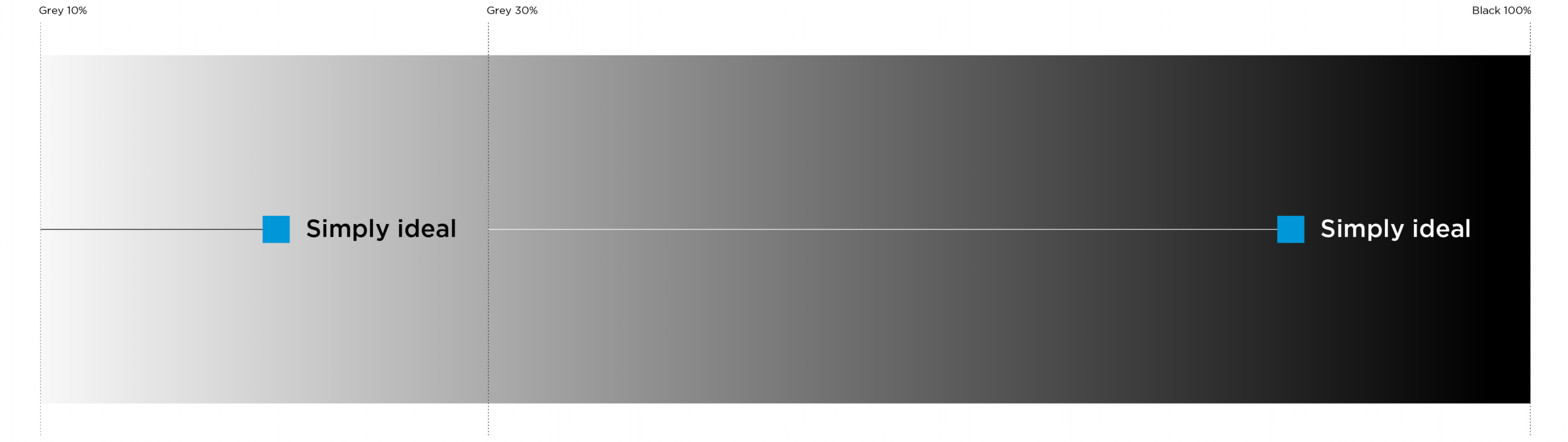
Color Application Rule
The “Simply ideal” graphic is used exclusively on neutral backgrounds ranging from Black to Grey 10%–90%, ensuring clear visual contrast at all times.
*If sufficient contrast cannot be ensured, or if visual conflict with adjacent content occurs, the use of the graphic is not permitted.
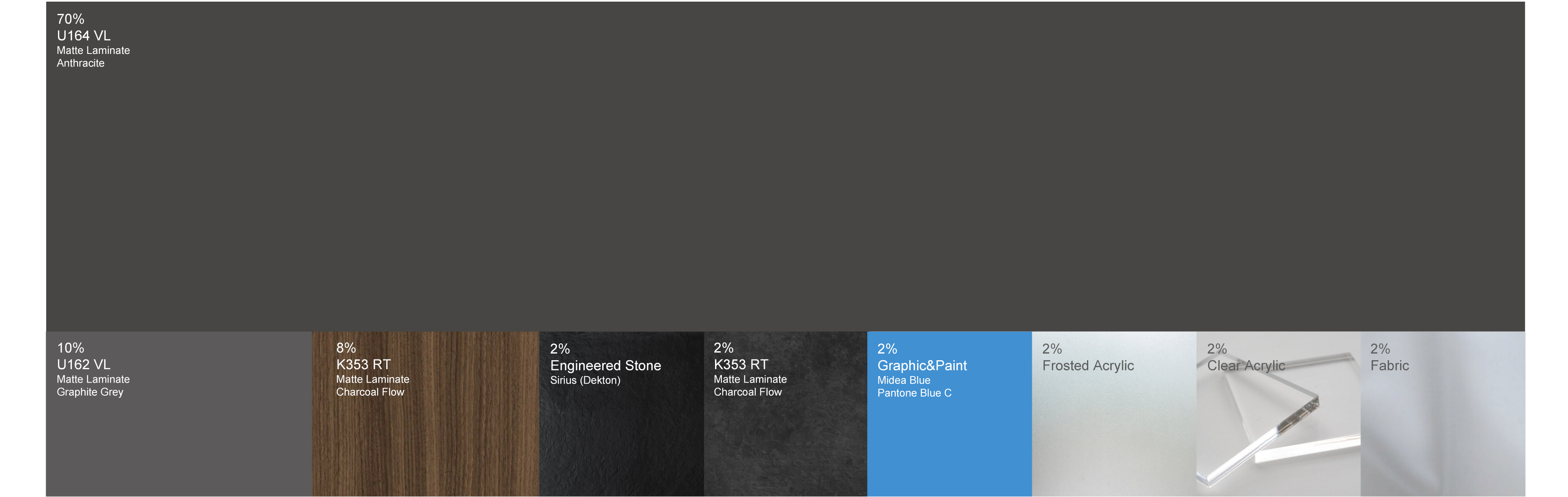
Material Tone & Manner
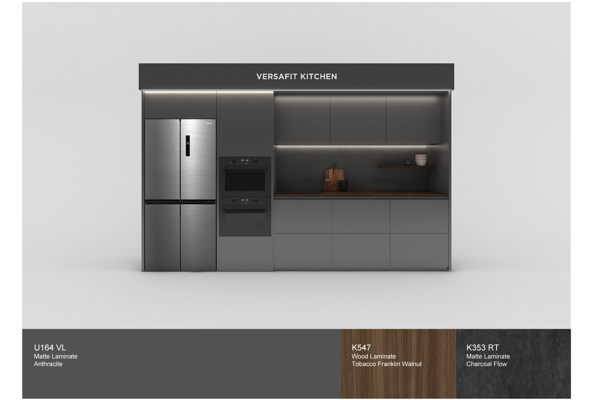
All materials must follow the visual direction defined by the Basic Material Palette. This palette establishes the overall tone and consistency of the exhibition space and should be treated as the primary reference for all applications. Point materials may be used as visual accents only and must not exceed 10% of the total visible area within the space. Laminate codes provided in this guideline are to be used as the standard reference. If the exact product is unavailable due to local sourcing limitations, materials with the closest possible color and texture must be selected.
Ambient Lighting
Ambient lighting must establish overall brightness, visual comfort, and a balanced brand atmosphere. As Midea’s brand values focus on Smart Life with Simply Ideal and the positive experiences derived from it, natural white lighting is preferred. A color temperature 4000K is recommended, and consistency must be maintained throughout the exhibition space.
Lighting should be planned so that light sources do not appear as distinct circular spots on the floor, but instead spread and reflect naturally through appropriate spacing and quantity.
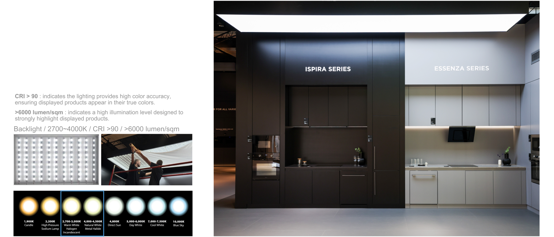
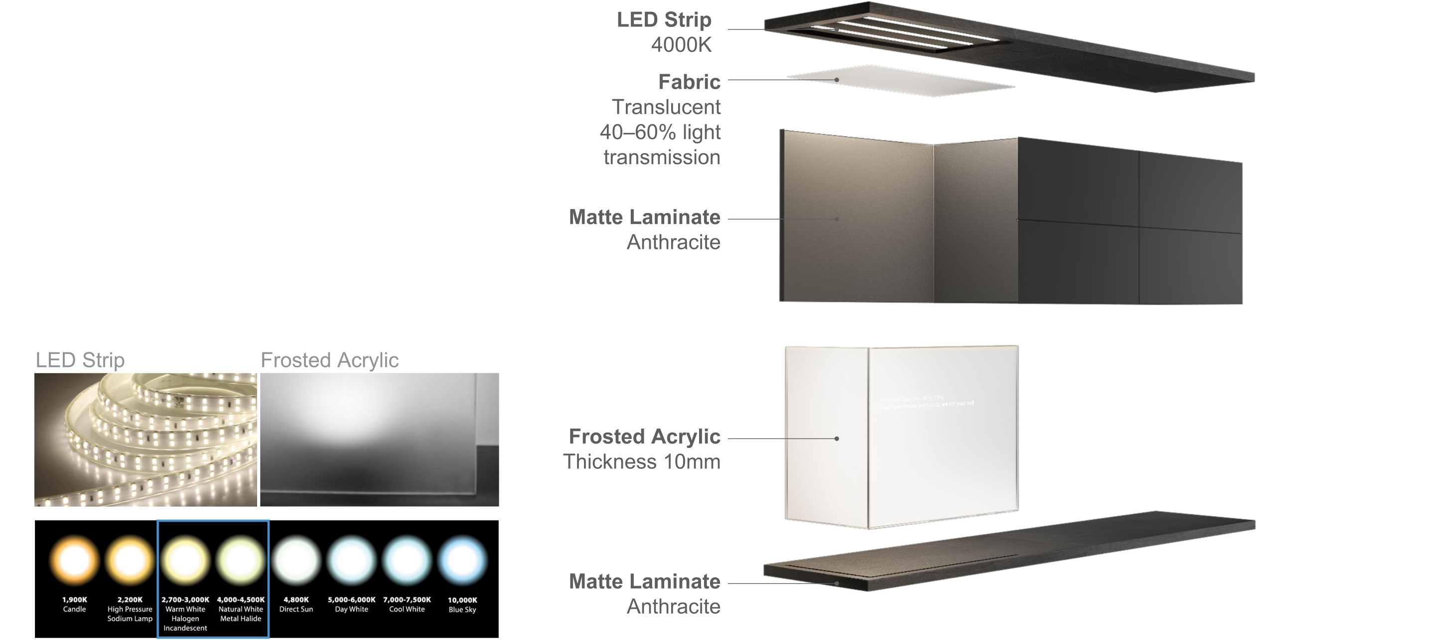
Surface Lighting
Surface lighting is used within the exhibition space to emphasize specific areas and must provide soft, uniform illumination. A 4000K color temperature is recommended, with an allowable range of 2700K–4500K depending on spatial atmosphere. Internal high-intensity signage lighting and evenly spaced recessed fixtures are required. Fabric finishes are preferred over acrylic to ensure a uniform lighting surface.
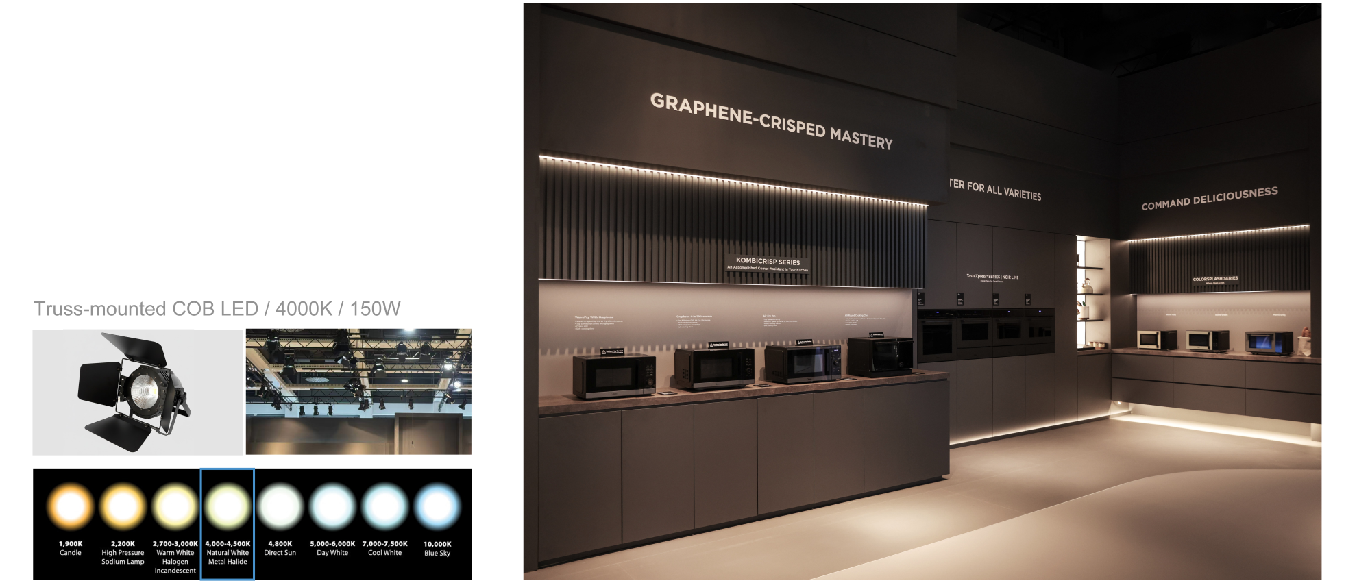
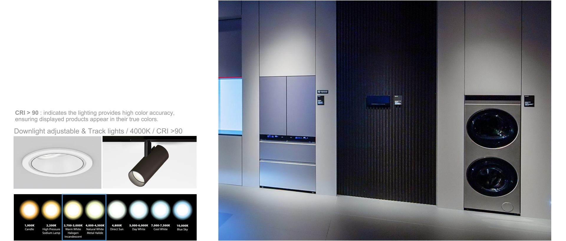
Product Accent Lighting
Focused light is applied to products to enhance visibility, material quality, and detail. Spot recessed or track lighting must be installed at a distance that allows the light to spread softly without forming harsh light spots on display walls or floors.
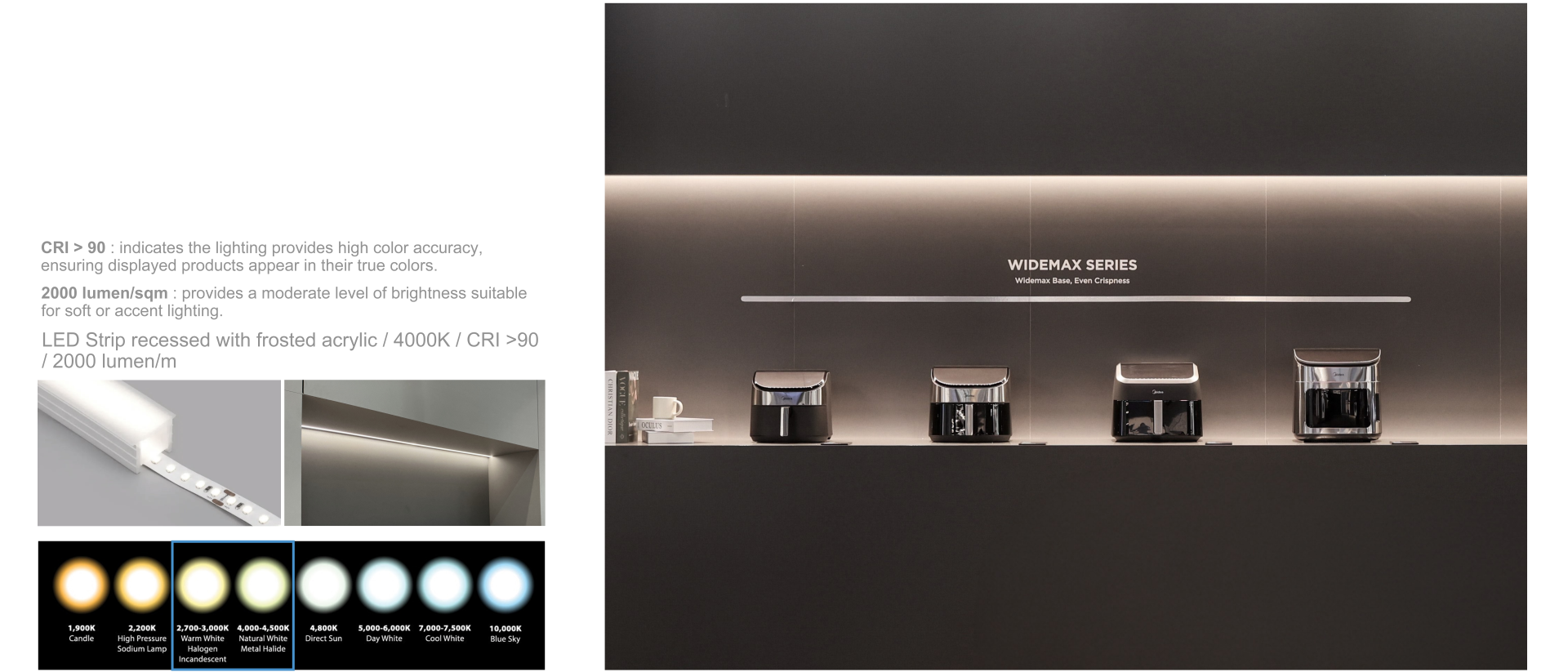
Indirect Lighting
Linear lighting on walls or fixtures must be executed as concealed indirect lighting ensuring a premium finish and refined visual quality. Creates a subtle glow by reflecting light off concealed surfaces. It enhances depth and spatial layering without exposing the light source.
Brand Accent Lighting
Blue-colored lighting is used as accent lighting to emphasize Midea’s branding.
The indirect lighting applied to structural elements should use a 6000K color temperature. Alternatively, RGB-adjustable lighting may be used to achieve a color tone consistent with Midea Blue.
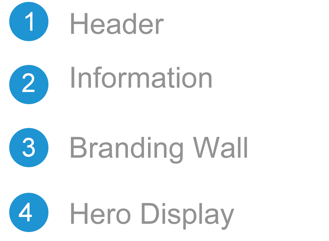
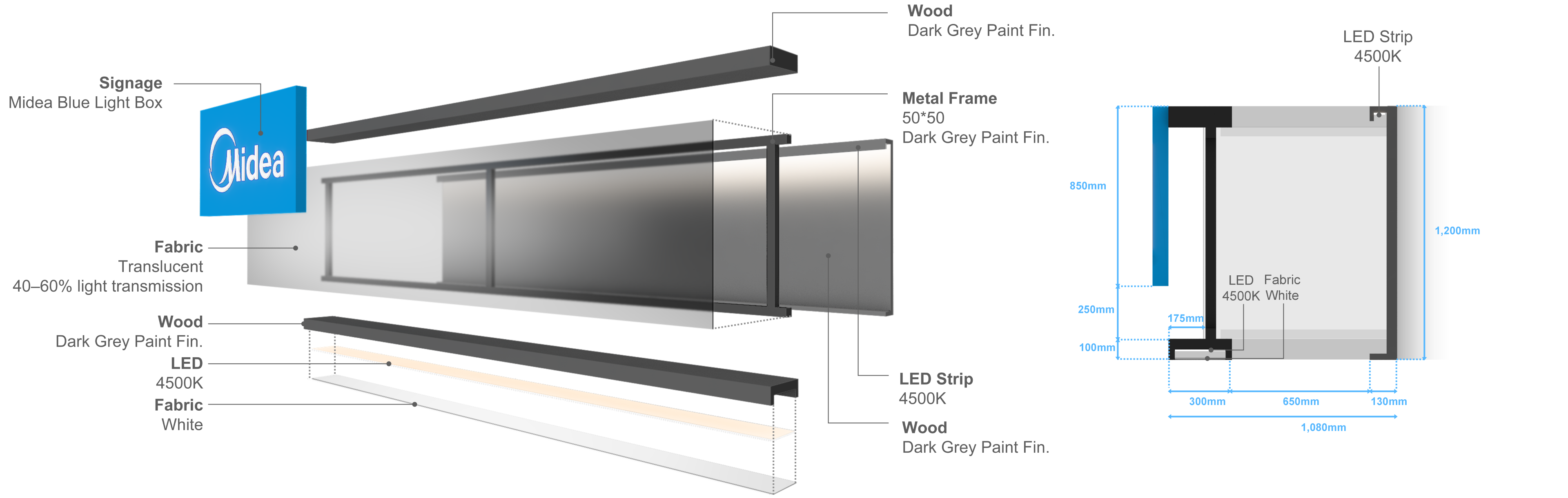
Header
The upper booth header defines the spatial structure while establishing the overall atmosphere. It functions as an architectural element that visually expresses the booth’s scale and identity.
The header is composed of layered translucent fabric and wood structures, creating a technical yet refined ambiance through material contrast.
Lighting is executed at 4500K in a neutral white tone to naturally highlight material textures while maintaining a restrained and sophisticated atmosphere.
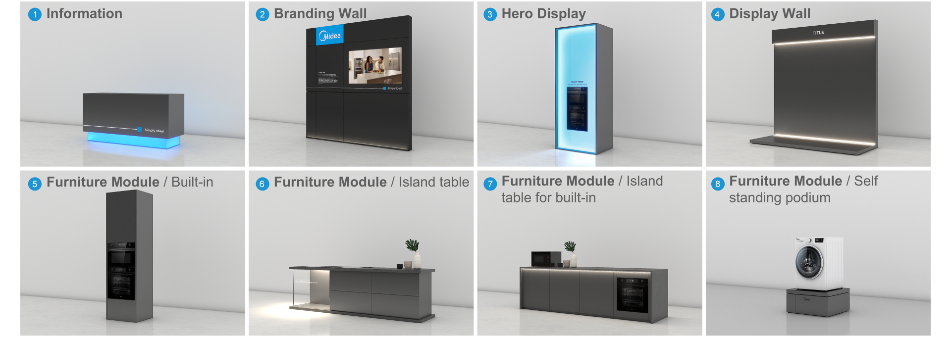
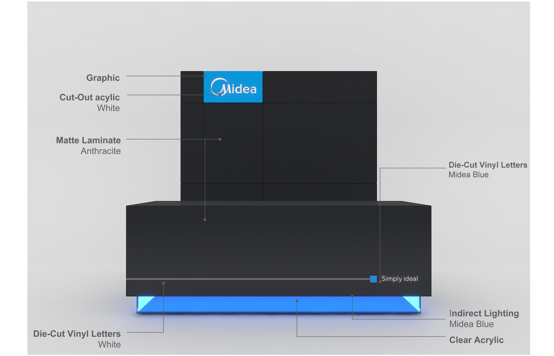
Information
The information desk, positioned as the first point of brand contact at the exhibition entrance, must maintain consistent use of Midea’s color tone & manner and logo application.
The primary base color is dark gray, and the logo must be applied in the blue box version. Midea Blue or gradient elements should be used as key accent details.
The “Simply Ideal” slogan object must be applied at the Information Desk as a key branding element.
Branding Wall with Logo
The Branding Wall, dedicated to brand communication beyond product display, must be constructed using a grid-based layout. This area is designated for key visuals, video content, and brand messaging. When applying the box-type logo, the grid structure must be strictly maintained. The “Simply Ideal” slogan object must be applied at the Branding Wall as a key branding element.
Branding Wall without Logo
The Branding Wall, dedicated to brand communication beyond product display, must be constructed using a grid-based layout. This area is designated for key visuals, video content, and brand messaging. When applying the box-type logo, the grid structure must be strictly maintained. The “Simply Ideal” slogan object must be applied at the Branding Wall as a key branding element.
Branding Wall
The Branding Wall, dedicated to brand communication beyond product display, must be constructed using a grid-based layout. This area is designated for key visuals, video content, and brand messaging. When applying the box-type logo, the grid structure must be strictly maintained. The “Simply Ideal” slogan object must be applied at the Branding Wall as a key branding element.
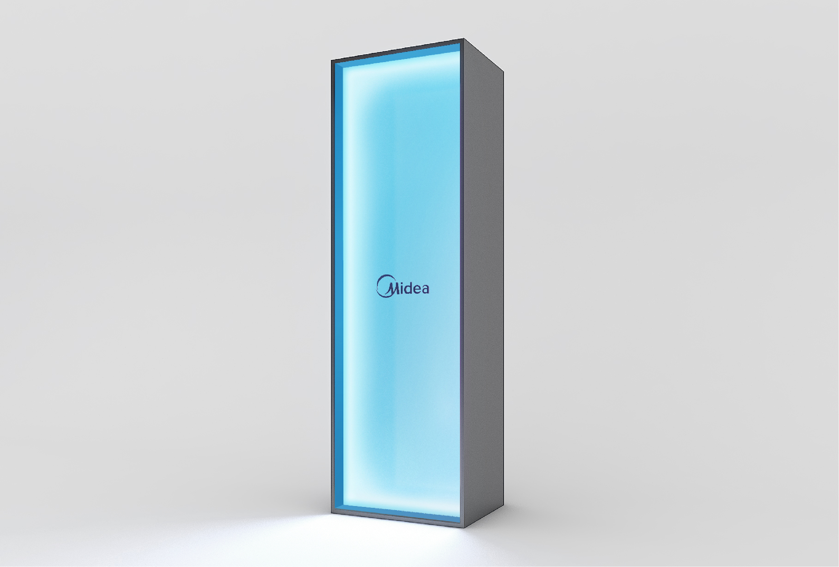
Hero Display
To emphasize hero products, the Midea Blue Square lighting box is applied to reinforce brand identity. The hero display zone is structured with a square-frame format, differentiated from standard product areas. Products are integrated into the Midea Blue square lighting box or presented as freestanding displays.
-
Standard Type
-
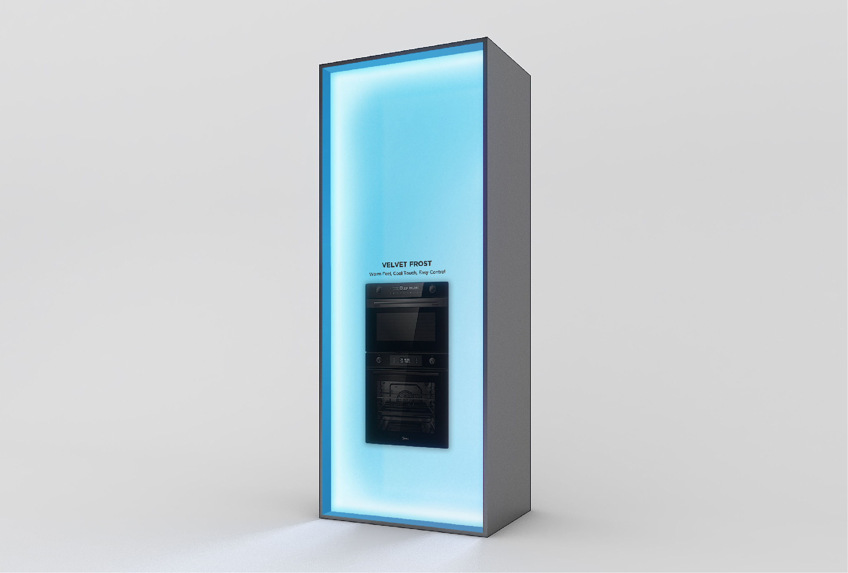
Application Case 1 Built-in Oven
-
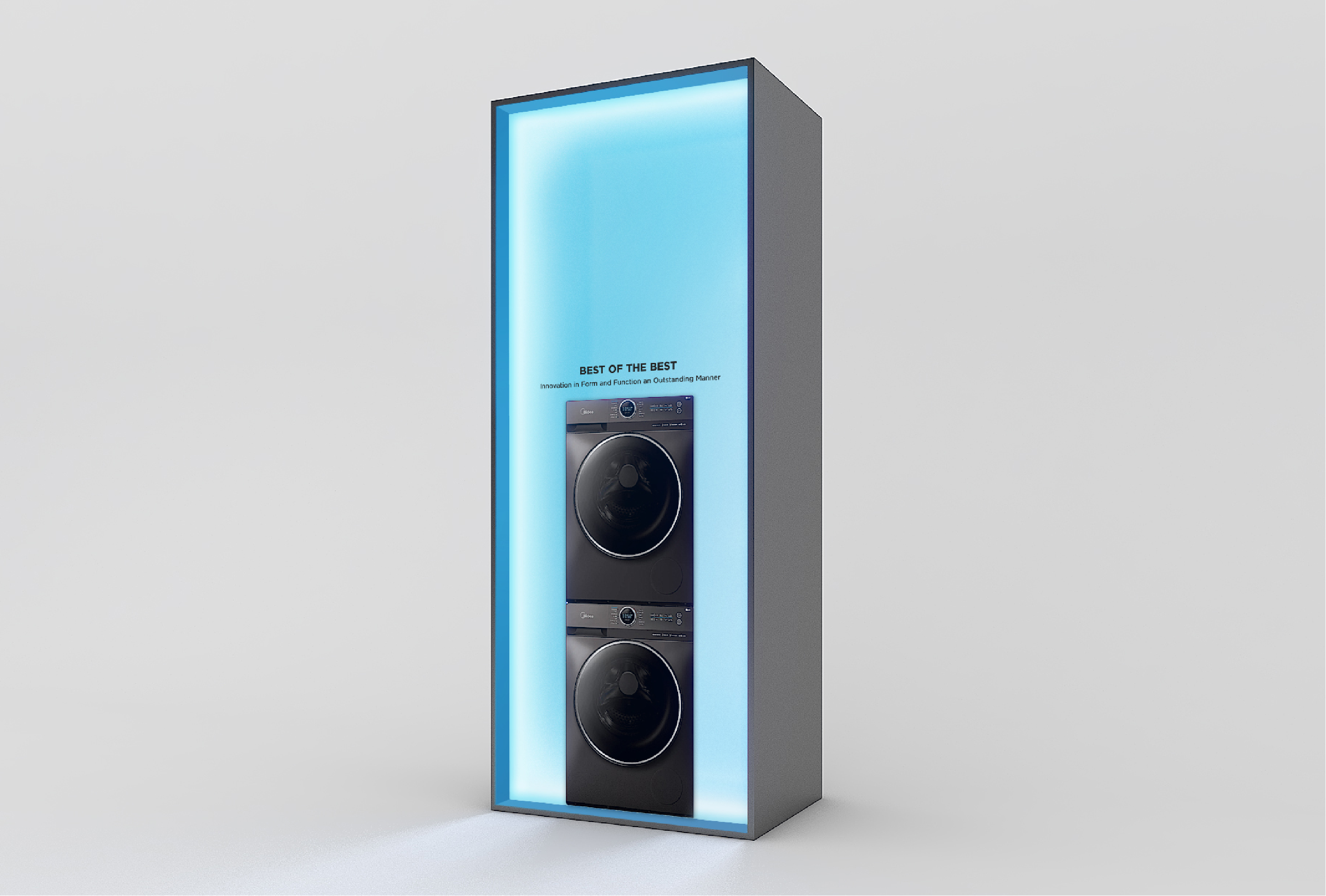
Application Case 2 Washing Machine
Hero Display Standardization
The Midea Blue Square Lighting Box establishes a standardized material and lighting system. Frosted translucent acrylic is used as the primary finish, with an internal coating in Midea Blue C.
Integrated LED strips illuminate the surface, expressing the Midea Blue brand identity through light. This approach ensures consistent production quality and a cohesive brand experience.
Furniture Module / Island Table
Island tables are key furniture modules in appliance exhibitions. Consistent finishing materials must be applied, and design accents may be added using indirect lighting and frosted acrylic.
The lighting color temperature should follow the 4000K specification defined
in Section 1.8 Indirect Lighting, with an allowable range of 2700K–4500K if necessary. The color temperature must remain consistent with the indirect lighting used throughout the space.
To ensure design consistency, exhibit elements should be selectively applied according to the booth’s scale and configuration. To prevent over-branding,
Midea branding applications are focused within designated elements 1, 2, and 3.